


This is the second in our three-part series discussing the use of unadjusted data and how it overstates the warmth of the 1930s over the U.S. See part one and part three for more.
Here on The Climate Brink, we’ve written many many posts about whether temperatures were more extreme in the 1930s than today. Just last week, we wrote about one such plot and pointed out one problem with using raw station records that do not account for well-understood biases associated with large changes in the way we measure temperature over the past century.
There are many similar plots that make the rounds; some focus on the frequency of US heatwaves, others on the number of records set over time. All suffer from similar problems when changes in measurement techniques are not taken into account.
One criticism we got on our prior article that we used the Berkeley Earth data, a different dataset than was used in the construction of the original plot. In this post, we look at a different plot – the number of records over time – and use the same dataset used in the original plot, the Global Historical Climatology Network-daily (GHCNd) data, to analyze it.
The plot
If you’re on social media, you’ve probably seen a plot that look like this:
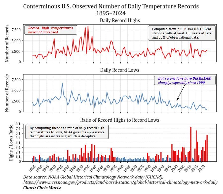
Let’s focus on the top panel, which shows that more high-temperature records were set in the 1930s than today by a huge margin. It’s not even close. And there’s been no increase over time since then, which seems to confound expectations for a warming planet.
This would be great news, if it were true.
Reproducing the result
Let’s see if it is. The data in plots like this almost always come from one dataset: the Global Historical Climatology Network Daily (GHCNd), which covers the continental U.S. (CONUS), or a closely related variant.
Using those data, we can accurately reproduce the top panel of the plot in the figure above.
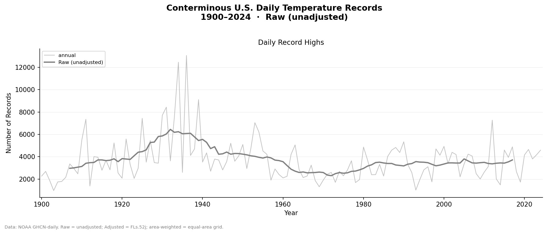
It shows the number of high-temperature records in each year in the 125-year record of 1,266 stations located in the CONUS. It looks an awful lot like the plot above (although the values are larger because we’re looking at more stations), confirming the methodology used in the plot.
Biases in the data
But, as discussed in our last post, these daily GHCN data are raw or unhomogenized, meaning they have not accounted for known biases in the data. These include time-of-observation changes, biases in the conversion from liquid-in-glass to electronic thermometers, biases due to stations moves, urbanization, etc.
Because the data are biased, you know this result is wrong. But, without estimating the size of the bias, you don’t know how wrong.
So let’s estimate how wrong the plot is. To quantify the impact of the biases, we created an adjusted or homogenized daily dataset by applying the adjustments NOAA used in the production of NOAA’s homogenized GHCN monthly data. See the appendix for details about how that was done.
Here are plots of temperature records using the raw and the homogenized daily dataset:
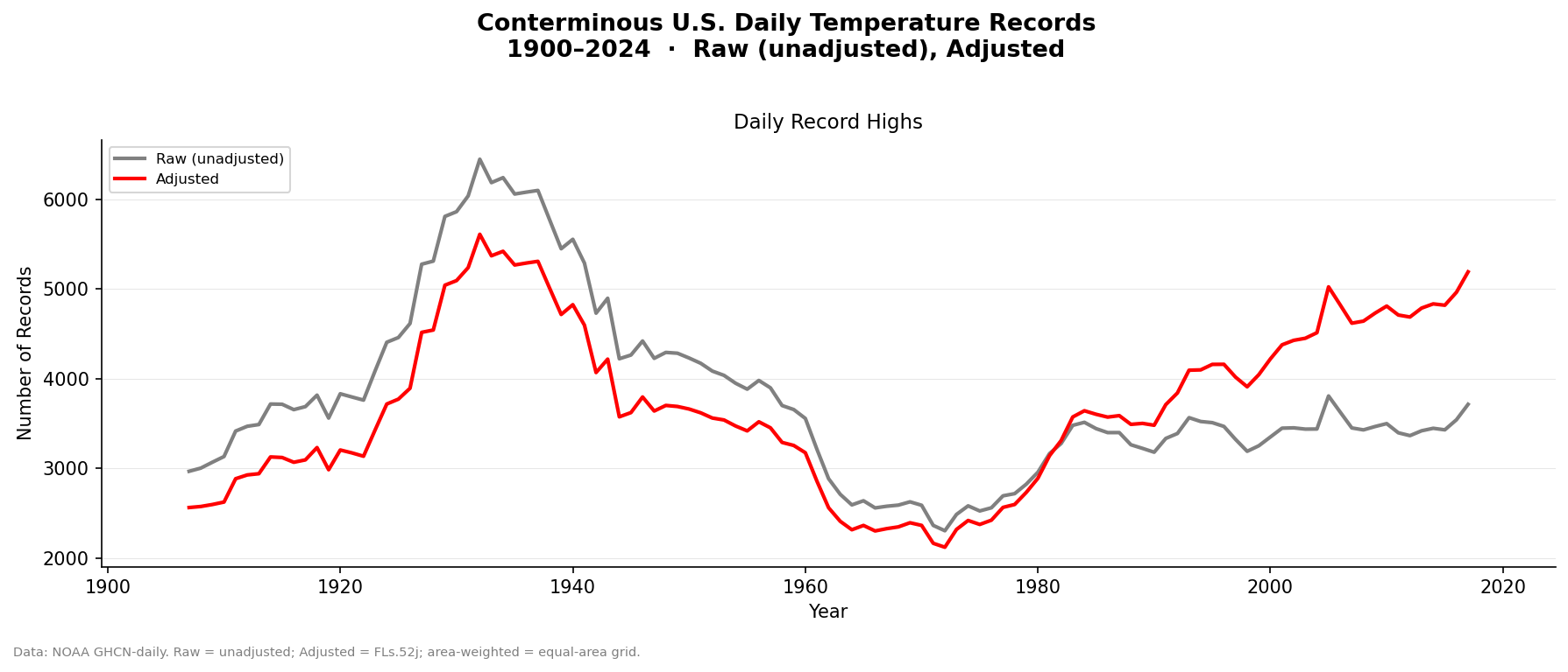
We see that correcting the biases reduces the number of records in the 1930s and increases the number of records in the present period, leading these two periods to be have roughly equal numbers of records. There’s also now an upward trend in record-setting temperatures starting around 1970s, which makes sense given the overall warming of the planet since then.
Check out our demonstrations of how time-of-observation changes and biases in the conversion from liquid-in-glass to electronic thermometers affect the temperature record.
Biases in space
But we’re not done. Here is a plot of the location of stations we’re analyzing along with the summertime average daily high temperature anomaly for the 1930s:
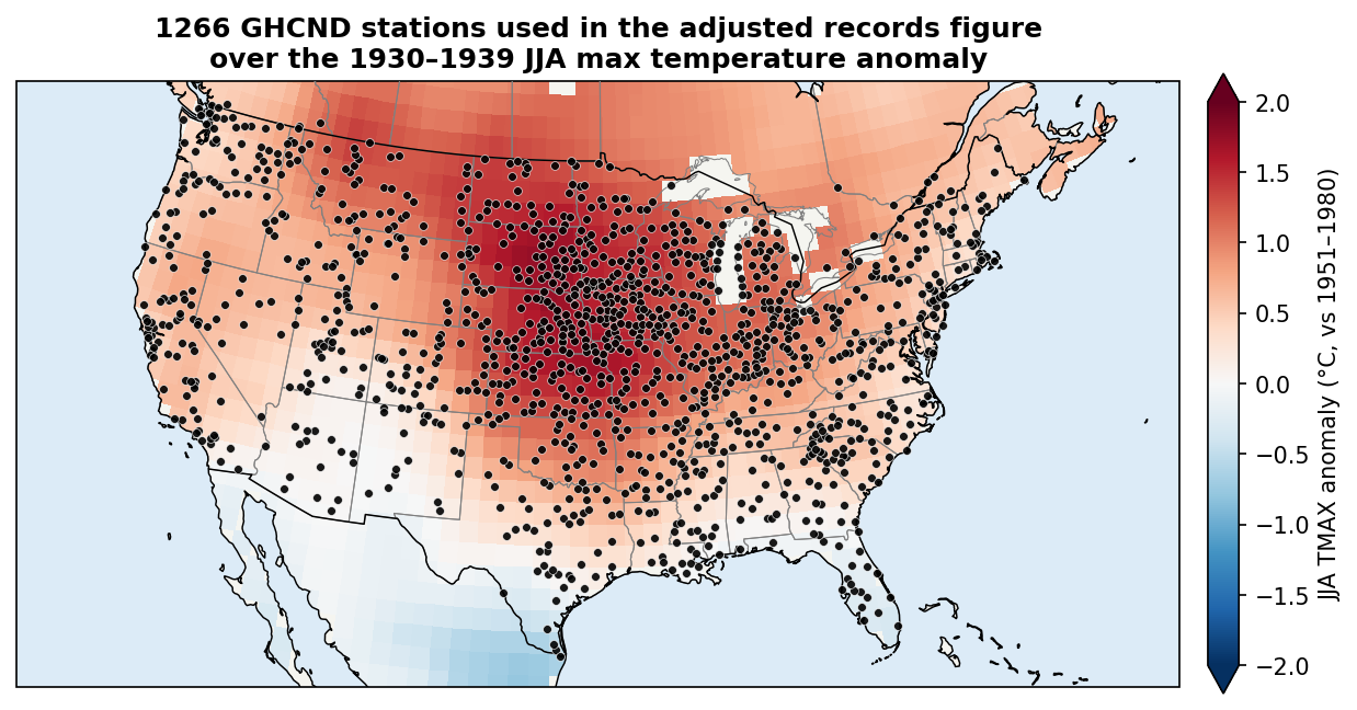
As you can see, the stations are not evenly distributed — there are a lot more stations in the middle of the continent — the exact location where the heat of the 1930s was focused. This is the Dust Bowl region, whose exceptional heat was due to drought exacerbated by poor land management by humans.
Without adjusting for this, the result will be biased towards the hottest part of the continent, thereby overestimating the heat of the 1930s.
To fix that, we area-weight the data by gridding and then averaging the gridded values. We’ve done that here:
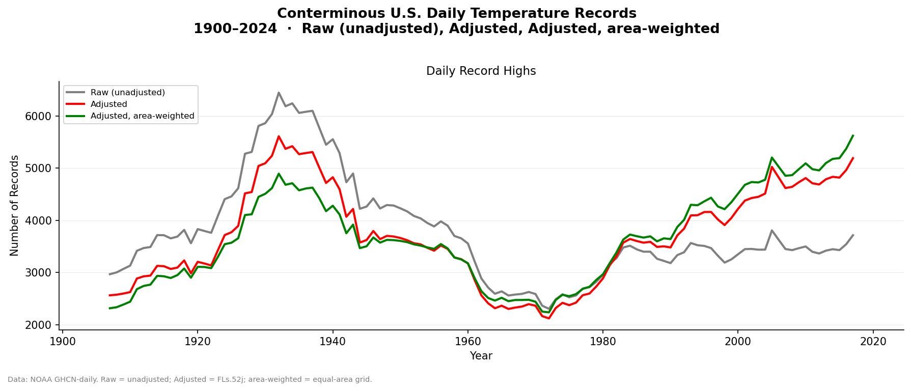
As expected, area weighting further reduces the number of record highs in the 1930s and increases it in the recent decades. By the late 2000s, the number of high-temperature records clearly exceeds the 1930s.
We also did this calculation using the gridded Berkeley Earth daily homogenized dataset, which we used in our rebuttal to the DOE Climate Working Group report (see Fig. 2 on page 186) and which was used in our last post. It shows a similar result to the one above. The agreement with our analysis here provides independent confirmation of the result.
But … but … but … adjustments!
Adjustments are a source of controversy among Twitter Ph.D.’s. For example, here’s a comment on our last post:

To scientists, adjustments to account for known biases are entirely uncontroversial. For example, James Webb Space Telescope images are heavily adjusted. Because the telescope captures a vast dynamic range of light across the universe, scientists mathematically shift pixel values, boosting the brightness of the darkest regions while compressing the brightness of the brightest areas.
The data are then further adjusted by removing various digital and physical artifacts. This includes digitally filling in black star cores — areas where bright light oversaturated the detector — as well as filtering out faint vertical striations caused by the camera’s readout noise. The team must also erase ghost stars, which are leftover light signatures from previous exposures, and delete bright spots caused by energetic cosmic rays physically striking the camera’s detectors.
The UAH (University of Alabama in Huntsville) satellite temperature dataset provides another example of the importance of adjustments. Since 1978, it has relied on more than fifteen satellites with different instruments and degradation rates. The satellites do not agree with each other for various reasons, so they use overlapping observations to adjust them into a consistent long-term record.
In addition, satellites gradually lose altitude, altering sensor viewing angles, and their observation times can drift, creating false temperature trends. UAH adjusts for these effects to remove artificial warming or cooling. In the end, the UAH data are heavily adjusted:
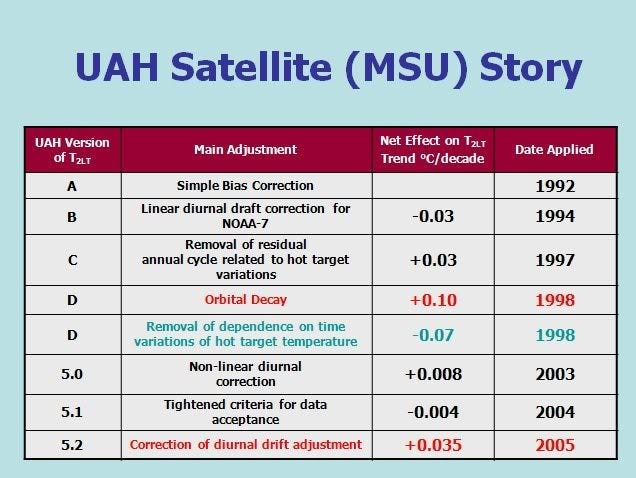
The bottom line is this: If you do not adjust the data for known biases, you’re getting the wrong answer.
Thus, adjustments and bias correction are not a conspiracy, they’re good science. In fact, the NCEI group has documented the algorithm and published the code used to bias correct these data (this is what we use to adjust the daily data). If you want to claim that the adjustments are wrong/bad science/fraudulent, please be specific about which adjustments should not be made.
Ultimately, the opposition to adjustments is entirely instrumental: climate skeptics like the results that the raw, biased data give them for the US, and they don’t like the results that bias-corrected data give them. So they oppose adjustments to the data.
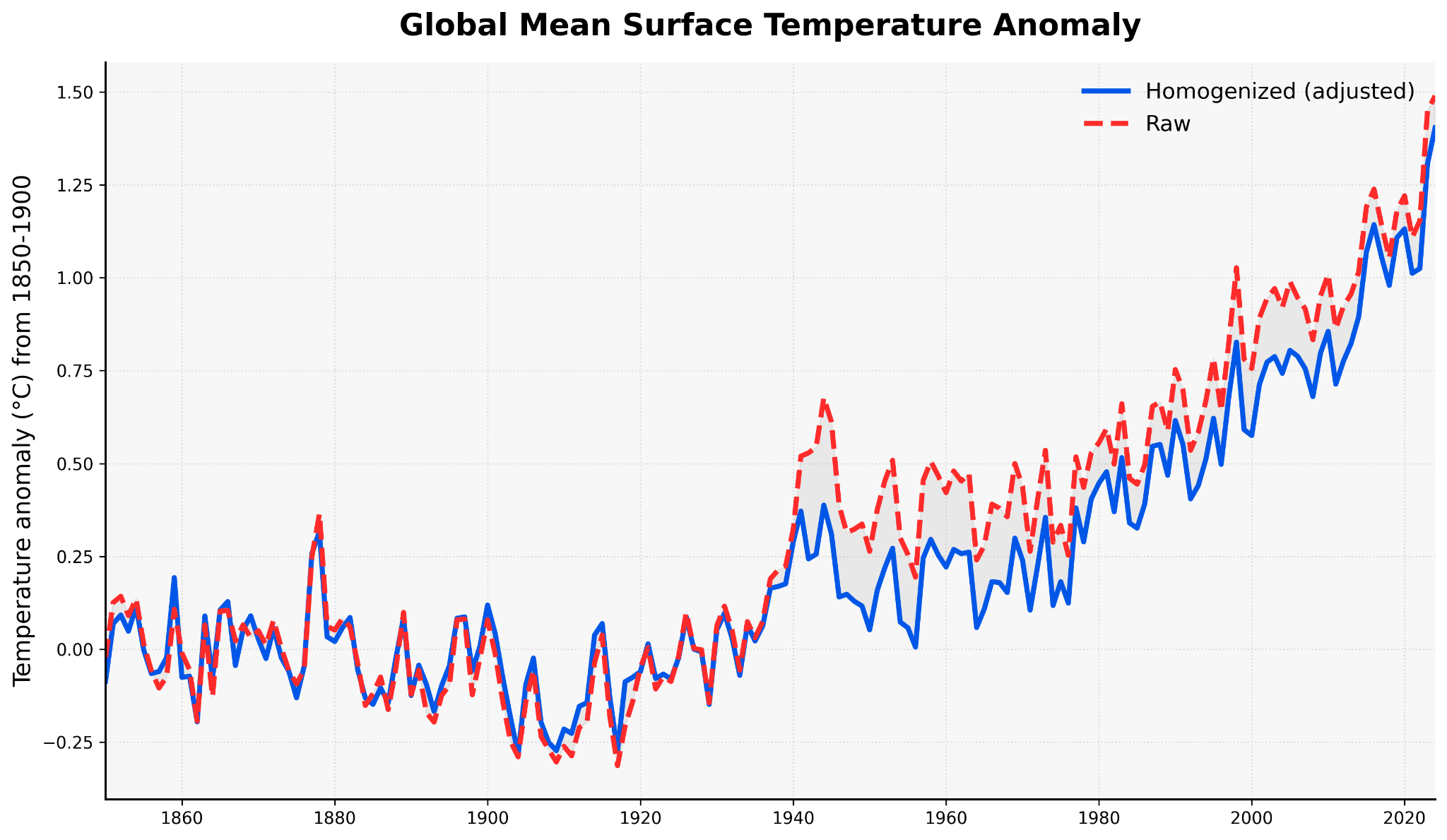
It’s worth noting that globally the picture is reversed, with the raw data actually showing more warming than the adjusted data.
Cherry picking
Another issue with the plot is the focus on the U.S. As we wrote last week, the heat of the 1930s was a regional event, due to a combination of unforced variability and human activities (poor agricultural land management). The continental U.S. was indeed hot, while the rest of the globe was cool:

Today, the continental U.S. is just about as hot as the 1930s, but everywhere else is also very hot.
What this means is that, had they picked any other region, they would not have gotten this result — even using raw, unadjusted data (something discussed in the last post). Thus, the focus on the U.S. in the 1930s is a classic cherry pick.
So: next time you see a plot focusing on:
The U.S.
In the 1930s
Using raw, unadjusted GHCNd data
The argument is most likely a scam. Please hit the “share” button below and send them a link and use the hashtag #1930sScam.
Appendix: how to create the daily adjusted GHCN data
To adjust the raw GHCNd data, we started with the monthly GHCN dataset (GHCNm), from which we can estimate the monthly biases as the difference between the monthly raw (unadjusted) and monthly adjusted to come up with an adjustment for each station for each month and year. The code to do that is here. To create the daily homogenized GHCN data, we take the daily raw data and add each month’s and station’s adjustment to all days in that month. The code to do that and create most of the plots in the post is here.
Other stuff
If you’re looking for a way to fight the power, check out Marcus Sarofim’s latest substack post. He identifies places where you can send in comments on proposed regulations: 1) a rollback of diesel pollution rules, 2) a rollback of the process for setting appliance efficiency standards, 3) a rollback of PFAS drinking water standards, 4) the elimination of public notice and comment for Forest Service actions. If you’re unhappy with what’s going on, take action! These things really do make a difference.
If you're teaching a programming course, I recommend having students use cocalc.ai as the programming platform. I used the last time I taught Python programming and it worked well. You don’t have to worry about students installing software (or whatever you use) and you can also control how much AI they can use (unlike google colab). More on how to use it for teaching is here.
I also use this platform for spinning up google VMs to do very large data analysis projects that require downloading TBs of, e.g., CMIP6 data. The people that run it are very very helpful and, if you have a problem, they'll fix it quickly.
Excellent work and communication...great science in action.
I was in the Australian Bureau of Meteorology in the 2000's when the sceptics were using the same tactic about the Australian high quality station data record ACORNSAT.
Measuring things accurately is not easy and often raw data can be misleading.
But again, same thing - comparing the all Australian raw temperature to the quality controlled data it was actually showed more warming.
https://www.bom.gov.au/climate/data/acorn-sat/#tabs=Methods
But still ended up with attacks pointing at particular stations and the suggestions of tampering.
This should be used in a philosophy of science class. Thanks.