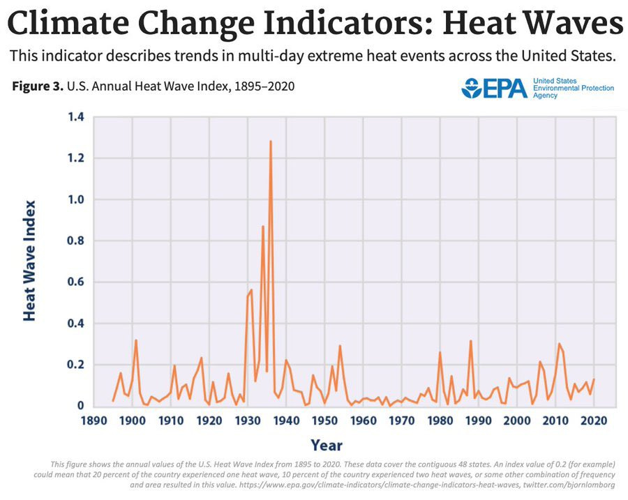
Which was warmer: the 1930s or the last 10 years
Are cherries your favorite fruit?
Cherry picking is a tactic where someone selectively chooses a small portion of a data set that contradicts the conclusion drawn from the entire dataset. This aims to mislead the audience by presenting a distorted picture of reality, leading them to question established facts.
In discussions surrounding climate change, the inherent complexity of the climate system and significant natural variability make it relatively simple to identify isolated parts of any big data set that seemingly refutes what scientists are telling you. Climate contrarians exploit these cherry picked facts to cast doubt on the existence or severity of climate change.
Numerous methods can be employed to cherry pick data. For instance, one might focus on a specific time period or region that demonstrates a different trend than the entire data set. Examples include examining short periods during which the climate appears stable or cooling. Or they might focus on a particular data set that gives the lowest trend (e.g., UAH satellite measurements).
Or they might concentrate on a geographically distinct area where the local climate behaves differently than the global average. An example of this is one of the most well-known examples of cherry-picked science:
This is classic cherry picking because it focuses on a very small region, the U.S., as we describe below.
Let’s begin by making it clear that the Earth is much warmer today than it was in the 1930s.
Let’s take a look at the average summertime maximum temperature, calculated by averaging daily TMax for each day during the summer months (June, July, and August) over land:
This shows that maximum summertime temperatures are higher just about everywhere. We can make this clearer by differencing these plots:
The exception is in the central United States – the region that saw extreme warmth during the dust bowl era – where summertime maximum temperatures were indeed higher in the 1930s.
It is this small blue region in the central U.S. that contrarians are focusing on when they argue that the 1930s had worse heat waves. Obviously, focusing on that one region gives a deeply misleading picture of the evolution of summer heat globally.
When we expand our perspective to encompass the entire globe, the data tell us that the hottest temperatures are getting hotter, with record-breaking temperatures occurring at a faster and faster pace, just as we would expect in a warming climate.
The bottom line is that when you see a plot that looks suspicious (like heat waves in the 1930s were worse than today), it’s worth asking whether you’re being told the whole story. In this case, you’re not.


And why would anyone infer the Dust Bowl era was acceptable anyway? Even if the argument was true it’s a dumb one to make, indeed it supports the climate change fears.
May I ask what tools you used to make those world maps? This bogus argument is universal and I’d love to produce a map for memorable heat waves in my corner of the woods, Western Europe.