
Comparing climate models with observations
The latest generation of climate models shows too much long-term warming but better reproduces recent trends

The extreme global temperatures of the past few years have led a lot of people to ask me if the world is warming faster than expected.
To answer that, we need to look at how well climate models reproduce observed global mean surface temperatures. Here I will look at the last three generations of climate models (CMIP3, CMIP5, and CMIP6) as well as a version of the latest generation of models (CMIP6) that excludes the so-called “hot models” whose climate sensitivity is higher than the range deemed likely in the most recent IPCC report.
It turns out that that the resulting picture is complex. Earlier generations of models better reproduce the rate of warming observed since 1970, while the latest generation better captures the rate of warming in the last two decades. Whether this is evidence that warming is occurring faster than earlier generations of climate models expected will depend on how much of the recent warming acceleration is here to stay, and how much is being driven by short-term climate variability. While a bit unsatisfying as an answer, it probably remains too early to tell.
This post represents an update of my 2023 TCB post on model-observation comparisons, albeit with a fair bit of new analysis included (and two more years of observations!).
Comparing warming over time
One classic way to compare models and observations is to look at how temperatures have changed over time, compared to the multi-model mean and 5th to 95th percentile range across individual climate model runs. This is generally done using a single run for each unique climate model (in cases where modeling groups submit more than one modeling run) in order to ensure that each gets equal weight in the analysis.
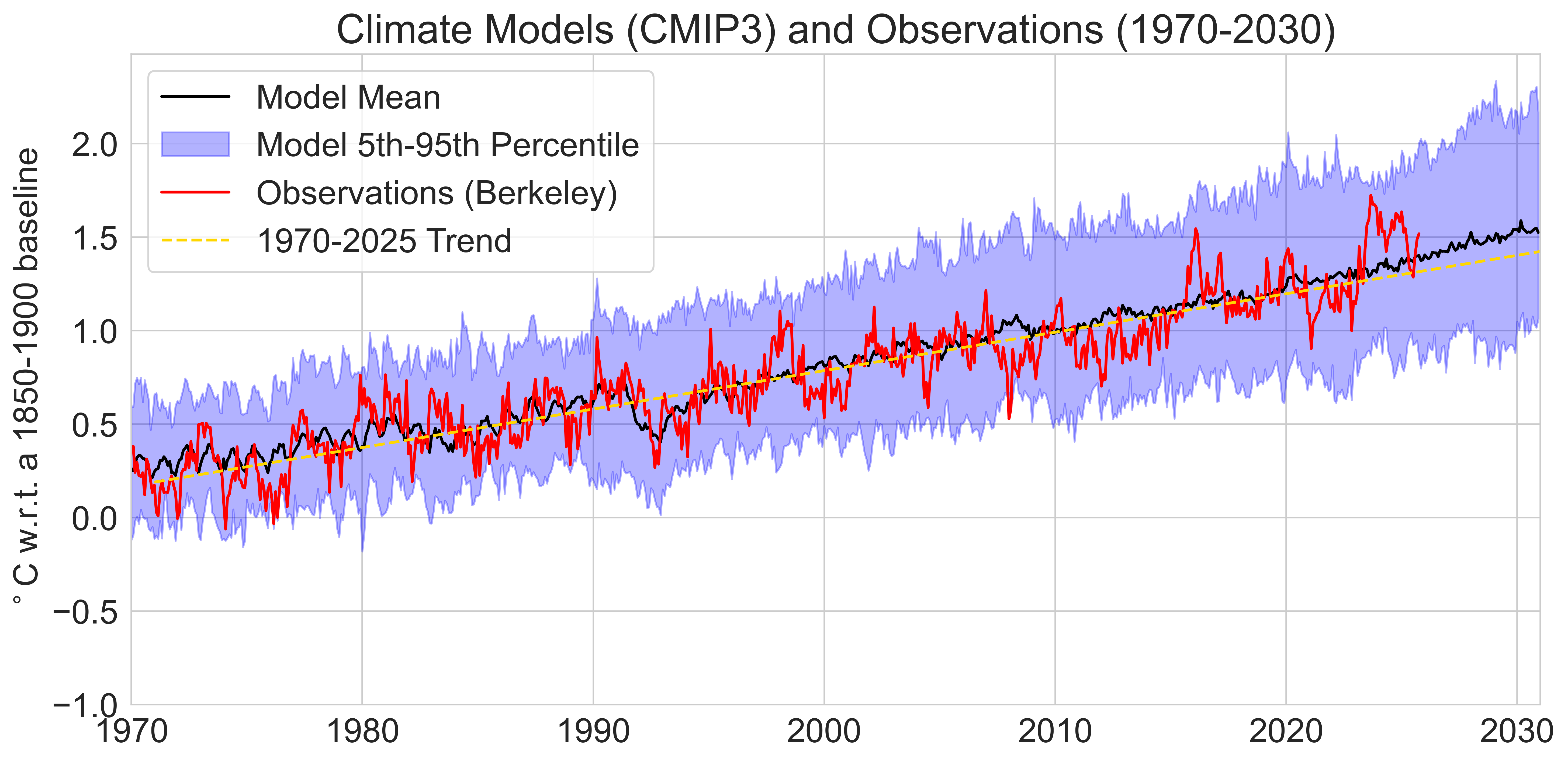
For example, here are the 23 unique CMIP3 climate models that accompanies the IPCC 4th Assessment Report published in 2007. These models were run around 2004, and use historical data on CO2 concentrations, volcanoes, and other climate forcings through the year 2000 (and the SRES scenarios thereafter, with the middle-of-the-road A1B scenario shown here).
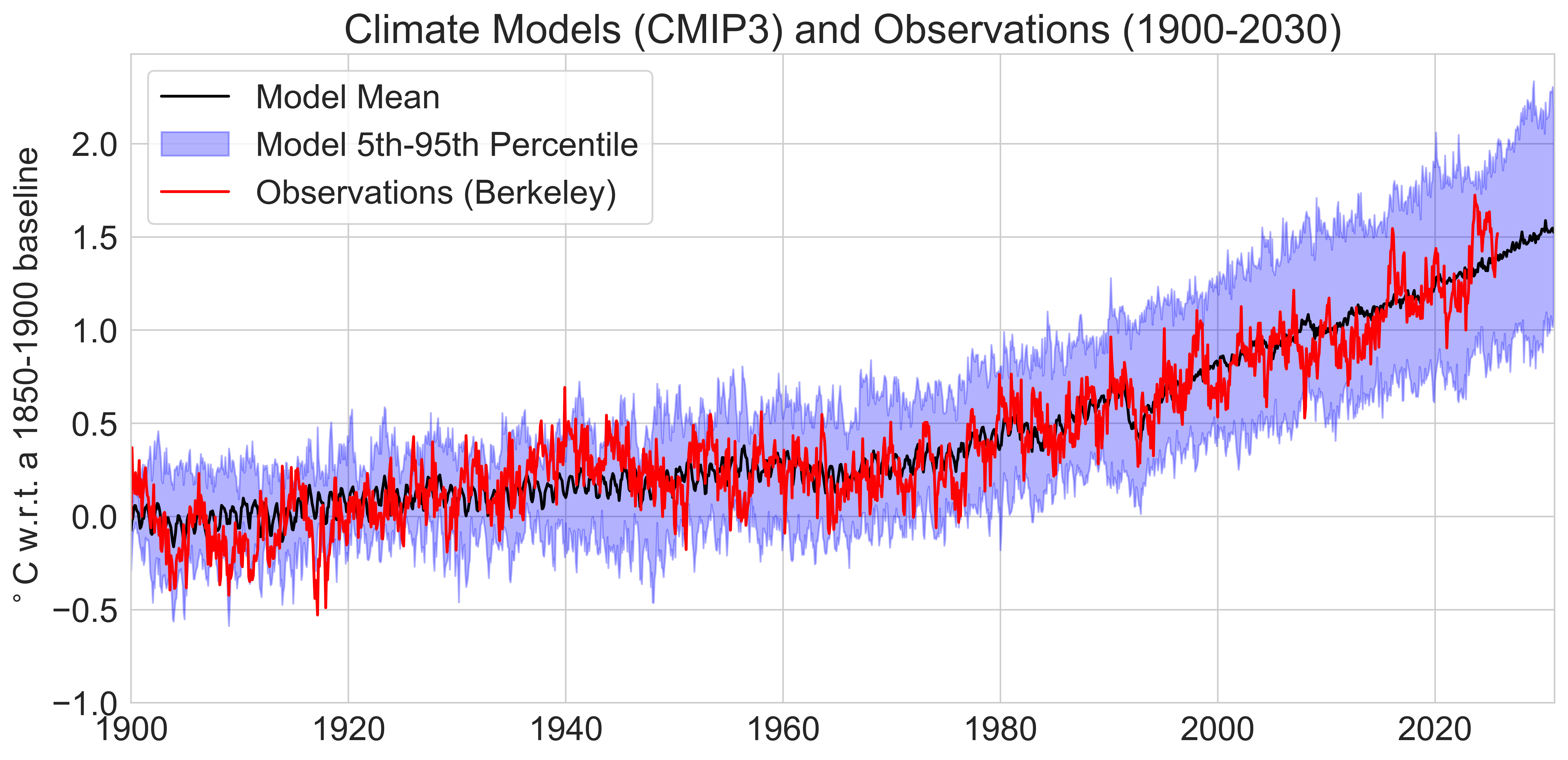
These are compared to observations from the Berkeley Earth surface temperature product on a monthly basis, and generally show quite a good agreement over the past century, with observations close to the multi-model mean except for a brief period in the 1900s and 1940s.
We can zoom into the more recent post-1970 period when the bulk of warming (>1C) in the instrumental record has occurred due to rapidly increasing human emissions of CO2 and other greenhouse gases. Here I also include the linear trend in the observations (dashed yellow line) to better compare with the multimodel mean.
The next generation of climate models was CMIP5, and accompanies the IPCC 5th Assessment Report which came out in 2013. These models were run around 2011 and use historic forcings (CO2, volcanoes, etc.) up through 2005 and the Representative Concentration Pathways (RCPs) thereafter (with the RCP4.5 scenario shown below):
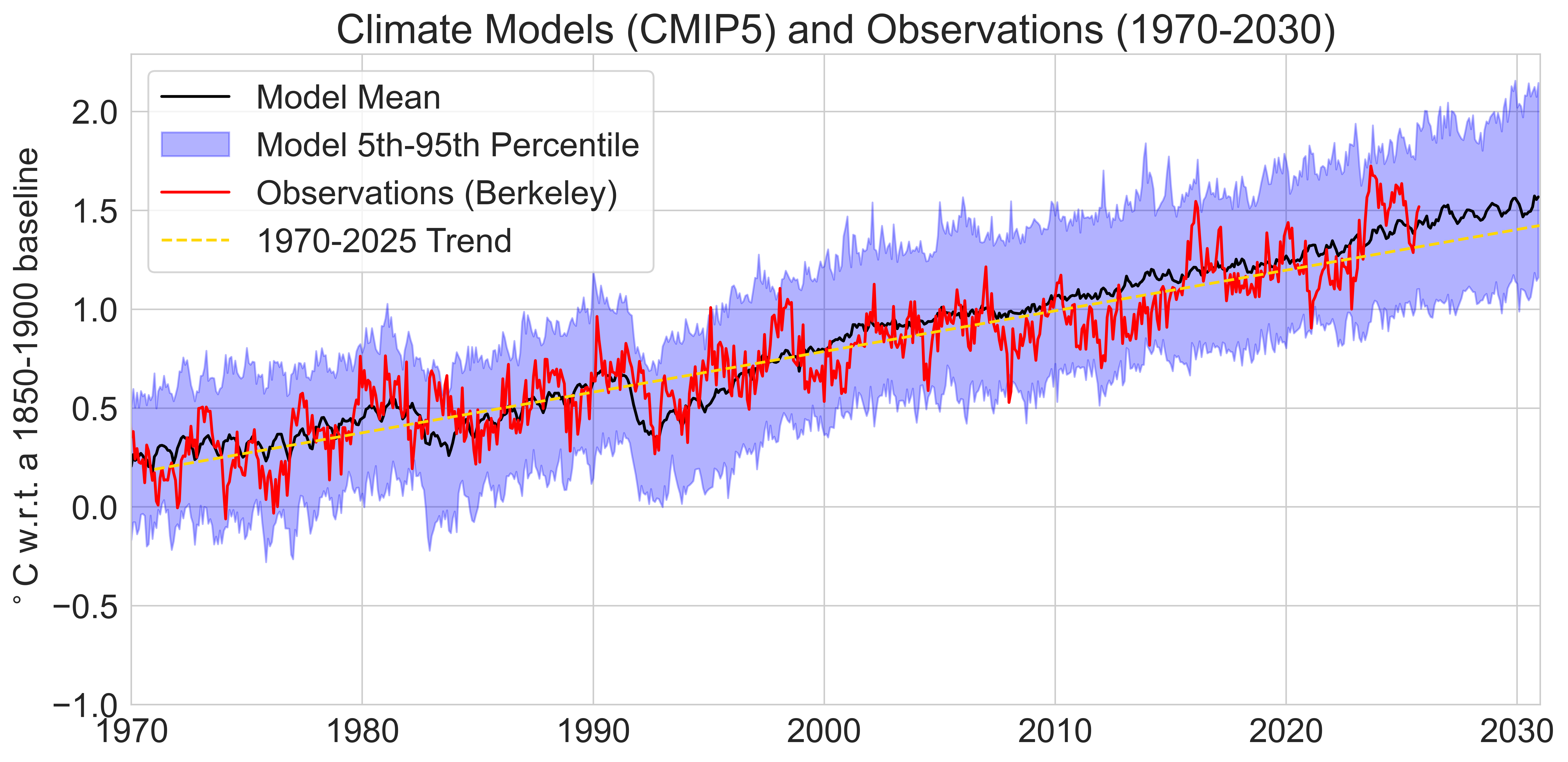
This similarly shows excellent agreement with observations in the years since 1970. Similar to CMIP3, the multimodel mean passes 1.5C above preindustrial levels around 2030.
The latest generation of models is CMIP6, which accompanied the IPCC 6th Assessment Report which came out in 2021. These models were run around 2020, and used historical forcings through 2015 with the Shared Socioeconomic Pathways (SSPs) used thereafter (with SSP2-4.5 shown below).
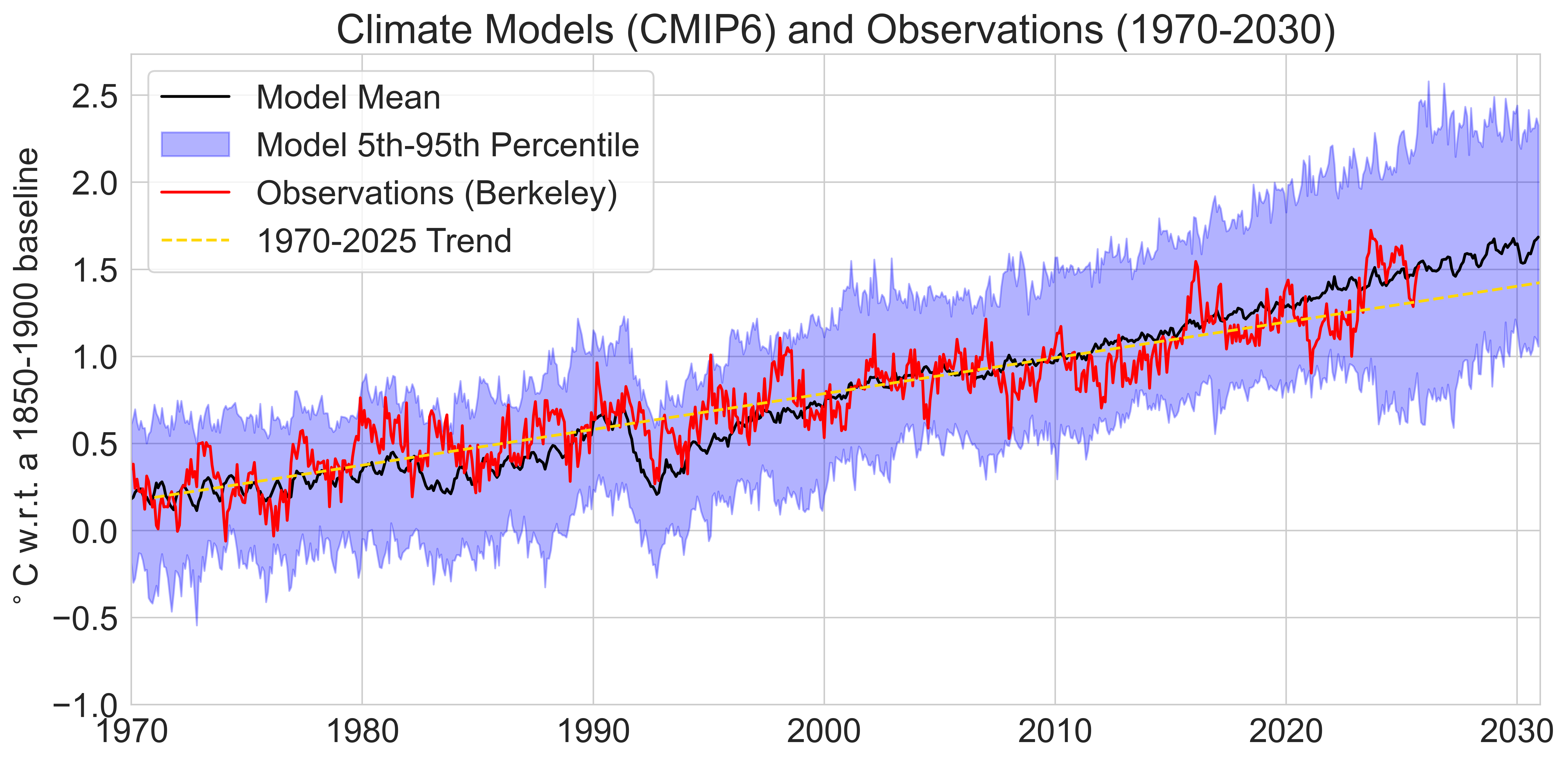
Unlike with prior generations of models, CMIP6 shows considerably higher warming compared with the post-1970 observed trend, with the multi-model mean warming around 25% faster than observations over the past 55 years and crossing 1.5C around 2025. This is due to a subset of these models featured a much higher climate sensitivity (>5C per doubling CO2) than seen in prior generations of models, resulting in a higher multi-model mean.
Due to the disproportionate amount of “hot models” in CMIP6, the IPCC AR6 report chose to develop its own Assessed Warming Projections that provided future warming projections more in-line with CMIP5. In a paper in Nature in 2022, we suggested an alternative approach to filter CMIP6 models based on their transient climate response that reproduced the IPCC’s projections while allowing us to still use most of the CMIP6 ensemble.
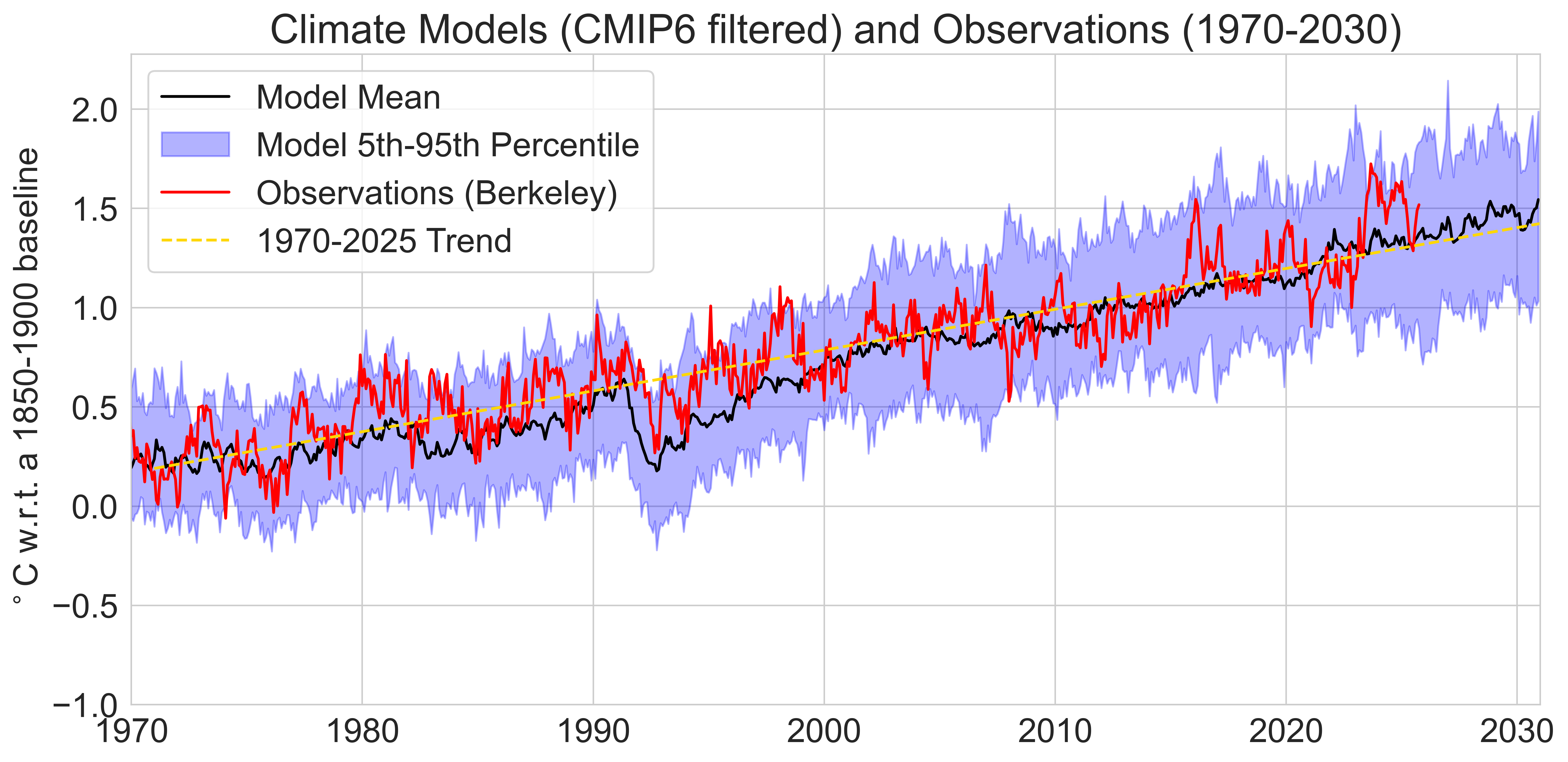
These TCR-filtered CMIP6 models have a post-1970 warming rate comparable to observations and show the world passing 1.5C above preindustrial levels around 2030.
Now, you might be asking why this post is focusing so much on linear trends since 1970. After all, if global warming is accelerating it would make sense to use a different approach to comparing models and observations that better assesses more recent periods. But this is inherently tricky, as shorter timescales have more influence from internal climate variability – events like El Niño and La Niña – that may not occur at the same time in climate models.
I also tend to find these “spaghetti plots” comparing models and observations useful to provide broader context around the agreement between the two, but less useful to assess changes over time. Our eyeballs are not well tuned to picking out relative changes over different time periods, and other ways to visualize the data can be more illuminating – if a bit more complex and less intuative.
A trendier view of changes
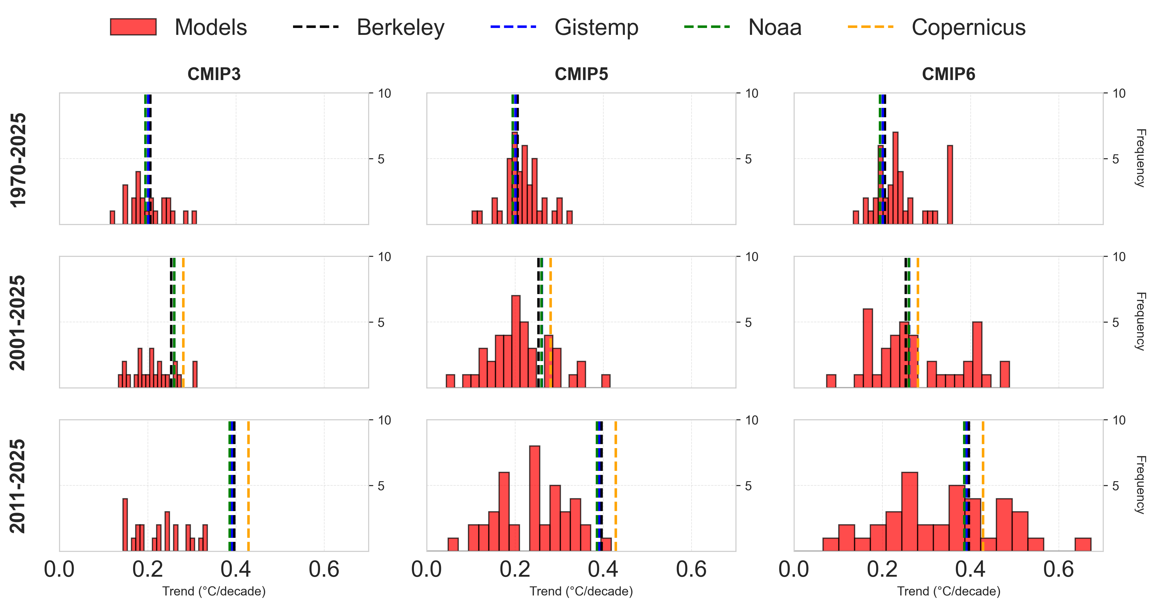
One way around this problem is to look at trends in climate models and observations over multiple time periods. For example, we can examine three different time periods: the 56 years between 1970 and 2025, the 25 years between 2001 and 2025, and the 15 years between 2011 and 2025.
This latter period (15 years) is the shortest period of time over which it is reasonable to look at trends given year-to-year variability in the record, and was the length of the period examined in Fyfe et al 2016 which explored a potential hiatus or slowdown in warming between 1998 and 2012.
The figure below shows a histogram (a frequency density plot) of climate model trends over these three periods compared with observations from four different groups: Berkeley Earth (which was used in the earlier plots), NASA’s GISTEMP, NOAA’s GlobalTemp v6, and Copernicus’ ERA5 reanalysis dataset. HadCRUT5 is not included as it does not have data available through October 2025 at the time this was posted.
This plot reveals a few fascinating things (at least in my opinion):
While CMIP3 and CMIP5 got trends since 1970 more or less right (with CMIP3 arguably being slightly better), most models in CMIP6 were running a bit too warm compared to observations over that period.
Observed trends in global mean surface temperatures over the past 25 years (2001-2025) were higher than the majority of CMIP3 models, on the high end of CMIP5 models, but more or less in the middle of the CMIP6 range.
Over the past 15 years, the rate of warming observed is well outside of the range of any CMIP3 models and all but one CMIP5 model, and on the higher side of the CMIP6 range.
Its illuminating to compare the trend over the past 15 years to that of the “hiatus” period from 1998 to 2012. The divergence between observations and the CMIP5 models featured in Fyfe et al is actually greater in the recent period than it was back in 2012 – albeit with an acceleration rather than a hiatus.
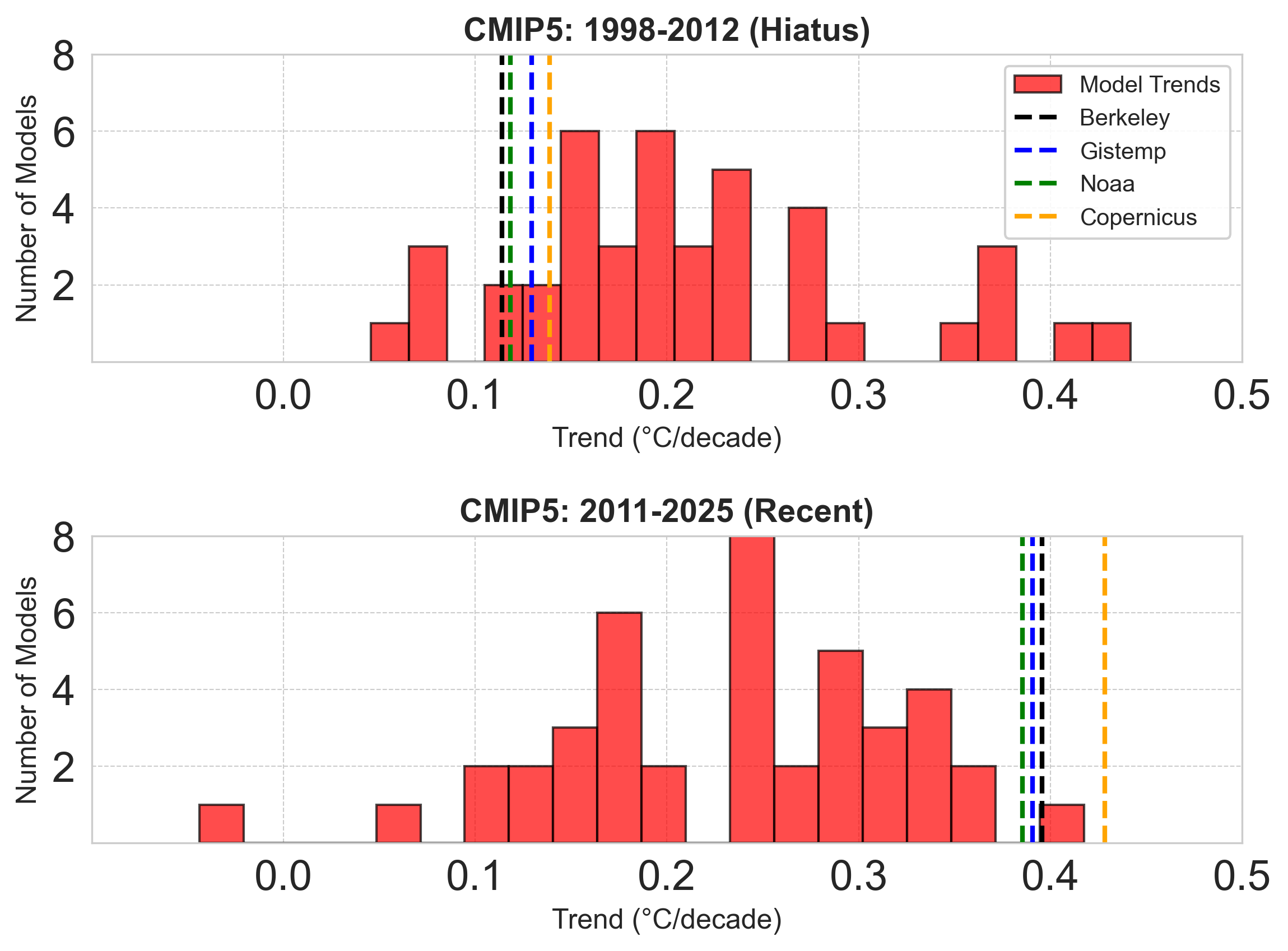
Of course the hiatus should also serve as a cautionary tale here. There were observational biases – e.g. the transition from ships to buoy-based measurements – that were not accounted for at the time. And there was an important role for internal climate variability in driving the apparent 1998-2012 hiatus that largely vanished in subsequent years.
It is quite possible – I’d even say quite likely – that a portion of the 0.4C per decade warming over the past 15 years is attributable to internal climate variability. After all, 2011 featured a strong La Niña event, while 2024 had a moderately strong El Niño. But there is also increasingly strong evidence that the rate of human-driven warming is now closer to 0.3C per decade than the ~0.2C that characterized much of the post-1970 period.
Picking the whole cherry tree
Trends in warming may be more useful for comparing models and observations than spaghetti plots of warming over time, but they are still quite sensitive to the choice of start and end dates. Models may agree with observations over some periods and not others, so the choice of time periods to present can influence your audience’s conclusions.
One way to get around the sensitivity to trend start date is to just pick the whole damn cherry tree – show comparisons between model and observations for all possible trend start dates. This of course comes at the expense of making a figure that is considerably harder to explain, but I nonetheless find quite useful.1
The figure below shows trends for all possible start dates between 1970 and 2011 for CMIP3 models. The first point on the x-axis shows the trend between 1970 and present in models in observations, the second shows trends between 1971 and present, and so on.
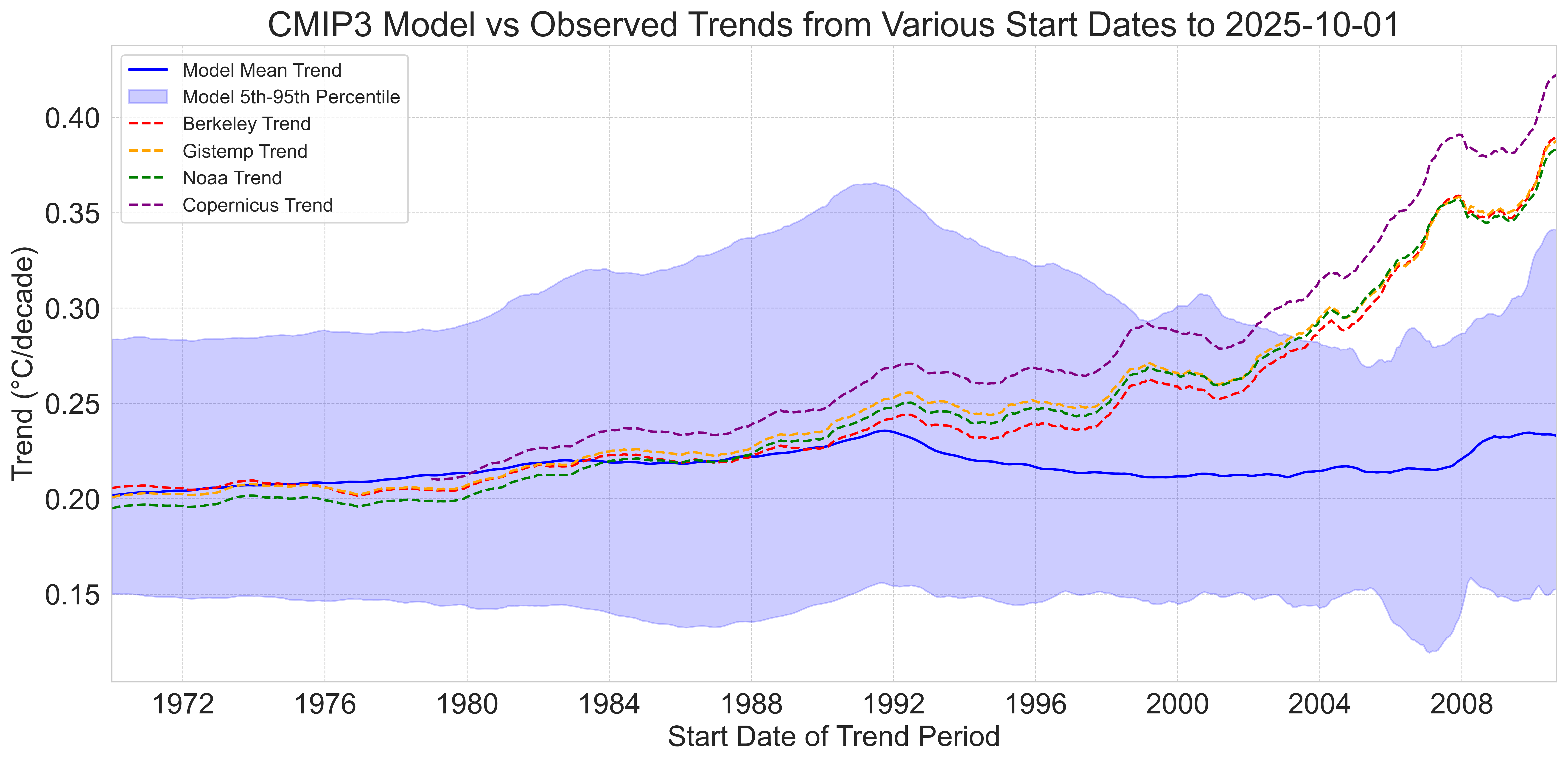
Here we can clearly see that CMIP3 models were more or less spot on with trends since 1970, but tend to underestimate the observed rate of warming after the 1990s. Observed warming moves fully outside the model envelope (e.g. the 5th to 95th percentile of model trends) between 2002 and 2004 (depending on the observational dataset).
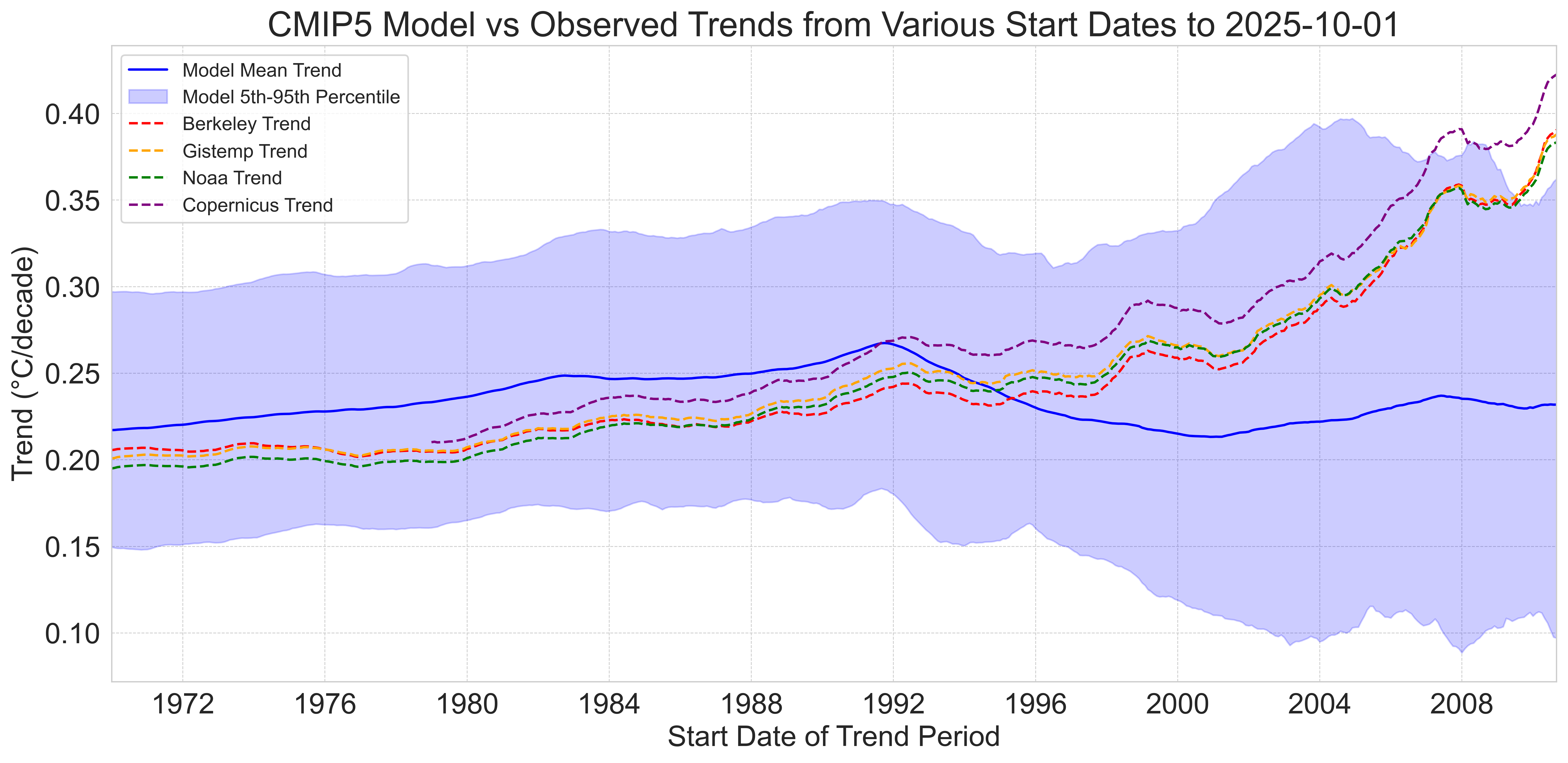
The CMIP5 multi-model mean shows a tad faster warming (~10%) than observations since 1970, but observations remain well within the model envelope. Observed warming trends start to be on the high end of the model range after 2000 or so, and are outside the 95th percentile of CMIP5 models over the past 18 years.
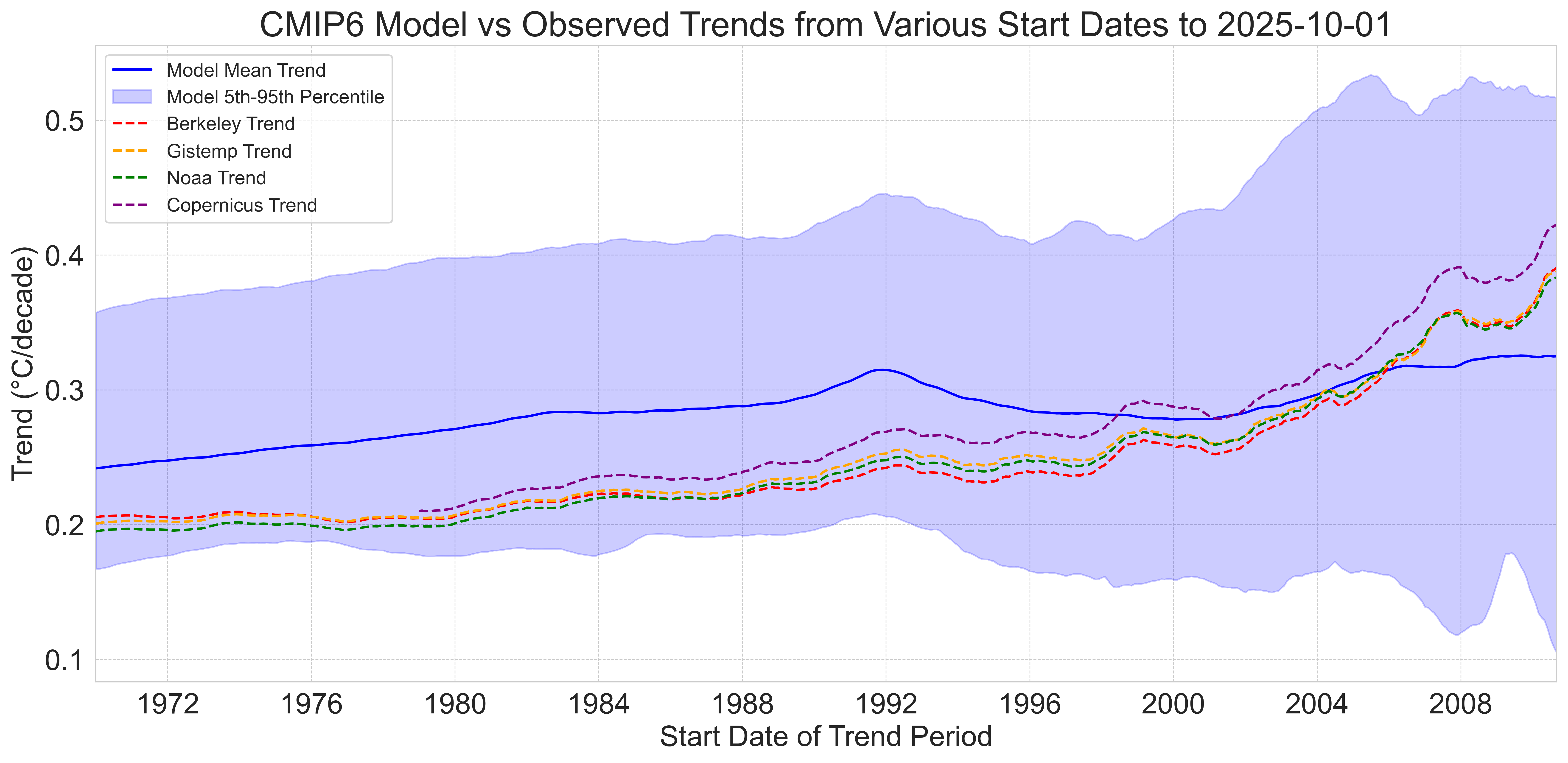
The CMIP6 multi-model mean shows notably faster warming (~23%) than observations since 1970, and observed warming trends are well on the low side of the model envelope starting years between 1970 and the early 1990s. They are roughly the same as the multi-model mean in the mid-2000s, and slightly above it in recent years.
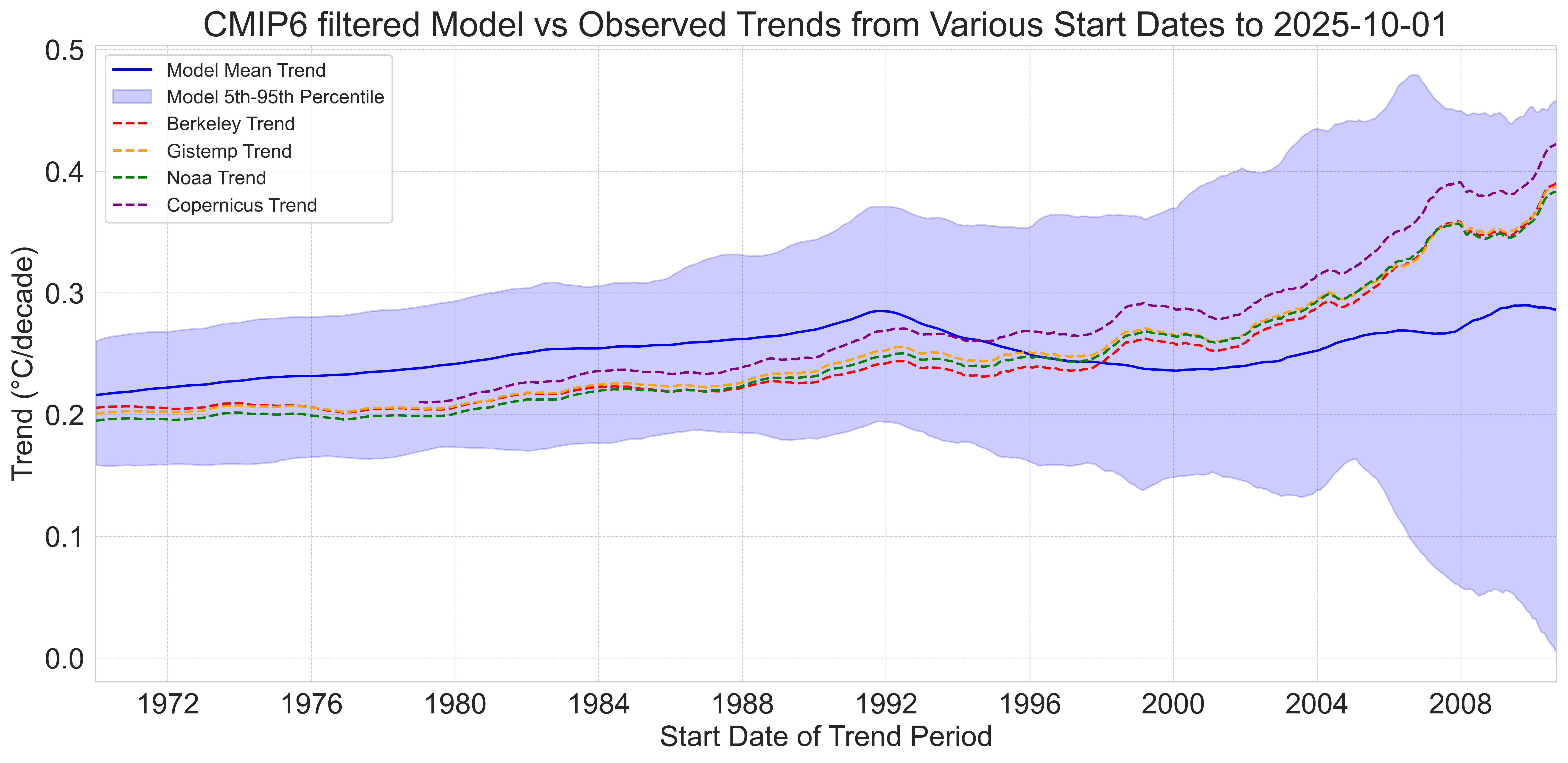
Finally, the TCR-filtered subset of CMIP6 models is much more similar to the CMIP5 ensemble in terms of warming since 1970, but observed warming trends remain inside the model envelope in more recent years.
Recent high global temperatures (and trends) have raised questions about whether the “hot models” in CMIP6 may have been right after all, and that warming is indeed occurring faster than some climate models projected. I personally think the jury is still very much out on this question; if the observed warming rate of ~0.4C per decade over the past 15 years is driven in part by internal variability, it may not be representative of what we would expect to see in the future.
If the human-driven warming rate is currently around 0.27C per decade – as we suggested in the recent Forster et al 2025 paper – than it would be more in-line with the filtered CMIP6 models than the full CMIP6 ensemble. We will have to wait a few more years to know how much of the recent rate of warming is here to stay.
This does not address the sensitivity to trend end point, but I think present is a reasonably unbiased choice in most cases given that we are consistently using it. That said, some folks like Nick Stokes have experimented with even more clever – and inscrutable – ways to visualize trends over all possible start and end dates: https://moyhu.blogspot.com/p/temperature-trend-viewer.html
Thanks Zeke. Two comments.
1. We know there is considerable short term weather and even climate noise in GMST and this can be removed by at least minimal filtering.
2. But we also know a far better metric is ocean heat content (OHC), and comparing models and obs, at least after 1958, would be more revealing. Values are not viable before IGY (1958) and error bars are certainly greater in earlier years, but also not muich was going on then.
For the record and contrary to several threads and comments, there’s no evidence that changes in Earth’s magnetic field have any measurable effect on climate or ECS.
1. Magnetic field strength has varied enormously over Earth’s history — including full reversals — without producing climate shifts.
2. The magnetic field does not regulate solar energy input, and ECS depends on radiative forcing, which magnetism cannot influence.
3. Cosmic-ray changes from magnetic variations are tiny compared to greenhouse forcing and too small to affect climate.
4. The observed pattern of warming matches greenhouse physics — not magnetic trends.
5. If the magnetic field had a large impact on ECS, past reversals would show huge climate anomalies, but they don’t.