
The great acceleration debate
Why the consilience of evidence points toward acceleration

The publication of an article titled “The World Is Warming Up. And It’s Happening Faster” by the New York Times kicked off a pretty heated debate among climate scientists over the evidence of acceleration and how strong a claim can be made based on the evidence today.
The NYT included the illustrative figure below, which draws simple ordinary least squares trends over three time periods: 1880-1970, 1970-2010, and 2010-present (May 2025). It appears to show a notable acceleration over the past 15 years compared to the rate of warming that characterized the post-1970 “modern warm period” when climate change began to notably take off alongside human emissions of CO2 and other greenhouse gases.

However, 15 years is a relatively short period of time; while the timeseries currently ends just after a weak La Nina event, there are concerns that the strong El Nino of 2023/2024 could bias the trend upward. More broadly, there is a lingering spectre of the hiatus haunting these discussions, when the climate science community arguably over-indexed on short term variability to make too much of an apparent slowdown in global warming between 1998 and 2012.
So, is there real evidence of an acceleration, or are we failing to learn from the past and overhyping short-term variability?
As I discuss below, it is my view that this is structurally different from the debate during the hiatus years; not because the evidence is much stronger in the surface temperature record alone (though arguably it is), but because so many other lines of evidence – climate models, ocean heat content, and changes in earth energy imbalance – also suggest an acceleration.
Evidence from surface temperature observations
Lets start by looking at global surface temperature records, and if they suggest any systematic change in warming rate in recent years from the ~0.19C per decade that characterized the post-1970 period.
The figure below shows global mean surface temperature records from Berkeley Earth, as well as the rate of warming between 1970 and 2010 extended forward through present. It also includes the two-sigma range of observations around this trend. This gives us a good sense of where we would expect temperatures to fall if global warming continued unchanged at its post-1970 rate.

Here we see that recent years have been notably above the long-term trend; of the ten years since 2015, only two of them (2021 and 2022) were below the long-term trend . Three years of the past decade – 2016, 2023 and 2024 – were outside the 95th percentile range.
Looking at annual anomalies can be illustrative, but more powerful statistical tests of changes and trends are available to use. One of these – piecewise-linear fits – is used in a new preprint by Stefan Rahmstorf and Grant Foster.
The figure below uses the paper’s approach on the Berkeley Earth data (via Grant’s blog Open Mind), and shows a notable increase in the rate of warming post-2010 compared to the 1970-2010 warming rate.

While this increase in the rate of warming is significant at the 90% confidence level, it falls a bit short of the 95% confidence level usually required to claim statistical significance. That being said, a 90% chance of something happening is still “very likely” in the language conventions of the IPCC.
Rahmstorf and Foster do find much stronger (>95%) statistical significance of trend changes when they remove the effects of short-term variability – El Nino and La Nina events, volcanic eruptions, and changes in the solar cycle. The change in trends on their adjusted data is strongly significant. Its worth noting that this approach had the opposite effect during the hiatus years: removing natural variability made the apparent hiatus largely evaporate, while it strengthens evidence of acceleration.

However, removing the effects of natural variability is a bit more of an art than a science. There are a number of choice in how to assess the magnitude of various factors, account for lags, and other issues that could impact the results.
Another recent paper in Nature Communications Earth & Environment came to a different result. They used changepoint models to try and detect if there was an increase in trends in recent years. While they found strong evidence of a break in trends around 1970, they failed to detect anything more recent in the data.

However, their approach would require an increase in the trend of 85% after 2010 in order to be detectable, and our expectation of the change in the rate of warming is well below that. They also did not include 2024 global temperatures, which may have changed the results a bit.
My view is that surface temperature observations suggest an acceleration over the past two decades relative to the rate of warming experienced since 1970, but are not by themselves fully definitive. Surface temperatures are also an imperfect proxy for the actual warming of the Earth system, as they represent a relatively small sliver (<5%) of the total amount of heat trapped by greenhouse gases and are subject to significant year-to-year natural variability from El Nino / La Nina cycles and other events.
Thankfully, however, we have more than just surface temperatures to help us answer this question. Both climate models (including those updated with the latest radiative forcing estimates) and observations of other parts of the climate system like Earth’s energy imbalance (EEI) and ocean heat content can help us better understand what is happening here.
Evidence and expectations from modeling
Climate models broadly expect a more rapid rate of warming than has characterized the post-1970 period. While future warming rates depend in large part on the choice of future emissions scenario, we see a faster rate of warming in current-policy-type scenarios like SSP2-4.5, as shown in the figure below (you can find more details in my Carbon Brief article on the topic last year):

Here we see that the IPCC’s assessed warming projections (which give less weight to “hot models” in CMIP6) show more warming (~0.24C/decade, with a range of 0.17C to 0.34C) than observations (~0.2C per decade from 1970-2024). The same is true for the full CMIP6 ensemble (~0.29C/decade, with a range of 0.2C to 0.4C) as well as James Hansen’s projections (0.32C/decade, with a range of 0.27C to 0.36C).
This means that under a current policy scenario, we would largely expect a higher rate of warming for observations to be in-line with climate model projections. To put it another way, it would be a bit surprising if we did not see some acceleration.
We can also use simple climate models like FaIR combined with up-to-date radiative forcing estimates to assess how the human contribution to warming has changed over time. This is analogous to the approach taken in the recent Forster et al 2025 paper, which argued that the rate of human-induced warming has increased from ~0.19C post-1970 to 0.27C over the past decade, roughly a 40% increase.

This analysis suggests that human-driven warming rates have been roughly constant at a bit below 0.2C since the 1970s, with a declining contribution of other GHGs (mainly halocarbons phased out after the Montreal protocol) compensating for continued increases in CO2 emissions. However, dramatic cuts in global aerosol emissions – primarily reductions in sulfur dioxide emissions – have reduced aerosol cooling and unmasked additional warming from greenhouse gases. This suggests that the recent increase in the rate of warming is primarily attributable to declines in aerosols.
For more details in how changes in aerosol emissions have impacted the magnitude and rate of warming, see my recent Carbon Brief analysis.
Evidence from other climate observations
So far we have moderately strong but not conclusive evidence from global surface temperatures, as well as evidence from climate models that we should expect an acceleration in warming given whats been happening with aerosols and other climate forcings.
We also have other relevant climate observations we can look at: ocean heat content (OHC) and earth’s energy imbalance (EEI). Both of these provide a more comprehensive (albeit shorter) view of changes to the climate system. EEI directly measures how much heat is being trapped, while ocean heat content measures where the vast majority of the heat (>90%) is accumulating.
The figure below shows ocean heat content from the Chinese Institute for Atmospheric Physics. Unlike surface temperatures, its measured in zettajoules (ZJ – billion trillion joules), as the actual temperature changes of the ocean vary dramatically with depth.
The figure below shows the annual OHC values and uncertainty in the top plot, and the rate of change in the bottom plot. A 10-year lowess smoother is used to remove year-to-year variability and isolate longer-term changes.
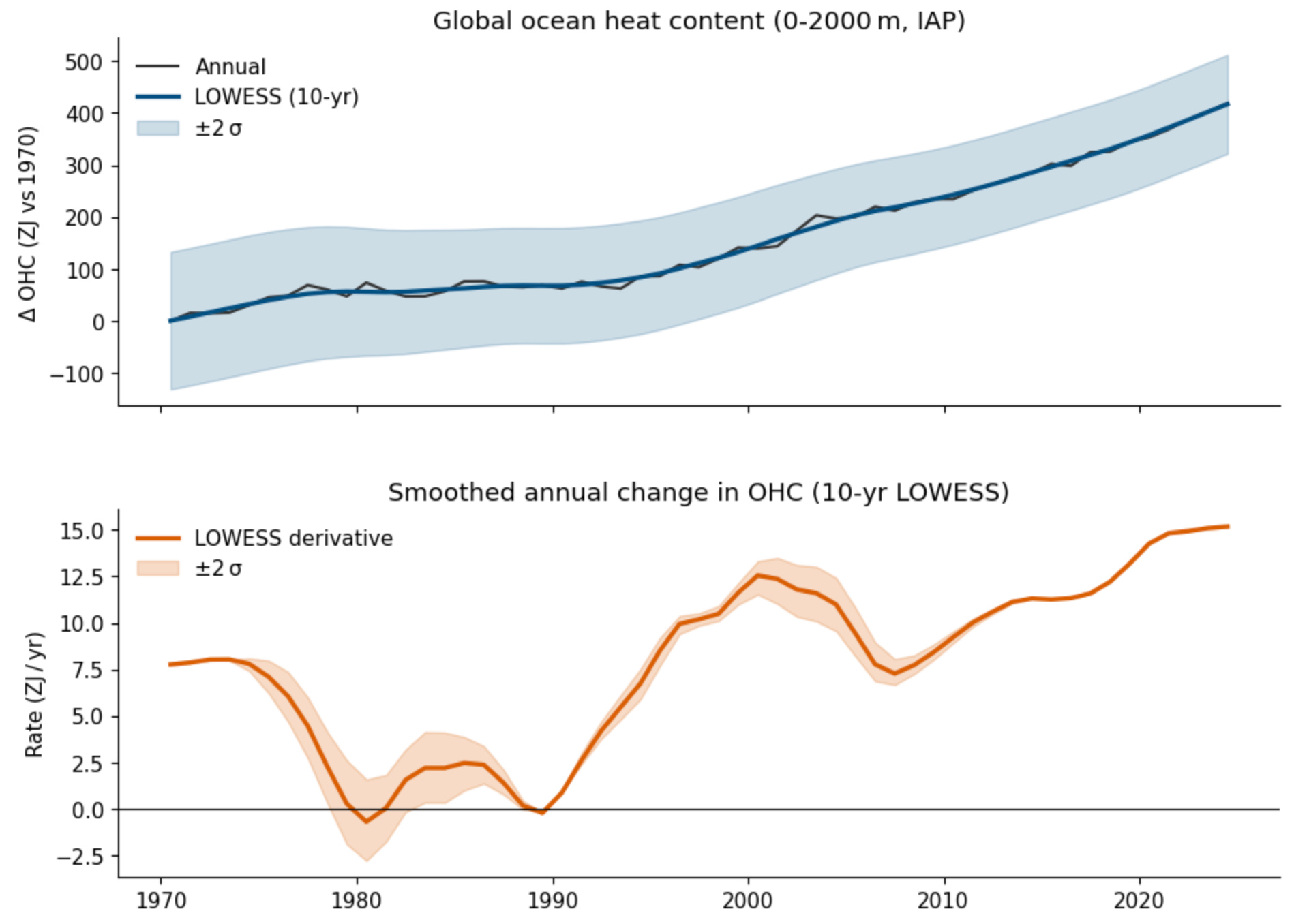
Unlike surface temperatures, ocean heat content increases pretty monotonically, with nearly every year setting a new record. There is also evidence of acceleration in recent years, with the period from 2020 onward seeing the largest year-to-year increases in ocean heat content on record. While the rate of OHC increase was also high around the year 2000 (~12 ZJ / year), its about 25% higher (~15 ZJ / year) today.
Earth energy imbalance has also increased sharply in recent years, with a trend of around 0.45 w/m^2 per decade. EEI as a metric is analogous to the rate of change in the system; a constant positive EEI should be associated with a constant rate of warming of the climate system, while any increase in EEI should be reflected in an increase in the rate of warming.
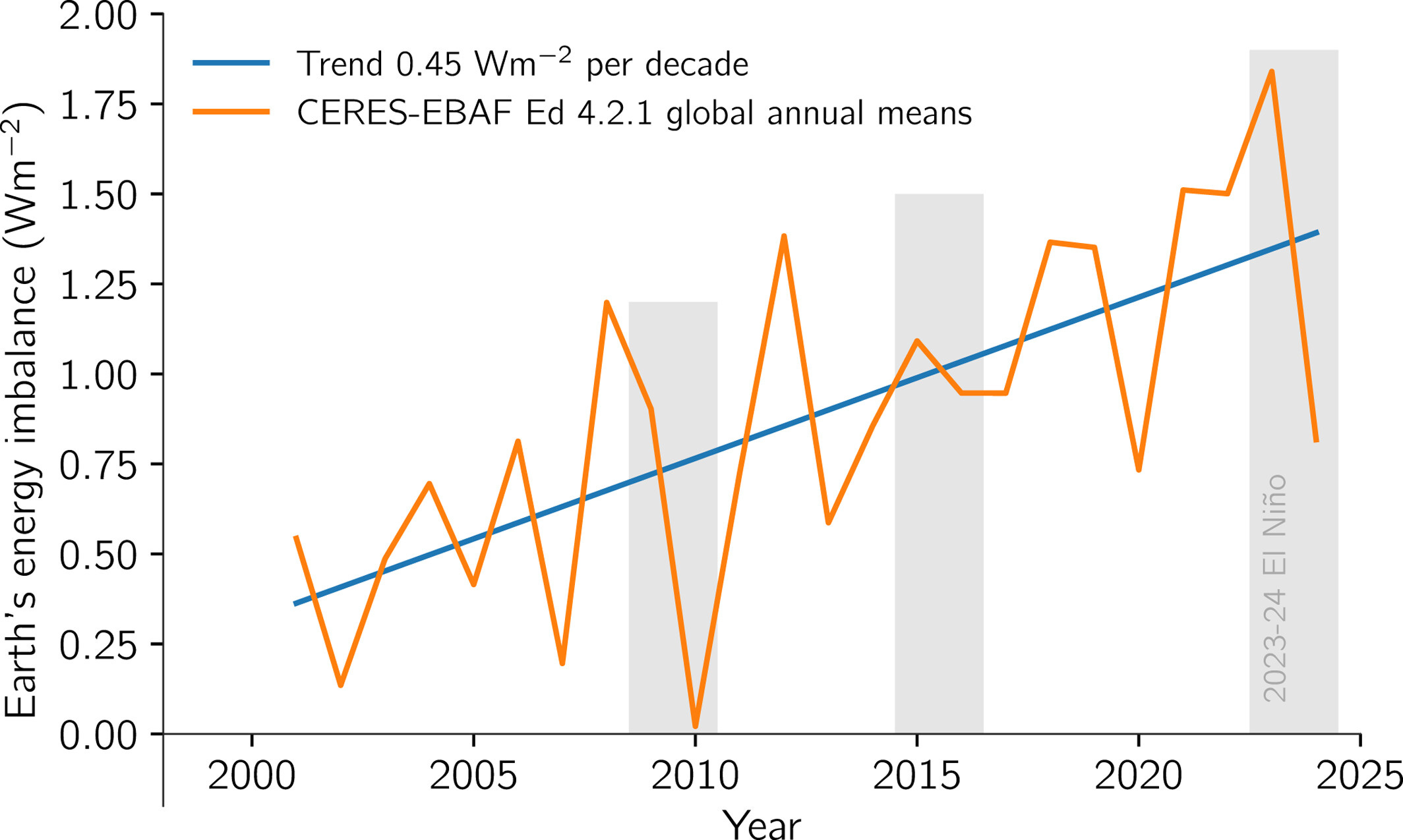
A recent paper by Dr. Chris Merchant and colleagues also makes the case for a detectable acceleration by combining measures of EEI with surface temperature observations.
The increase in EEI also appears to be substantially faster than expected in most climate models. Though it is worth noting that there are some disagreements between the magnitude of EEI changes and the observed increases in OHCs (the two should nominally agree as >90% of the additional heat trapped is being absorbed by the oceans), which suggests that potential uncertainties in measurements of EEI should not be discounted.
Consilience of evidence
If we were solely relying on drawing trend lines through cherry-picked periods in surface temperature records, I too would be pretty skeptical about making strong claims regarding a recent acceleration in warming.
But we don’t just have surface temperatures:
Acceleration in surface temperatures is more readily apparent and significant when removing natural variability.
Our climate models expect a faster rate of warming under current policy scenarios.
We have a clear mechanism in declining aerosol emissions to explain a recent acceleration.
Acceleration is apparent in both ocean heat content and earth energy imbalance measurements.
In my view this consilience of evidence tips the scale toward pretty clear acceleration in recent years. I hope I am wrong – I’d prefer to live in a world where the rate of warming was flat or falling – but the evidence is becoming too strong to ignore.
Appreciate this very much. I saw the NYT article, then saw a famous climate scientist holding forth on Bluesky about his dim view of acceleration. Naturally, I went to Forster's website and read his take. But, I really needed a comprehensive view.
Fitting linear trends is always a very bad thing to do because it emphasizes the end points. Besides, given the changing climate there is no reason at all for anything to be linear. It is reasonable before about 1970 to fit a linear trend, as has been shown many places, but then acceleration upwards is mandatory. The question should be has it stopped? Indeed, once again water vapor feedback is ignored. It can only kick in as temperatures rise and an assessment indicates the net forcing matches or even exceeds that of CO2 increases since 1970. But it is a feedback, one of many. Ice-albedo feedback is another obvious one. That will cease when all the ice is gone!
There are indeed issues with EEI. The last points are very ordinary, highlighting variability. And the first 3 years are too low as that was when there was only one satellite. So the trend is slightly inflated. In any case it is caused mostly by changes in atmospheric and ocean circulation as the tropics (down branch Hadley) get wider and storm tracks and the jet streams over the oceans move polewards.