

On the morning of August 26th, part of a glacier cliff on the north face of Langtang Lirung (a ~7,200 meter peak 60 km north of Kathmandu) collapsed. The falling mass of ice and rock released energy equivalent to a magnitude 5.2 earthquake according to the USGS, and set off a debris flow that traveled ~100 km down into the Trishuli and Bhote Koshi rivers. This buried and washed away large parts of towns, severed the only highway between Nepal and China, and damaged at least six hydropower facilities. Currently (the morning of August 28th), reports put the death toll at around 500, with roughly 2,000 people still missing across Nepal and Tibet, and we expect these numbers to continue to rise.
The tragedy is unfortunately familiar for the Langtang valley. In 2015, shaking from a magnitude 7.8 earthquake released an avalanche of ice and rock from this same mountain that buried Langtang village and killed around 300 people. But there is an important difference between the two events: in 2015 an earthquake triggered the collapse. This time there was no tectonic trigger. The mountain simply failed, and the collapse itself produced a seismic event that was initially mistaken for an earthquake.
Within hours, some people on social media were confidently asserting that climate change caused the disaster, while others were just as confidently asserting it had nothing to do with it. In this piece I’ll try and lay out what the data and the scientific literature actually supports.
The short version is this: any formal attribution of this specific collapse to climate change is premature, and single events like this are genuinely hard to attribute even after careful study. At the same time, the collapse happened on a mountain that has warmed rapidly for decades, immediately after four consecutive summers that all rank among the five warmest in at least 86 years, and in a valley that has been losing ice at an accelerating rate. A rapidly warming climate and retreating glaciers are increasing risks of these sorts of events in the region, whether or not we can ultimately attribute this particular event.
A rapidly warming mountain
Let’s take a look at how temperatures have changed in the region where the glacier collapsed. The figure below shows ERA5 surface air temperatures for the ~25 km grid cell containing the glacier, both for monthly anomalies since 1940 and the summer (June–August) average for each year.1
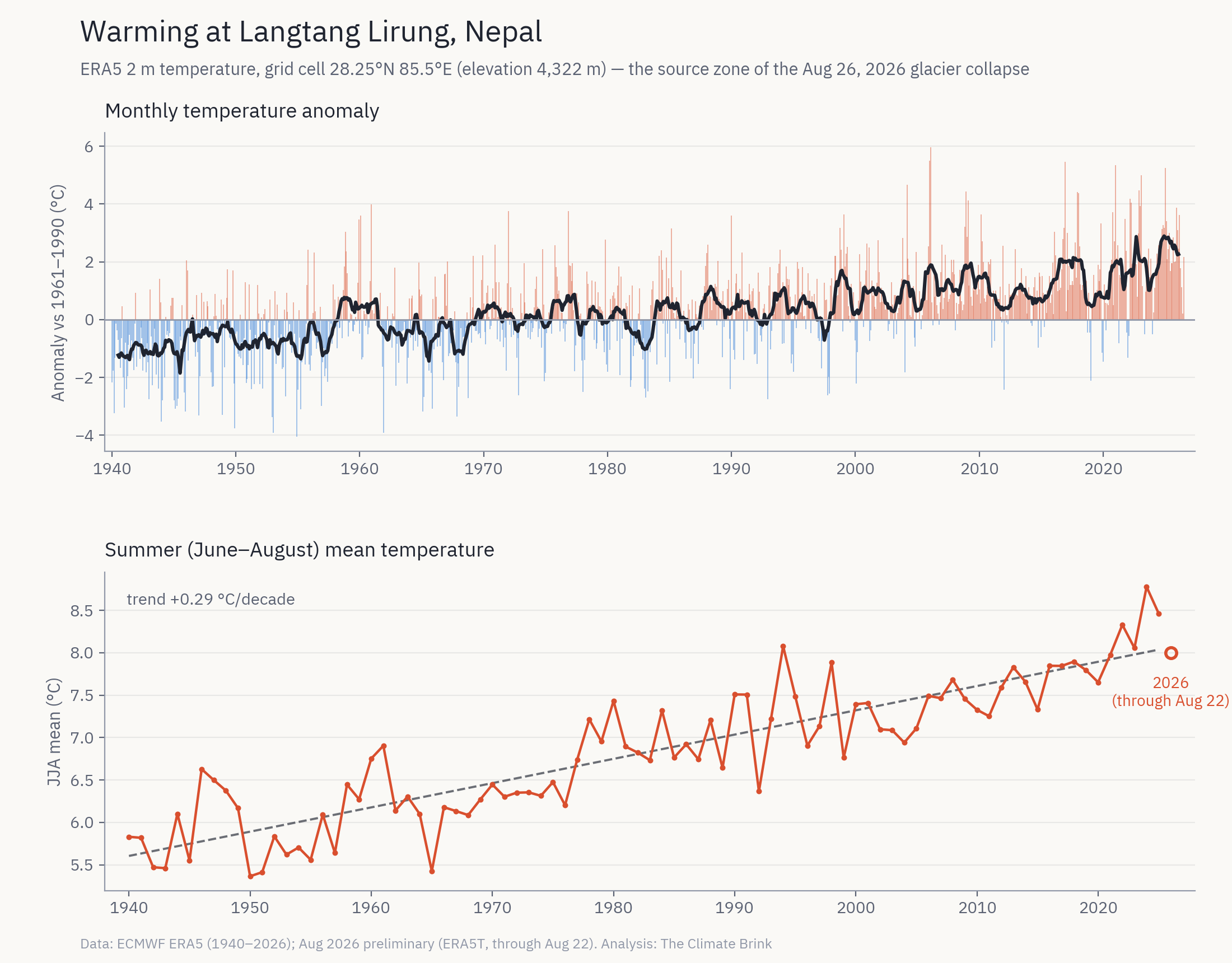
Summers at the site have warmed at around 0.29C per decade since 1940, with the most recent 30 years (1996-2025) averaging about 1C warmer than the 1961-1990 baseline. The four most recent summers (2022 through 2025) all rank among the five warmest on record. A newly published study of the Langtang Catchment (Silwal et al 2026) also provides a separate check on my numbers. Using the higher-resolution ERA5-Land product, they find the glacial areas of the catchment (above 4000 m) warmed at 0.31C per decade over 1960-2023.
The glacial collapse came at the end of an exceptionally warm monsoon season. July 2026 was the second warmest July in the 86-year record (at 9.4C, behind only 2024’s 9.8C). The first three weeks of August (the latest daily data available when I ran this analysis) averaged 9.3C, running above the warmest complete August on record (9.1C in 2022). The collapse came on August 26th.2
Warm summers do not by themselves knock a mountain down. But sustained warmth at a glacial cliff increases risks by melting the ice that buttresses steep slopes, sending meltwater into cracks in the rock, and degrading the permafrost that acts as a frozen glue holding fractured high-altitude rock faces together (Gruber and Haeberli 2007). As the glaciologist Jakob Steiner told Scientific American, “you basically had the lower part of a glacier tongue that sheared off because the rock below failed.”
A valley losing its ice
Next let’s look at whats been happening to the region’s glaciers. The figure below shows glacier mass balance for the surrounding region (the Randolph Glacier Inventory’s South Asia East region, which spans the Himalaya east of ~81E, including Nepal) from the WGMS annual mass change estimates, along with in-situ measurements from two Nepali glaciers where long term measurements are available. This includes Yala Glacier in the Langtang valley itself, around 10 km from the collapse site.
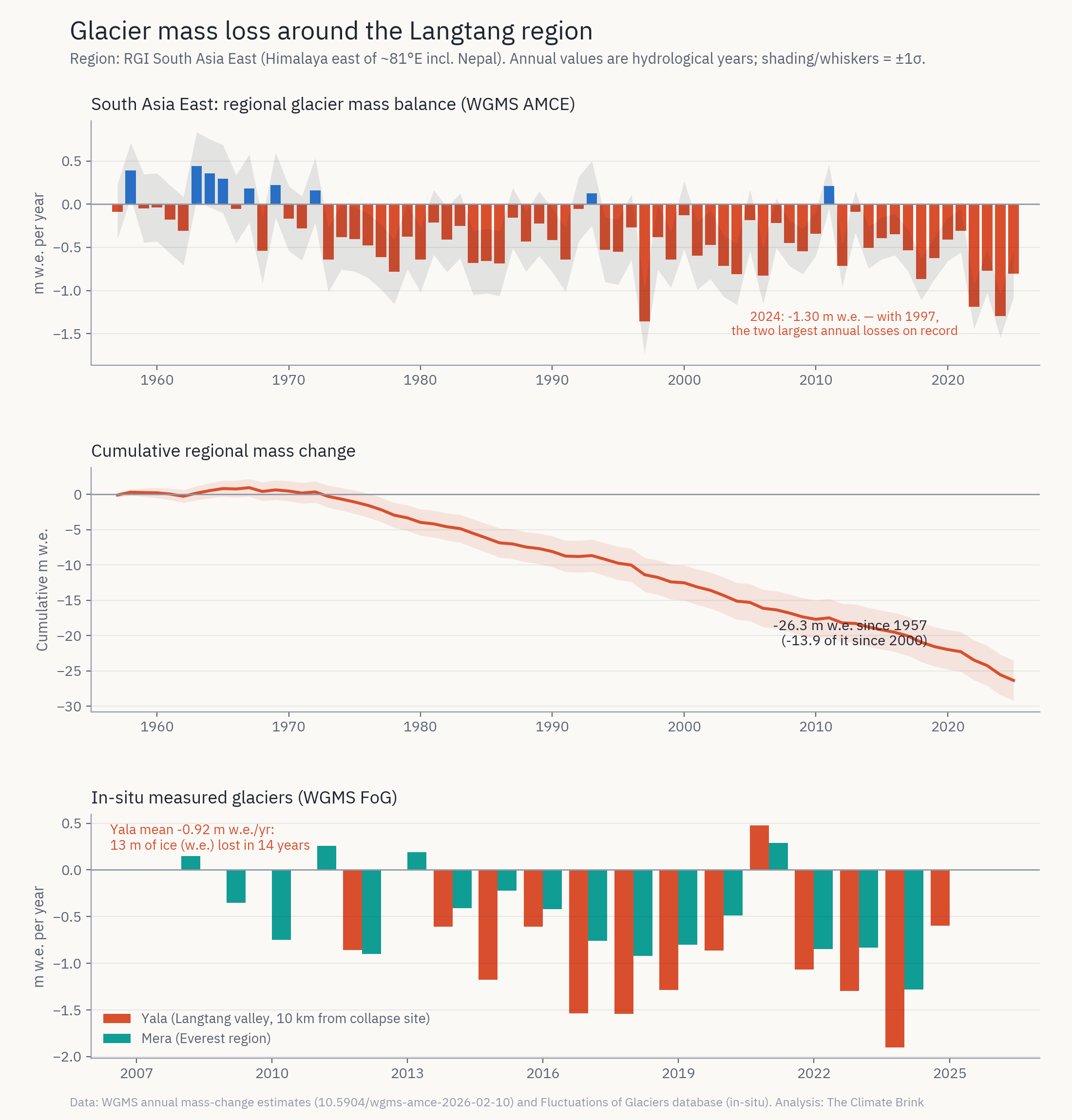
Regional glaciers have lost a cumulative 26 meters of water equivalent since 1957 – equivalent to shaving roughly 30 meters of ice thickness off the average glacier surface. More than half of that loss (about 14 m w.e.) has occurred since the year 2000, with 2024 and 1997 as the two biggest loss years on record. Yala Glacier, the closest measured glacier to the collapse site, lost an average of 0.92 m w.e. per year over 2012–2025, with its worst year (-1.90 m w.e.) in 2024.3
Yala has become something of a symbol of Himalayan ice loss: this past May, ICIMOD and local communities held a tribute ceremony at the glacier, which has shrunk by 66% and retreated 784 meters since it was first surveyed in the 1970s. In their new paper, Silwal and colleagues find Yala’s equilibrium line (the altitude above which a glacier gains mass) has risen roughly 200–250 m since the 1980s and now sits above 5600 m. This is above the top of the glacier itself, meaning the entire glacier now sits in the melt zone.
Studies of the Langtang catchment specifically have found glacier thinning nearly doubled between 1974-2006 and 2006-2015 Ragettli et al 2016, mirroring the Himalaya-wide doubling of ice loss between 1975-2000 and 2000-2016 found by Maurer et al (2019) and the global acceleration documented by Hugonnet et al (2021).
The Langtang catchment has lost around 42% of its glacier area since the Little Ice Age (~1815, Silwal et al 2026), with the rate of loss more than quadrupling from 0.11% per year over 1815-1964 to 0.49% per year over 1964-2023, and the fastest loss coming after 2000. The number of glaciers nearly doubled (58 to 115) over that period as retreating glaciers have fragmented and disconnected into pieces.
The cause of this ice loss is clear. The IPCC’s Sixth Assessment Report concluded that “human influence is very likely the main driver of the global retreat of glaciers since the 1990s.” When researchers have done formal attribution studies of individual glacier hazards (e.g. Stuart-Smith et al (2021) on the glacial lake threatening Huaraz, Peru), they have found glacier retreat that is “virtually certain” to be outside natural variability.
Why attribution of the collapse itself is premature
So why not simply connect the dots, and say that a warming mountain, retreating glaciers, and a record-warm August led to the collapse? The challenge is that the chain of causation for rock-ice avalanches is much messier than for glacier retreat, and the scientific literature on these events is consistently, and appropriately, cautious.
The Himalayan mountains have always shed ice and rock, as skeptics of any climate link will point out. The 2015 Langtang avalanche in the region was caused by a magnitude 7.8 earthquake rather than a string of warm summers. Steep glaciated faces fail for reasons of geometry, geology, and bad luck that have nothing to do with human emissions. Attribution of a specific collapse requires detailed forensic reconstructions on specific drivers before causes can be known with any certainty, and that work will take months to years.
The best precedent here is the February 2021 Chamoli disaster in the Indian Himalaya, where a rock-ice avalanche killed more than 200 people. The definitive study of that event (Shugar et al 2021 in Science) reconstructed the failure in detail but stopped short of attributing it to climate change, while noting that warming increases the probability of such events. Studies of other large glacier collapses, like the 2016 twin glacier detachments in Tibet (Kääb et al 2018), reach similarly hedged conclusions. A 2021 survey found an apparent increase in large glacier-related landslides in High Mountain Asia over 1998–2018, but its authors flagged the small sample size and cautioned that the association with warming “requires further research.” We simply do not have the kind of long, well-observed event record for high-mountain collapses that we have for heatwaves or heavy rainfall, where rapid attribution is now routine.
There is a related argument I’ve seen circulating online that events like this happened long before modern warming, and if anything a world with more glaciers should have more ice available to fall. The first part is clearly true. The largest ice avalanche ever observed in the Alps came off the Altels glacier in 1895 (around 4 million cubic meters), and a 1962 rock-ice avalanche from Huascarán in Peru killed around 4,000 people with no apparent trigger at all. Mountains were shedding ice catastrophically well before we started burning fossil fuels in earnest. But the existence of old events tells us nothing about whether the odds are changing, and heat waves happened in 1900 too (just less frequently). It is worth noting that the the best modern reanalysis of the Altels collapse, Faillettaz et al 2011, suspects hot summers in the preceding years warmed the glacier’s frozen bed toward the melting point.
Hazard from these slopes are not solely determined by how much ice sits on them. Rather, what drives risks is how fast the ice and the frozen ground beneath the ice are changing. A cold glacier frozen to its bed in a stable climate will be comparatively secure, but one in transition will be more at risk. Thinning glaciers withdraw support from the steep rock faces they once buttressed (called the “paraglacial response”, Ballantyne 2002), meltwater reaches previously dry failure planes, and warming permafrost loses the ice cement that held fractured rock together.
Its also worth listening to what experts have been saying about the event. Kristen Cook of Grenoble Alpes University told Scientific American that “it’s difficult to conclusively link a single event directly to climate change. We know it’s getting warmer in the Himalaya.” Dan Shugar, who led the Chamoli study, was cautious on this event’s specific cause while noting he is “100 percent” certain climate change will make such events more likely, “by some combination of glacier melt, permafrost thaw, and changes to precipitation and temperature patterns.”
Confident claims that climate change caused this disaster are getting ahead of the evidence. But at the same time, confident claims that it played no role ignore the rapid changes that we’ve observed in the area around where the mountain failed.
What are the takeaways here?
This is a humanitarian catastrophe, and the immediate causes of the enormous death toll include things like villages and infrastructure concentrated along narrow river corridors, a debris flow that covered 100 km, and limited warning systems that have little to do with climate change. As with other extreme events, we shouldn’t let debates about attribution distract from the urgent need to reduce vulnerability.
It is clearly premature to attribute the collapse itself to climate change. Given the messy causality of rock-ice avalanches, a definitive single-event attribution may never be possible. We will likely see careful forensic studies to be published over the next year or two (as happened after Chamoli), and I’d treat any confident causal claim made this week (in either direction) with a lot of skepticism.
But the broader context is not in doubt. The collapse happened on a mountain warming at around 0.29C per decade in summer, immediately after four consecutive summers that all rank among the five warmest in an 86-year record, during an August that was running warmer than any complete August on record, in a valley that has lost ice at an accelerating pace, and in a region where human influence is very likely the main driver of glacier retreat.
High Mountain Asia already has more people exposed to glacier flood hazards than anywhere else on Earth, and projections suggest the Hindu Kush Himalaya could lose a large fraction of its remaining ice this century, with losses scaling with emissions (Rounce et al 2023). The ice that holds these mountains together is being lost, and every tenth of a degree of additional warming pushes these systems further outside the conditions in which the region’s settlements, trails, and hydropower plants were built.
So when people ask whether climate change caused the disaster in Nepal, the answer is that we don’t know, and we may never know for this specific event. But if the question is whether a warming climate is making disasters like this one more likely in the Himalayas, the literature and essentially every scientist working on these hazards point in the same direction.
I’ve included a more detailed methods writeup and code to reproduce this analysis on my GitHub here.
A single 0.25° ERA5 grid cell in terrain this steep is an imperfect measure of the temperatures at the glacier itself; the grid cell spans valley floors around 1,400 m to the 7,200 m summit, with a mean elevation of 4,322 m. Early reports put the failure zone above 5,000 m. Absolute temperatures at the failure zone are substantially colder than the cell average, but anomalies and trends should be more consistent across elevations (if anything we’d expect slightly faster warming at higher elevations). ERA5 also has some limitations in the High Mountain Asia region before the satellite era (pre-1979), so I’d put less weight on individual early extremes than on the long-term trend.
For what it’s worth, the partial 2026 summer (8.0C) sits close to the long-term trend line, well below 2024, so the striking 2026 signal is in the July and August values specifically rather than the summer as a whole.
Yala is a small, debris-free, relatively low-elevation glacier that is known to lose mass faster than the regional average, and it is not a direct proxy for the hanging glaciers on Langtang Lirung’s north face. I’m showing it because it is the closest long-running measured glacier to the collapse site.
if you divide ice lost by GDP, the trend disappears. checkmate, alarmist.
Ket me be a bit clearer: we need a different null hypothesis:
see
Trenberth, K. E., J. T. Fasullo, and T. G. Shepherd, 2015: Attribution of climate extreme events. Nat. Clim. Change, 5, 725-730 doi: 10.1038/NCLIMATE2657, [PDF]
not sure the link works:
https://staff.cgd.ucar.edu/trenbert/trenberth.pdf/2015_TFS_nclimate2657-2015_attribution.pdf