

Earlier this summer I told a journalist that it was not beyond the realm of possibility that this year’s El Niño would end up the strongest in 500 or even 1,000 years. That was a strong claim at the time, and I’ve had a few people ask how I could possibly know what El Niño was doing in the year 1200. It is a fair question, and the answer is that we know more than you might think.
This year’s El Niño event is already the strongest in the instrumental record based on Niño 3.4 region sea surface temperature anomalies. I’ve written in more detail about this year’s forecast here, and breaking the prior record over at Carbon Brief.
Daily Niño 3.4 anomalies passed the prior record (set in November 2015) on September 20th, and reached 3.4C as of this week. September as a whole had the highest Niño 3.4 temperature anomalies on record. And this year’s El Niño still has a few more months to grow; the latest runs in (from 14 seasonal forecast models) show this year’s El Niño peaking around 4C (with 80% of model runs ending up somewhere between 3.3C and 4.6C).
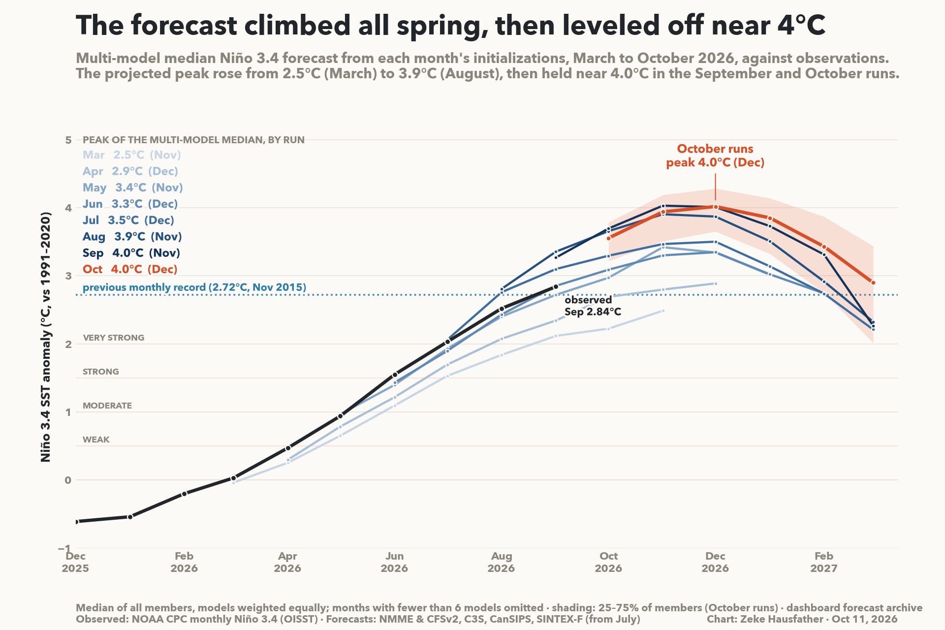
That being said, while the models underestimated the magnitude of the event earlier in the year, they have overestimated it over the past two months. However, with the first week of October already above 3C, the October forecast of 3.6C doesn’t seem outside the realm of possibility. But there remains a wide range of possible outcomes for this event across different modeling groups and ensemble members.
How far back can we look?
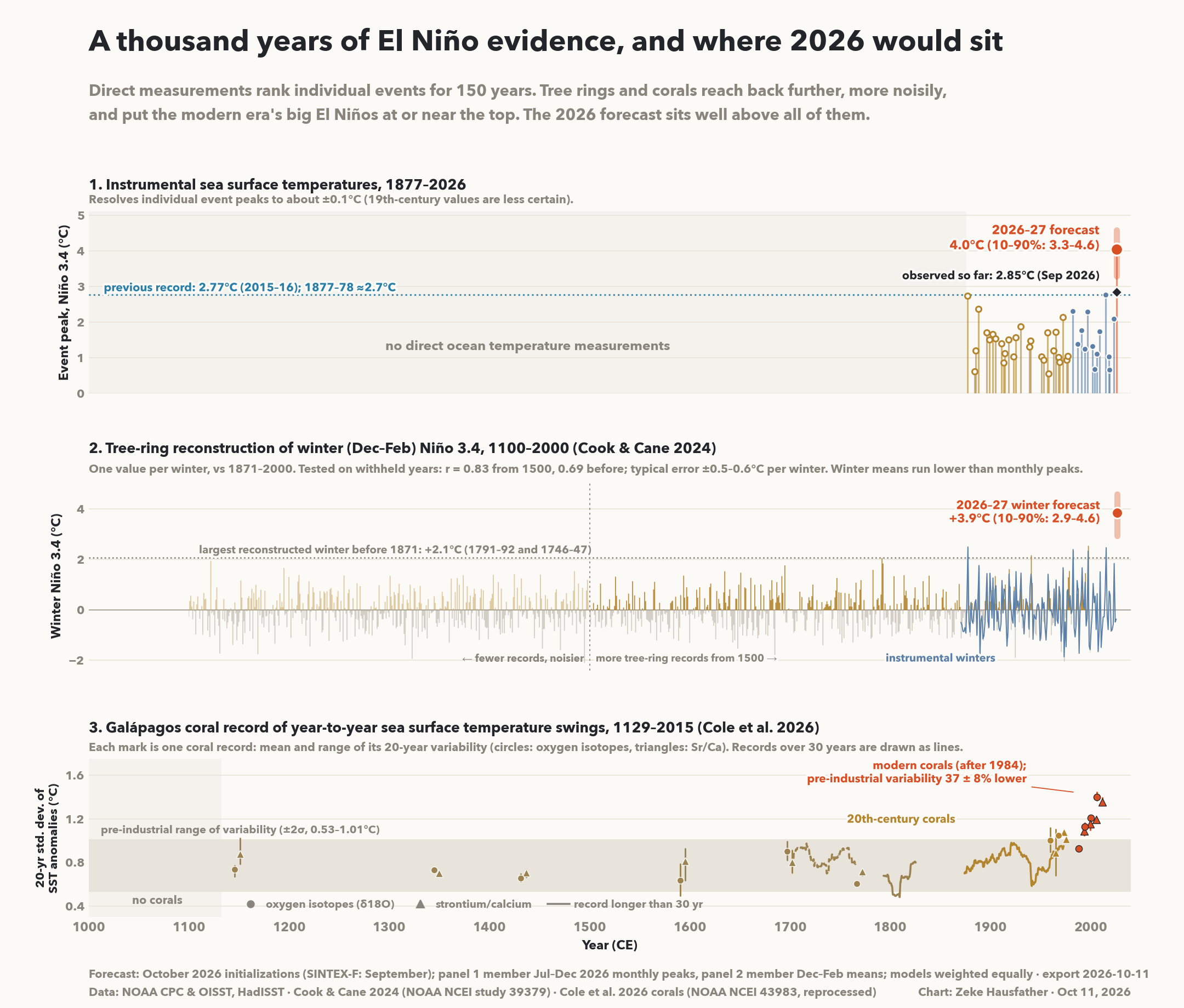
The figure below looks at three different lines of evidence for historical El Niño strength. The top panel shows the thermometer record, where this event has already set a record for events since 1877 and is forecast to smash it. The two lower panels show different lines of evidence from tree rings and corals as to what happened during the millennium before.
Before 1877 there are also written records to draw from. Quinn et al. (1987) compiled El Niño occurrences off Peru back to 1525 from ship logs, mission records and chronicles, and Gergis and Fowler (2008) combined these with tree ring, coral and ice core records into an event chronology back to the same year. Five of the nine events in their most extreme tier are from the 20th century.
But these chronologies sort events into coarse classes and miss a lot (they rate the 1997-98 event as only “weak”, for example), so are only modest evidence for how a 4C event this year would rank. The two records shown in the figure above, from tree rings and coral, reach back to the 1100s and can give us a more solid estimate of how this year’s event will stack up.
Tree rings back to 1100
Cook and Cane (2024) (middle panel of the figure above) used 544 tree-ring chronologies from places whose rainfall responds to El Niño to reconstruct winter (December to February) sea surface temperatures across the equatorial Pacific. However, only 81 of those chronologies reach all the way back to 1100s. If we look at the data since 1500 (when more tree rings are available), it tracks observed winter Niño 3.4 reasonably well, with a typical error of about 0.5C in any one winter. The one starting in 1100 is noisier, with a typical error of about 0.6C.
The largest winter either version reconstructs before 1871 is 2.1C (1746-47 in one, 1791-92 in the other), and the largest before 1500 is 2.0C (1121-22). The biggest instrumental winters (1877-78, 1982-83, 1997-98 and 2015-16) all come in between 2.3C and 2.5C on the same measure. The forecast for the coming winter is 3.9C (with 80% of model members between 2.9C and 4.6C).1
To account for the uncertainty in the tree ring dataset, I simulated the range of true values each winter before 1871 could have had, given how far off the reconstruction was in the years it was tested on.2 If models of this year’s El Niño prove accurate, the chance that this winter beats every winter since 1100 is between 91% and 95% on the standard Niño 3.4 index. On NOAA’s relative index (RONI), which subtracts the warming of the wider tropics, it falls to between 60% and 72%. Over the past 500 years, where the reconstruction is better, the odds rise to between 94% and 98% and between 69% and 85% for ONI and RONI, respectively. Cook and Cane similarly note that “The positive excursions (i.e., El Niño events) in recent decades are generally higher than at any time since 1100.”
What the corals say
The second long record came out in August of this year, when Julia Cole and colleagues published a study in Science using 28 coral records from five islands in the Galápagos. The Galápagos sit in the eastern Pacific, where El Niño events (including this year’s) are centered. Corals lay down annual bands whose chemistry tracks the temperature of the water they grew in, so a fossil coral can be used as a rough thermometer for whatever decades it was alive. The oldest of these corals grew around 1130, and together they sample about half the years of the past millennium.
Corals cannot tell you the peak of a single El Niño as reliably as a thermometer (or a tree ring) can. What they measure well is how much the sea surface temperature swung from year to year over a 20-year window. Through 1850, the year-to-year swings stay inside a relatively narrow band. They begin to rise in the late 19th century, and the corals that grew after 1984 sit mostly above the pre-industrial range. Cole and colleagues find that variability before 1850 was about 37% lower than in recent decades.3 They find the increase comes from stronger El Niño events rather than stronger La Niñas.
They also tested whether natural factors alone could produce a jump this large, using last-millennium simulations from 12 climate models driven only by volcanoes, the sun and changes in Earth’s orbit (as well as control runs with no changes). They find that the increase in variability in the modern era come close to 1-in-100 odds in climate model control runs. Other proxy work finds similar results, including studies of central Pacific corals (Grothe et al., 2020) and an earlier tree-ring reconstruction covering seven centuries (Li et al., 2013).
Putting the two records together
The tree rings and the corals are about as independent as two paleoclimate records can be. One reads El Niño’s effect on rainfall over land through tree growth, and the other reads ocean temperature directly in the eastern Pacific. They agree that the El Niños of recent decades are at or near the top of everything since the 1100s, and the 2026 forecast sits more than a degree above those recent events.
However, climate proxies are necessarily imperfect thermometers, and both types have real limits. Tree rings underestimated the 1877-78 El Niño event and come with uncertainties of more than 0.5C before 1500 (though I account for this uncertainty in my calculation of the odds!). The corals record variability over decades rather than the peak of any one event, they measure local Galápagos temperature rather than the Niño 3.4 index, and the gaps between them leave about half the years unsampled.
Even taking all those limitations into account, I think that this year’s El Niño event is likely to be the strongest in 1,000 years if the latest models of its peak prove accurate. The tree rings alone give it 91% to 95% odds on the standard index (ONI) and 60% to 72% using RONI. The coral records already show that the modern era stands outside the natural range of eastern Pacific variability, and this year will be an unambiguous record in the modern era.
As always, for daily updates on the El Niño forecast and global temperatures head over to our Climate Dashboard.
These numbers reflect the same winter averages used by the tree ring proxies, and are lower than the peak monthly estimates for the event as they reflect a three-month average.
To do this, I fit observed winter Niño 3.4 against the reconstruction over the withheld years 1871-1929 (a slope of 0.92 and residual error of 0.49C for the version from 1500, 0.75 and 0.64C for the version from 1100), resampled those years to capture uncertainty in the fit, generated plausible true values for every winter before 1871. I repeated this analysis 20,000 times, and took the largest each time.
Cole and colleagues measure the change relative to recent decades, so their percentage describes how much weaker pre-industrial variability was. When measured against the pre-industrial, they find that recent variability is roughly 60% higher.
Great stuff Zeke, as always. Thank you
Excellent, easy to read analysis.