

The 2026-27 El Niño is on track to be the strongest event in the instrumental record. The latest (September 2026) runs of the 14 seasonal forecast models that I track over at the Climate Dashboard put the event’s peak at around 4.1C in the Niño 3.4 region (with the middle 80% of ensemble members between 3.4C and 4.6C), well above the prior record of 2.75C during the 2015-16 El Niño.1
I’ve previously written about how unprecedenteted this event will be. The question I get asked most often now is a more practical one: what does it actually mean for the weather where I live?
I recently published a piece in Nature on the impacts of El Niño and what countries should do to prepare. But I can only fit so much in a short journal article, and there is vast scientific literature on regional El Niño impacts that has accumulated over the past few decades.
This post walks presents a map of higher-confidence El Niño impacts, with an in-depth discussion of each different region. Some of the canonical El Niño impacts show up in nearly every strong event on record, while others turn out to be closer to a coin flip when looking at the record of past events.
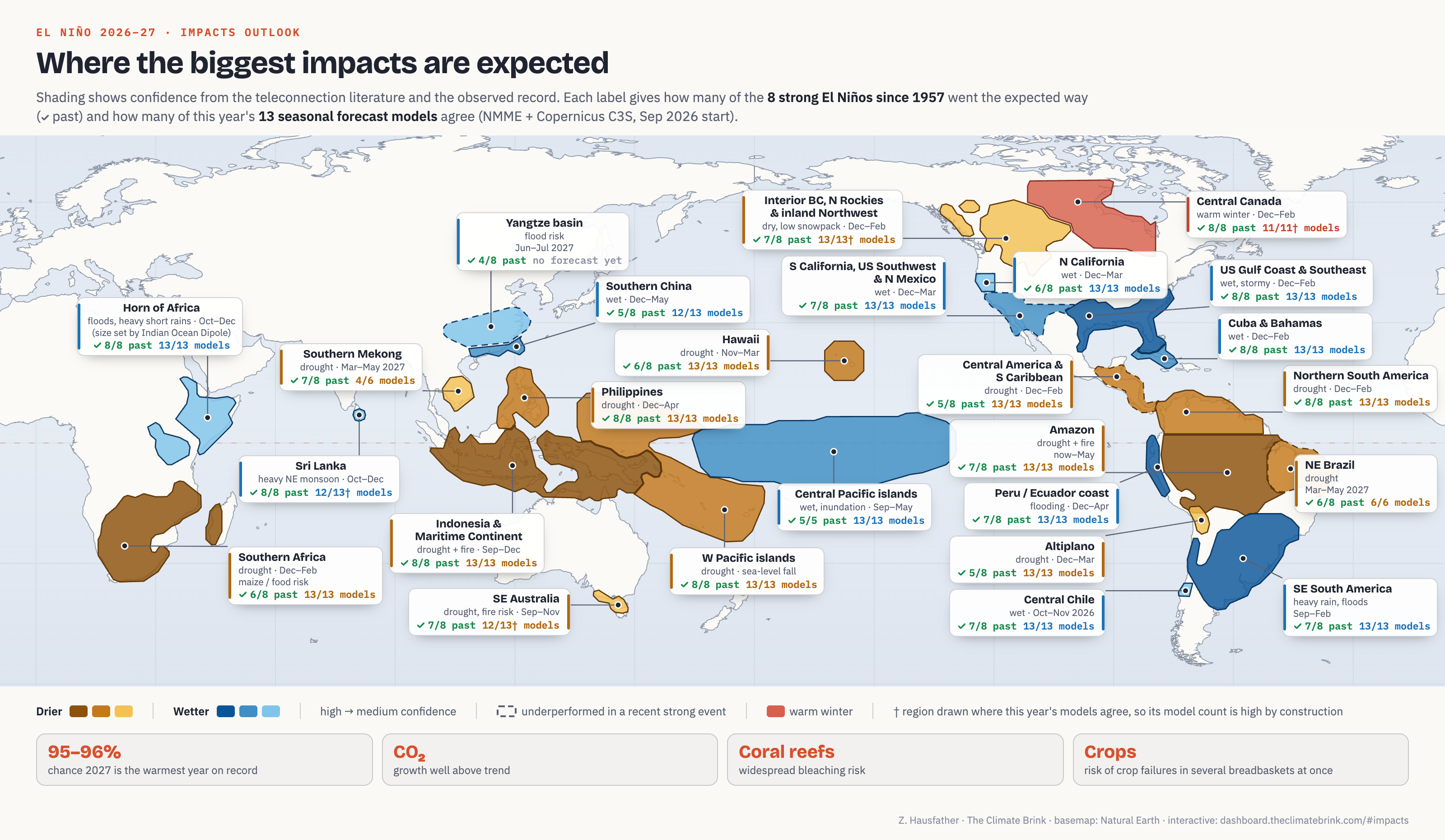
If you want to dig into a particular region, I’ve put togehter an interactive version of this map over at the Climate Dashboard. Clicking on a region brings up how it fared in each of the eight past strong El Niños, what each of this year’s forecast models shows, and a short summary of the relevant research. You can also replay any past strong event across the whole map, step through the forecast season by season, or click anywhere to see the raw model forecast for that spot. In addition, I’ve put together an animated explainer video below:
Likelihoods but not guarantees
El Niño events shift the odds of different climate outcomes, but not every El Niño has the exact same impacts (Mason and Goddard 2001). As NOAA’s Climate Prediction Center puts it in their current ENSO discussion: “With an event of this magnitude, the chances of experiencing impacts consistent with El Niño are larger, but they are not guaranteed.”
To get at how much the odds shift, I’ve leaned on three separate lines of evidence for each region. The first is the published literature on El Niño teleconnections (the physical pathways by which a warm tropical Pacific changes rainfall and temperature elsewhere). I’ve assessed these with IPCC-style confidence levels like high, medium-high, and medium confidence. You can find links to the individual studies I’ve relied on below, with more details shown over at the Climate Dashboard when clicking on a particular region.
The second is the current generation of dynamical seasonal forecasts: 13 independent modeling systems (six from NOAA’s North American Multi-Model Ensemble and seven from the European Copernicus Climate Change Service), which let us see where the models agree and disagree with the teleconnection literature during this particular event.
The third is the past performance during strong El Niño events. For every region on the map I went back to the eight strong events since 1957 (1957-58, 1965-66, 1972-73, 1982-83, 1997-98, 2009-10, 2015-16 and 2023-24) and checked how often that region was drier or wetter than a typical ENSO-neutral year.2 The figure below shows the results. Each cell is one past event, colored by how dry or wet it was relative to neutral years, with a check mark wherever it landed on the expected side.3
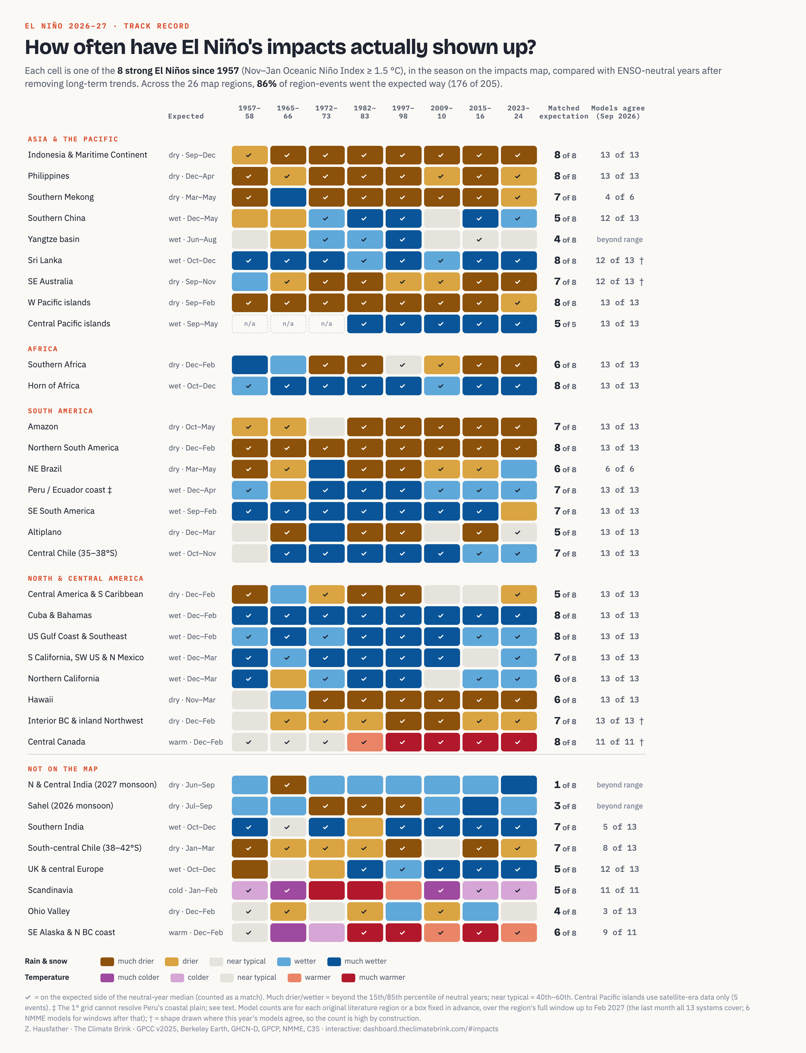
A few things jump out here. Across the 26 regions on the map, 86% of region-events went the expected way (176 of 205). The two biggest east Pacific events, 1982-83 and 1997-98, gave the expected impacts in every single region. The two earliest events delivered in only 68% of regions, which likely reflects both sparser rain gauge networks in the 1950s and 60s and genuine differences between events.
That being said, the teleconnection literature draws in part from these same events, particularly 1982-83 and 1997-98, so these hit rates partly restate the evidence the literature was built on. It’s also worth noting that no past event looks like the one forecast for this winter. All eight of these are “strong” events, and 2026-27 is forecast to be well beyond any of them. In the regions with the most reliable signals that probably means larger impacts. But it also means we are extrapolating well outside the training data here.
Asia, Australia and the Pacific
The western tropical Pacific is where El Niño’s fingerprint is clearest, because it is where the atmosphere’s rising branch of the Walker circulation normally sits. When that rising air shifts east toward the central Pacific, the islands and archipelagos that normally sit under it dry out.
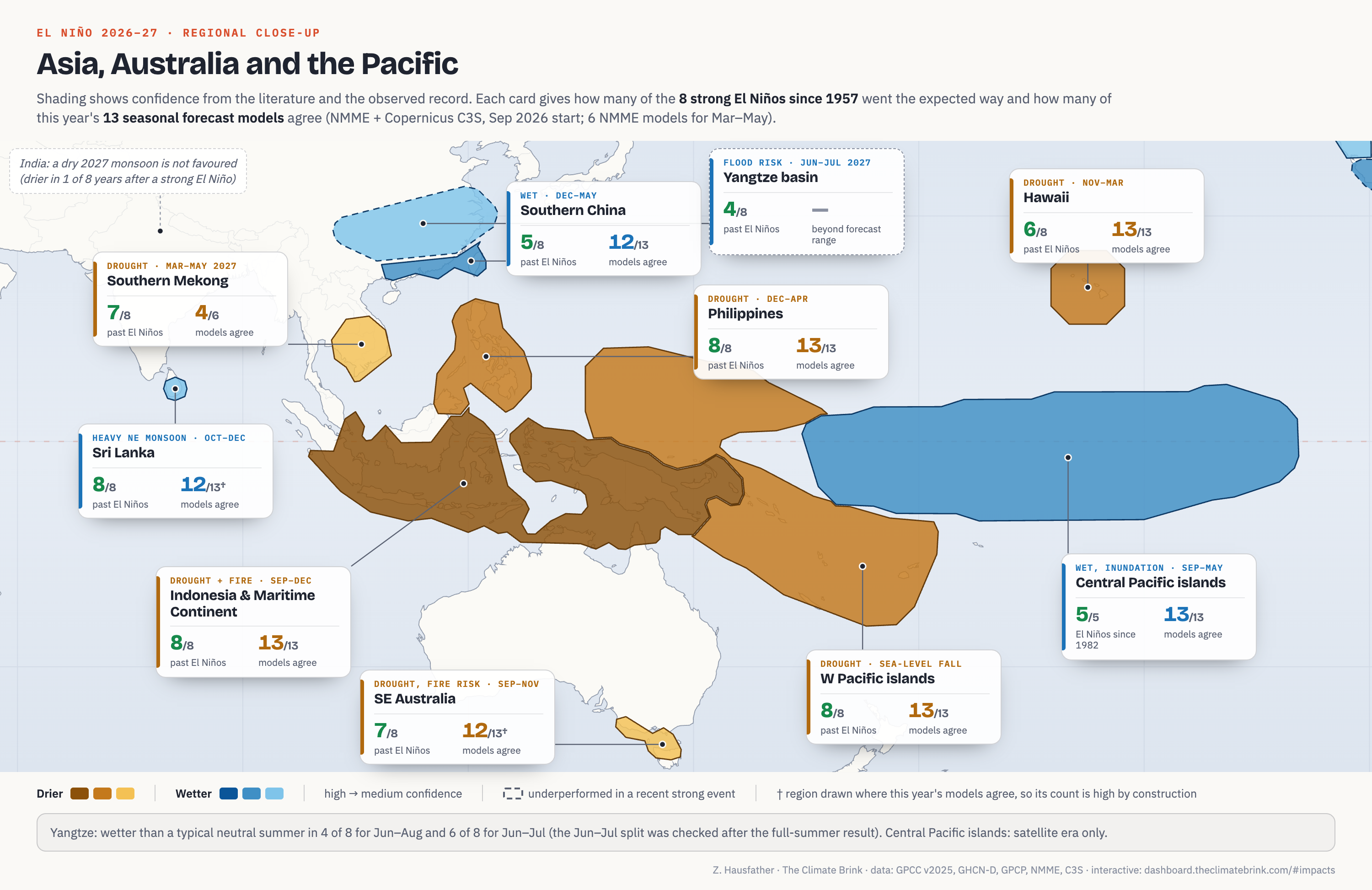
Indonesia and the Maritime Continent are the single most reliable El Niño impact on the planet. September through December was drier than the median neutral year in all eight past strong events, and in six of them it was drier than any neutral year in the record. Past strong events resulted in around 73% of normal rainfall, and all 13 models agree on drought this autumn. The main risk for the region is fire. Burning on drained peatlands responds very nonlinearly to drought, and the fires during the 1997 El Niño released an estimated 3 to 9 billion tonnes of CO2, equivalent to 13% to 40% of global fossil fuel emissions that year. The haze from the 2015 fires has been linked to around 100,300 excess deaths across Indonesia, Malaysia and Singapore.
The Philippines has an equally consistent record, dry from December through April in all eight strong events (with a median of 58% of normal rainfall). This is driven by an anomalous high pressure system that sets up over the western North Pacific during El Niño winters (Lyon and Camargo 2009). Every one of the 13 models shows it this year.
The western Pacific islands, from Palau and Guam through Micronesia, the Solomon Islands, Vanuatu and Fiji, were drier than normal (i.e. than in a typical neutral year) in all eight events. These islands also see sea level drop as the warm water sloshes east, which can expose and kill shallow reef flats (Widlansky et al. 2015).
On the other hand, the central Pacific islands of Kiribati and Tuvalu get deluged. Satellite-era data show September to May rainfall there wetter than in any neutral year in each of the five strong events since 1982, with a median of around double normal.
Southern China tends to be wetter from winter through spring, fed by moisture flowing around the same western Pacific high pressure system. The observed record is weaker than for the Philippines, with 5 of 8 strong events wetter than normal, though the big events were very wet (1982-83 brought around 200% of normal rainfall and 2015-16 164%). The models are in strong agreement (12 of 13) on heavier than normal rainfall this year.
The Yangtze basin is generally expected to experience heavy summer rain in the year after a strong El Niño, when the Indian Ocean warms up and acts as a “capacitor” that sustains the western Pacific high pressure system into summer. That signal was real in 1998, the year of catastrophic Yangtze floods. In June and July, when the East Asian monsoon rain band normally sits over the basin, it was wetter than normal during 6 of 8 past strong events, including all six since 1972. However, next summer is beyond the range of any current seasonal forecast, so no model-based odds are available.
The southern Mekong basin (Cambodia, southern Laos and southern Vietnam) was drier than normal in March to May of the year after the El Niño peak in 7 of 8 strong events, with a median of around 71% of normal rainfall. The teleconnections literature suggests that the ENSO drought signal in mainland Southeast Asia is “most consistent and expressed over the largest areal extents during March-May of the year when the ENSO events decay.” The models show a bit less agreement this year (only 4 of 6 models that extend through May show drying) and the literature notes the relationship varies between events, so it shows up on the map as only medium confidence.
In India, the the textbook example of El Niño is a weaker than normal Indian monsoon. North and central India were drier than normal in all eight years during which strong El Niño events developed, and the 2026 monsoon was running around 12% below normal by mid-August. But that season is already behind us; the monsoon in the year after a strong El Niño was drier than normal in only 1 of 8 cases (1966), with the other seven running between 102% and 115% of normal. Part of this is that strong El Niños often flip into La Niña by the following summer, and part of it is that eastern Pacific events like this one appear less effective at suppressing Indian rainfall in the first place (Kumar et al. 2006). Either way, the data do not support calling for a weak 2027 monsoon.4
Sri Lanka’s northeast monsoon (October to December) was wetter than normal in all eight strong events, with a median of 126% of normal (Zubair and Ropelewski 2006). However, Sri Lanka was also on the wet side in 8 of 12 La Niña years, so the island’s autumn rain is less tied to El Niño specifically than the count might suggests. Southern India shows a similar observed record (7 of 8), but it is not on the map because this year’s models disagree about it (only 5 of 13 show a wet signal).
Southeast Australia (Victoria and Tasmania) was drier than normal between September and November in 7 of 8 strong events, with a median of 81% of normal and a severe 44% in 2015. The El Niño dry signal is concentrated in spring, when it is reinforced by the positive Indian Ocean Dipole that often accompanies El Niño (Cai et al. 2009), and it has a habit of reversing in summer. In 2023-24, national rainfall ran 20% below average in spring before summer came in 19% above average. And for eastern Australia more broadly, this year’s models show little signal at all (only 10 of 13 lean dry, which is not significant). It’s worth noting that the 2019-20 Black Summer fires, often associated with El Niño in the public mind, happened during a record positive Indian Ocean Dipole with only borderline El Niño conditions.
Africa
El Niño’s effects on Africa run through the Indian Ocean. This year a positive Indian Ocean Dipole (warm water off East Africa, cool water off Sumatra) has been developing alongside it. That combination points in opposite directions for the two halves of the continent.
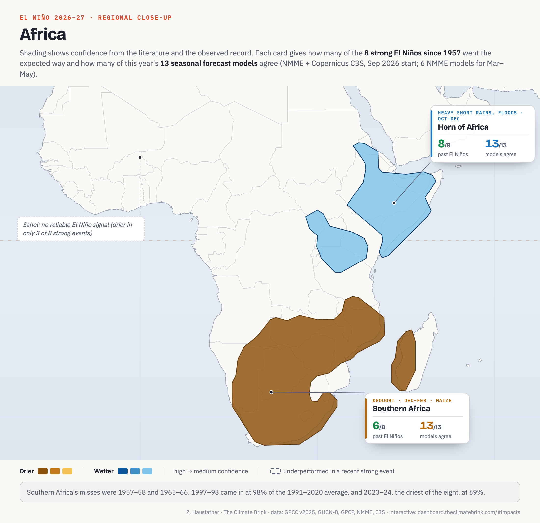
Southern Africa probably the most potentially disasterious impact on the map, because summer rain there feeds the maize crop that tens of millions of people depend on. December to February was drier than normal in 6 of 8 strong events, consistent with Pomposi et al. (2018), who estimate an around 80% chance of below-normal rain in a strong El Niño. The two clear misses were early in the record (1957-58 and 1965-66). The largest recent failure was 1997-98, when the expected regional drought failed to materialize. That has been attributed to regional circulation features (the Angola Low and Botswana High) that vary independently of ENSO, and it isn’t something we can rule out this year. But the most comparable recent case suggests we will see a bigger impact this year: in 2023-24, with an Indian Ocean Dipole almost as strong as 1997’s, southern Africa had the driest season of all eight events (69% of normal), prompting a $5.5 billion regional humanitarian appeal for more than 61 million people. All 13 models show drought this coming summer.
The Horn of Africa (southern Ethiopia, Kenya and Somalia) was wetter than normal between October and December in all eight strong events, with 1997 at 241% of normal and 2023 at 175%. Here the Indian Ocean Dipole matters more than El Niño itself. In model studies the influence of the dipole on the short rains is “overwhelming as compared to that of ENSO,” and World Weather Attribution’s analysis of the catastrophic 2023 floods found “no significant role of ENSO but a significant influence of the IOD.” Because strong eastern Pacific El Niños tend to come with positive dipole events, the hit rate here is really a record of the two acting together. That is also what it looks like will occur this year, as all 13 models show a wet season.
The Sahel is not on the map. Its El Niño signal mostly falls on the summer rainy season of the developing year (which for this event was 2026), and even then it was drier than normal in only 3 of 8 strong events. The literature agrees this is one of the weakest teleconnections, with El Niño explaining only a small share of Sahel rainfall variability (Pomposi et al. 2020).
South America
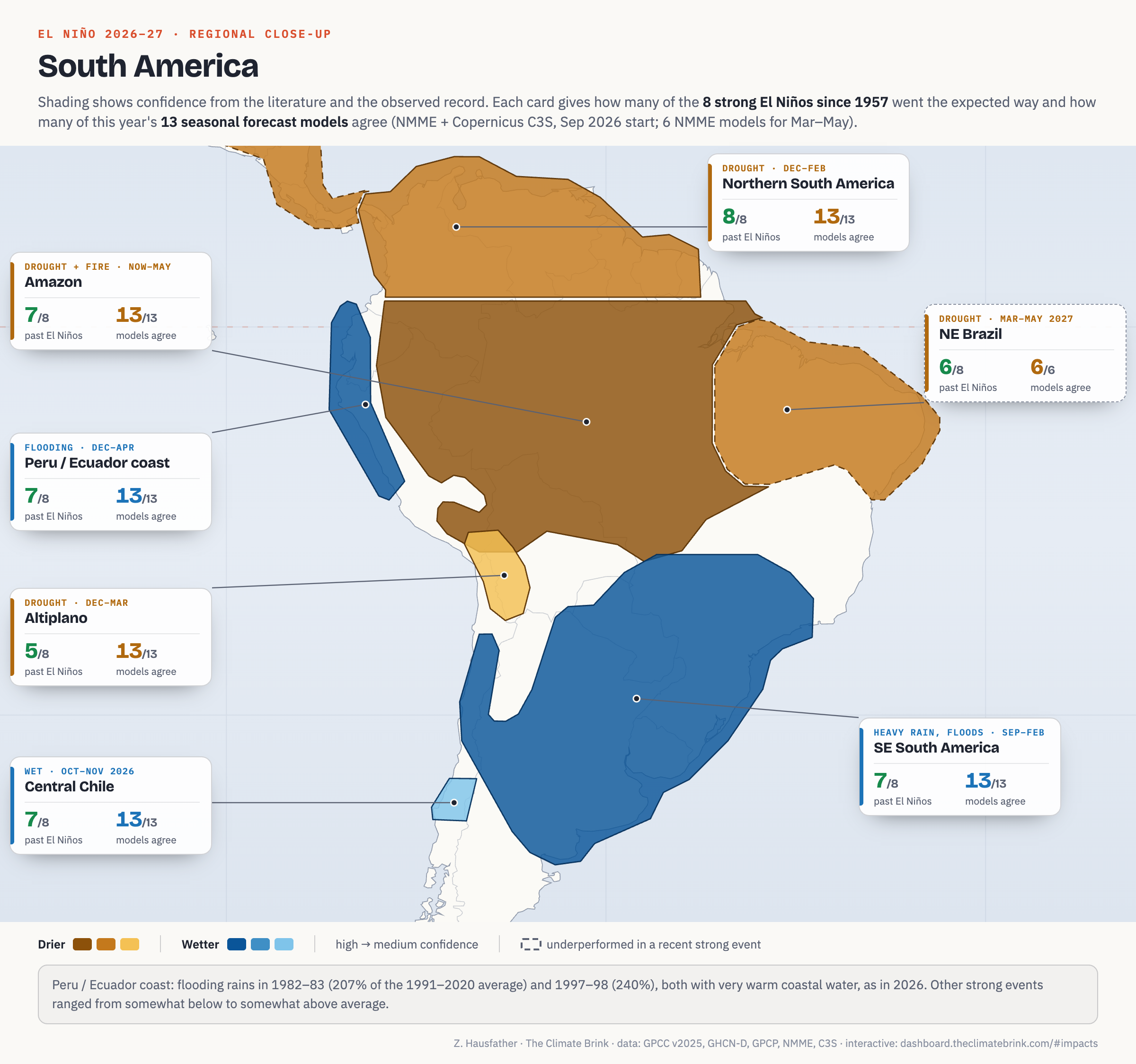
The Amazon was drier than normal between October and May in 7 of 8 strong events, and in each of the last five (from 1982-83 onward) it was drier than any ENSO-neutral year in the record. All 13 models agree for this season. But the Amazon is also strongly impacted by longer-term climate changes. A World Weather Attribution study found that “the severity of the [2023-24] drought… is largely driven by climate change,” with El Niño and warming contributing about equally to the rainfall deficit but the drying trend almost entirely due to warming. Fire risk also depends heavily on land management practices, as the large majority of Amazon fires are set by people.
Northern South America (Colombia, Venezuela and the Guianas) was drier than normal in December to February in all eight strong events, with a median of 71% of normal (Poveda et al. 2011). All 13 models agree this year. Northeast Brazil’s March to May rainy season was drier than normal in 6 of 8 events (Hastenrath 2011). That signal depends on tropical Atlantic temperatures as well as the Pacific, which is why it shown as only medium-high confidence. It also has a dashed outline on the map, because after the last El Niño the 2024 rainy season came in right at normal (100%).
The coast of northern Peru and Ecuador is where El Niño got its name, and where its impacts can be most violent. Normally a desert, the coast floods when the ocean just offshore warms enough to support deep convection. Only 1982-83 and 1997-98 brought truly extreme rains, with the coastal grid cells averaging more than double normal rainfall from December to April. Other strong events ranged from somewhat below to somewhat above normal, and in 2023-24 the expected coastal rains largely failed after Peru had set aside around $1.2 billion for flood preparation. What distinguished 1982-83 and 1997-98 was very warm water right along the coast. This year looks more like those two events than the others; in mid-September the far eastern Pacific (the Niño 1+2 region) was running 4.6C above normal, compared to 3.5C in 1997, 2.1C in 2015 and 2.6C in 2023 at the same point. I’ve rated this high confidence provided that coastal warmth persists as predicted by current models.
Southeastern South America (Uruguay, northeastern Argentina, southern Brazil and Paraguay) was wetter than normal between September and February in 7 of 8 strong events (Grimm and Tedeschi 2009), while the 2023-24 season was close to normal. The devastating Rio Grande do Sul floods of May 2024 came much later – in the autumn after the El Niño’s peak – though one attribution study found the El Niño approximately doubled their likelihood (albeit with a very wide uncertainty range).
The Altiplano, the high plateau shared by southern Peru, western Bolivia and northern Chile, gets most of its rain from December to March, and El Niño tends to suppress it. A warmer tropical atmosphere strengthens the upper-level westerly winds over the Andes, which cuts off the easterly flow that normally carries Amazon moisture up onto the plateau (Garreaud and Aceituno 2001). All 13 models show a dry summer this year, one of the strongest model signals anywhere on the map. The observed record is weaker as only 5 of 8 past strong events were drier than normal. The link is closest over the drier western part of the plateau (Vuille et al. 2000) and weaker toward Lake Titicaca in the north, so I’ve rated the region medium confidence.
In Chile, Montecinos and Aceituno (2003) find that during El Niño “there is a tendency for the occurrence of above-average precipitation between 30° and 35°S in winter [June–July–August (JJA)] and from 35° to 38°S in late spring [October–November (ON)].” October and November were wetter than normal in 7 of 8 strong events (with a median of 170% of normal) and in all six moderate El Niños, and all 13 models agree this year.
Further south, the same literature finds relatively dry summers between about 38°S and 41°S during El Niño, and the observed record agrees (7 of 8 strong events drier than normal from January to March), but this year’s models are split (only 8 of 13 show a drier January and February), so I’ve left it off the map. The Atacama Desert does get rare heavy rains in El Niño years, but historically these have come in the winter of the developing year (Vargas et al. 2000), which for this event has already passed.
North and Central America
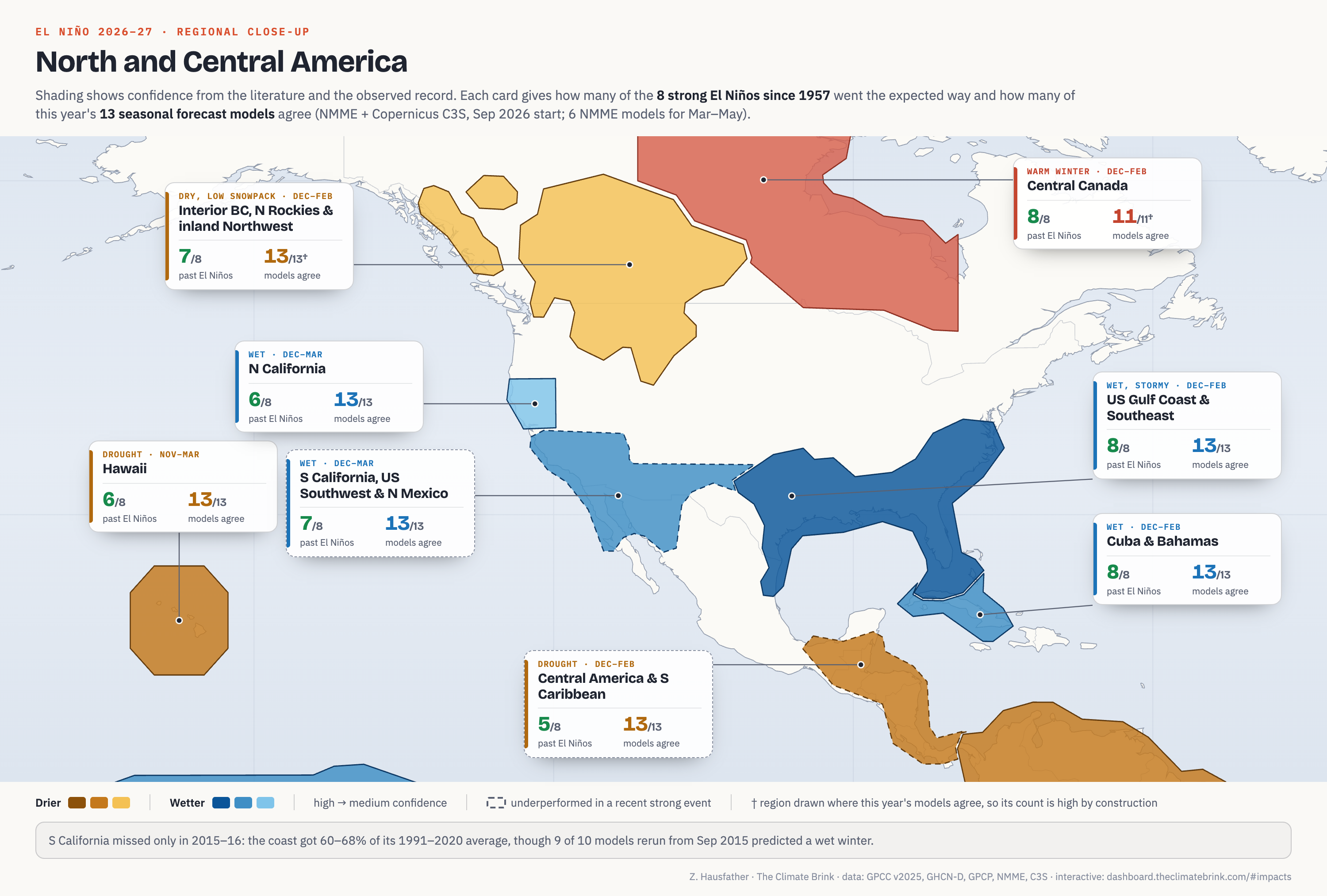
The US Gulf Coast and Southeast was wetter than normal between December and February in all eight strong events, with 1982-83 at 151% and 1997-98 at 168% of normal (Ropelewski and Halpert 1986). The strengthened subtropical jet stream also brings wetter winters to Cuba and the Bahamas, which were wetter than normal in all eight strong events, with a median of 163% of normal (Giannini et al. 2000). This year all 13 models agree on wetter than normal conditions in both regions.
Southern California, the US Southwest and northern Mexico were wetter than normal between December and March in 7 of 8 strong events, with 1982-83 and 1997-98 both around double normal. The exception was 2015-16 when coastal southern California ended up at only 60% to 68% of normal despite 9 of 10 seasonal models predicting a wet winter that year. Rerun for 1982-83 and 1997-98, those same models called for wet winters (9 of 9 and 10 of 11), which is what happened. El Niño explains at most around a third of West Coast winter rainfall variability even in strong years, so a lot comes down to where individual storms go.
Northern California is a bit more ambigious. It was wetter than normal between December and March in 6 of 8 strong events, including 2015-16 (120% of normal) when Southern California missed, and 1982-83 and 1997-98 were both well above normal (173% and 156%). All 13 models lean wet this year. The misses were 1965-66 (75%) and 2009-10 (90%). However, the signal is not very specific to El Niño. Northern California was also on the wet side in 7 of 12 La Niña winters, only 2 of 6 moderate El Niños were wet, and the El Niño relationship across all winters since 1950 is weak. Past work has generally found the El Niño rainfall signal is concentrated in Southern California, and I’ve added it to the map as only medium confidence for this year.
Further north, El Niño winters tend to be drier in interior British Columbia and the inland Northwest, with lower snowpack (Shabbar et al. 1997). This was observed in 7 of 8 past events, though the typical dry anomaly is small (~95% of normal), so I’ve assigned it only medium confidence.
Central Canada tends to have mild winters during El Niño, with the strongest warmth just west of Hudson Bay (Shabbar and Khandekar 1996). All eight strong El Niño winters were warmer than the typical neutral winter once long-term warming is removed, and the four since 1997 were strikingly warm (2023-24 was Canada’s warmest winter on record). But La Niña winters were also on the warm side in 7 of 12 cases, and it is sensitive to how the warming trend is removed so I’ve assigned it medium confidence.
Hawaii is usually dry during El Niño winters, particularly in eastern Pacific events like this one (Lu et al. 2020). A composite of long-running Hawaiian rain gauges shows November to March was drier than normal in every strong event since 1972 (six of six, with a median of 69% of normal), though 1957-58 and 1965-66 were both wet. All 13 models show a dry winter this year.
Central America and the southern Caribbean (Costa Rica, Panama and the Caribbean coast of Colombia) tend to be drier during El Niño winters. During the 2023 El Niño, drought restricted traffic through the Panama Canal. But December to February is the dry season across much of this region anyway, and in the places where it normally rains during those months drier conditions only occurred in 5 of 8 past events. The more robust Central American signal is midsummer drought during the developing year (e.g. July and August 2026), which has already passed.
While some of the literature on teleconnections suggests that El Niño drives drier conditions in the Ohio Valley, this year’s models lean wet there (only 3 of 13 show drying), and the observed record is a coin flip as it was only drier in 4 of 8 past strong events.
Europe
Europe is conspicuously absent from the map, which has surprised some people given the summer heat and drought across the continent this year. For most of Europe we simply don’t know what El Niño will do this winter.
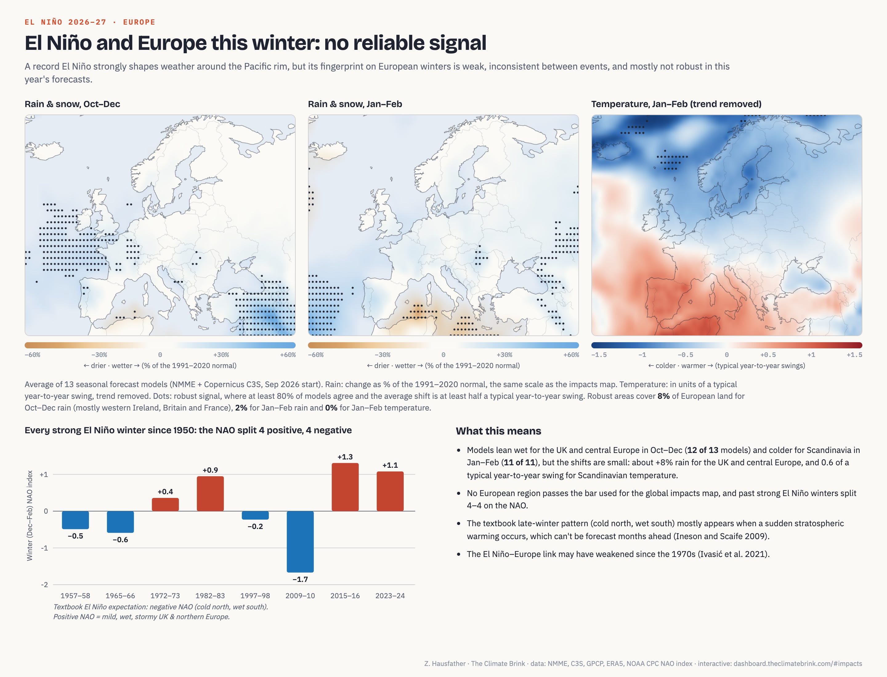
The textbook late-winter pattern (cold northern Europe, wet south) mostly shows up when a sudden stratospheric warming occurs, which can’t be forecast months in advance (Ineson and Scaife 2009). The link may also have weakened since the 1970s. Past strong El Niño winters split 4 to 4 on the North Atlantic Oscillation, 5 of 8 showed a wet UK and central Europe in autumn, and 5 of 8 had a cold Scandinavian late winter. The models (12 of 13) lean wet for the UK and central Europe from October to December this year, but the shifts are small.
The global picture
Because global temperature lags the tropical Pacific by a few months, 2027 is almost certain to be the warmest year on record. My latest forecast, which combines six global temperature datasets with the 14-model ENSO forecast, gives it a 95% to 96% chance, up from around 85% in April. El Niño-driven drought and fire in the tropics also weaken the land carbon sink, which is why the growth rate of CO2 at Mauna Loa hit a record 3.33 ppm in 2024. A similar spike in 2027 is likely. The fourth global coral bleaching event was driven by the 2023-24 El Niño on top of longer-term warming and affected 84% of the world’s reef area. A stronger event arriving before those reefs have recovered raises the risk of widespread mortality next year.
The most reliable El Niño impacts are clustered around the tropical Pacific and in the Americas. Drought in Indonesia, the Philippines, the western Pacific islands and northern South America, and wet winters from the Gulf Coast to Cuba, have shown up in essentially every strong event since the 1950s, and this year’s models agree. Southern Africa, the Amazon and the Horn of Africa are nearly as consistent. Those are the places where preparation (water storage, food reserves, fire management, flood defenses) is urgently needed now before the rains or droughts arrive.
The impact I’d flag most for policymakers is on food. Of the major climate modes of variability, “only El Niño can force globally synchronous crop failures,” because it simultaneously affects breadbaskets on multiple continents. The map shows drought risk for maize in southern Africa, rice in the Philippines and Southeast Asia and a range of crops in northern South America during the first half of 2027.
Its also worth remembering that this event is forecast to be well beyond anything in the observed record, and the two most similar past events (1982-83 and 1997-98) showed the expected impacts in every region on the map.
I’ll update the map when the October forecasts come in, and I’ve put the code and data to reproduce this analysis on my GitHub here.
These numbers are from the September initializations of the 14 models tracked on our Climate Dashboard, with each model weighted equally, and use the same convention as NOAA’s Oceanic Niño Index (each month relative to a centered 30-year climatology). The regional impact forecasts in this post use a slightly different set of 13 models that publish rainfall and temperature fields (NMME and Copernicus C3S). For each region, the model check averages every model over the region’s whole season up to February 2027, the last month all 13 cover; seasons that fall mostly after that use the six NMME models, which run through May.
Strong events are those with a November–January Oceanic Niño Index (ONI) of at least 1.5C. For each region I compared its average rainfall (or temperature) in the season on the map to ENSO-neutral years, after removing a long-term trend fitted to the neutral years only. An event counts toward the tally if it lands on the expected side of the median neutral year. Percentages of normal are relative to the 1991–2020 average. The main precipitation data are GPCC’s new Precipitation Analysis Monthly Version 2025. The full methods, including all sensitivity tests, are in the GitHub repository.
One note on how to read the numbers here: the counts (like 7 of 8) compare each event with a typical ENSO-neutral year, while the percentages (like 70% of normal) are relative to the 1991–2020 average. These usually tell the same story, but not always, because a few very wet or very dry years can pull the average away from a typical year.
This is consistent with the long-standing observation that the ENSO-monsoon relationship has weakened since the 1980s. The strongest El Niño on record at the time, 1997, produced a near-normal monsoon even in the developing year (around 102% of normal in our data for north and central India).
4Hunger.org is translating all of these effects into the hunger they cause and what humanitarian aid is or isn not being mobilized. https://www.4hunger.org/p/hunger-foretold-the-coming-2027-hunger?r=1mi3pt&utm_campaign=post&utm_medium=web; https://www.4hunger.org/p/el-nino-has-landed-the-rain-that?r=1mi3pt&utm_campaign=post&utm_medium=web; https://www.4hunger.org/p/el-nino-crosses-the-atlantic-to-the?r=1mi3pt&utm_campaign=post&utm_medium=web; https://markroberts995.substack.com/p/the-half-of-the-world-that-has-only?r=1mi3pt&utm_campaign=post-expanded-share&utm_medium=web; https://www.4hunger.org/p/nineteen-african-countries-have-already?r=1mi3pt&utm_campaign=post&utm_medium=web. Happy to collaborate!
Why are the boundaries between high impact and no impact regions are so sharp?