
Why are there more high temperature records?
Yes, it's climate change

You may have seen arguments like this:
This is 100% wrong, so let me explain how we expect temperature records to evolve over time and show you how they’re actually evolving.
First, you can convince yourself that, in a stable climate, the odds of seeing a record should decline as 1/n, where n is the length of the data set. See notes for a derivation.
We can test this by analyzing a climate model with a stable climate, i.e., one that doesn’t have any forced climate change in it, a so-called control run. In these runs carbon dioxide and all other climate forcers are held constant at their pre-industrial values. As a result, all of the climate change in the model is due to unforced variability, like El Nino cycles. We count the number of records each year and it follows the 1/n line almost perfectly:
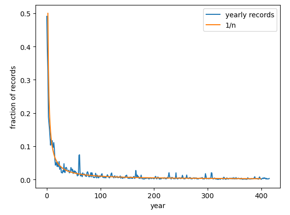
The fraction plotted is the fraction of grid points between 30N and 60N in each year that have record heat (other latitudes also follow the 1/n dependence).
Thus, all evidence suggests that, in a stable climate, we should be seeing fewer and fewer record-breaking events as time goes on and our climate records gets longer.
What do the observations tell us? We can take the Berkeley Earth data a run it through the same code. Here’s what we get:
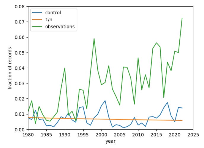
The blue line and orange lines are the same as in the previous plots: the model run with no forced climate change and the 1/n line. The green line comes from the observations.
As you can see, there are far more records in the observations over the last 30 years than we expect in a stable climate whose length is 150-175 years.
We can, of course, also take a climate model and force it with observed increases in carbon dioxide, etc. In these runs with realistic climate forcing, the climate will warm over time, just like our actual climate. What does that show for the increase in hot records?
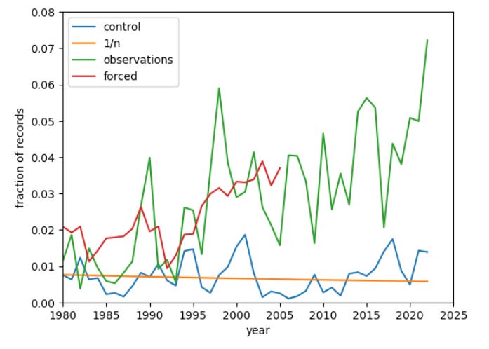
The red line shows the results for the climate model with realistic global warming: it agrees quite closely with the observations. Note that the historical runs end in 2005, which is why the red line ends there.
Thus, we see a consistent and intuitively obvious picture of global warming driving increasingly frequent record-breaking heat events.
What about record cold, you ask? Here’s your answer:

This plot shows that the cold records in a model with a stable climate (blue) still closely follows the 1/n line (orange), as you would expect. But the observations (green) show many fewer record cold months. The forced climate model (red) agrees well with the observations.
So we also see a consistent and intuitively obvious picture of global warming decreasing the occurrence of record-breaking cold.
It is important to keep in mind that there are different ways to phrase this question, and the answer you get may vary depending on how you phrase it. For instance, if you ask how the length of your time series affects the occurrence of 1-in-X year events, the answer would be that, the longer the time series, the greater the chances of experiencing rare events that are expected to occur with a low probability in any given year. But for the question of record-breaking heat events, the answer is clear — climate change is causing more of them.
Notes:
Derivation of 1/n decline of the odds of year n being a record: If you have a time series of independent and identically distributed temperatures, then there are n! ways of arranging that time series. There are (n-1)! ways of arranging the time series so that the last year has the highest temperature. So the odds of selecting a time series with a record in year n is (n-1)!/n! = 1/n. Adding autocorrelation to the time series causes the probability of having a record to drop more slowly than 1/n but it still declines every year.
In our model analyses, we are using runs from the MPI grand ensemble; all of our analyses are done on monthly average temperatures. The fraction plotted is the fraction of grid points in each year that have record heat between 30N and 60N, where most people live, and we compare grid points in each month of the year to record temperature from the same month in previous years. The historical run results are the average of the values from nine model runs, so they show much lower year-to-year variability than the observations.
You would like my latest. It compliments yours.
https://open.substack.com/pub/richardcrim/p/the-crisis-report-39?r=a66g&utm_campaign=post&utm_medium=web
This is a nice way to try and show the point about records being broken. But would you mind explaining how you deal with more weather stations being bought online over time? I guess that doesn't make any difference as long as the grid size is consistent over that time? (The only difference is that measurements for the grid will be more accurate).
And, following on from that, can you therefore also go further back in time then 1980? I'm asking because someone showed me a blog post where they were looking at tmax from 1900's onwards and claiming that there's no great records being set for this July 2023 and i highly suspect their methods are totally flawed. (They're basically just looking at tmax for stations which existed from 1900 onwards.)