
Visualizing a summer of extremes in 7 charts
The past four months of 2023 have shattered all prior records by a truly staggering margin

Global surface temperatures have dramatically spiked since the start of June, with the past four months (June-September) breaking prior monthly records by a large margin.
This extreme global heat has made it virtually certain that 2023 will rank as the warmest year on record, and means that there is a chance it will emerge as the first year exceeding 1.5C above preindustrial levels – at least in some datasets.
Here we explore seven different figures that highlight just how extreme global temperatures have been this (northern hemisphere) summer.
Visualizing daily global temperatures
To look at how global temperatures have evolved over the course of this year we use a reanalysis data product – the Japanese Meteorological Agency’s JRA-55. This is one of the two next-generation reanalysis products (the other being ECMWF’s ERA5) that uses data from satellites, weather balloons, airplanes, surface stations, buoys, and ships to feed into state of the art weather models that calculate global temperatures back in time.
These reanalysis products differ from surface-only datasets like NASA’s GISTEMP or Berkeley Earth, but produce broadly similar estimates of global temperature over time. Unlike surface datasets, their ingestion of massive real-time data allows for much more rapid updates of global temperature estimates. We can get estimates of daily global average temperatures from JRA-55 or ERA5 from a few days ago, while we will have to wait until early October to get monthly September temperatures from traditional surface records.
The first figure shows daily global temperature anomalies from the JRA-55 dataset for each day of the year between 1958 (when the reanalysis dataset starts) through a few days ago (Sep 21st 2023) at time of publication). The black line shows 2023 to-date, the red line shows the prior warmest year on record (2016), and the light grey lines show all other years in the dataset. The month of September is highlighted.

Here we see that temperature anomalies – the divergence from the dataset’s 1991-2020 baseline period – were the highest recorded so far this year (and so far over the full record) during the past few days in September. These exceeded the prior record temperature anomalies set during late February 2016 during the super El Nino event of that year. They were also a full 0.5C warmer than any temperatures recorded for during the month of September in any prior year.
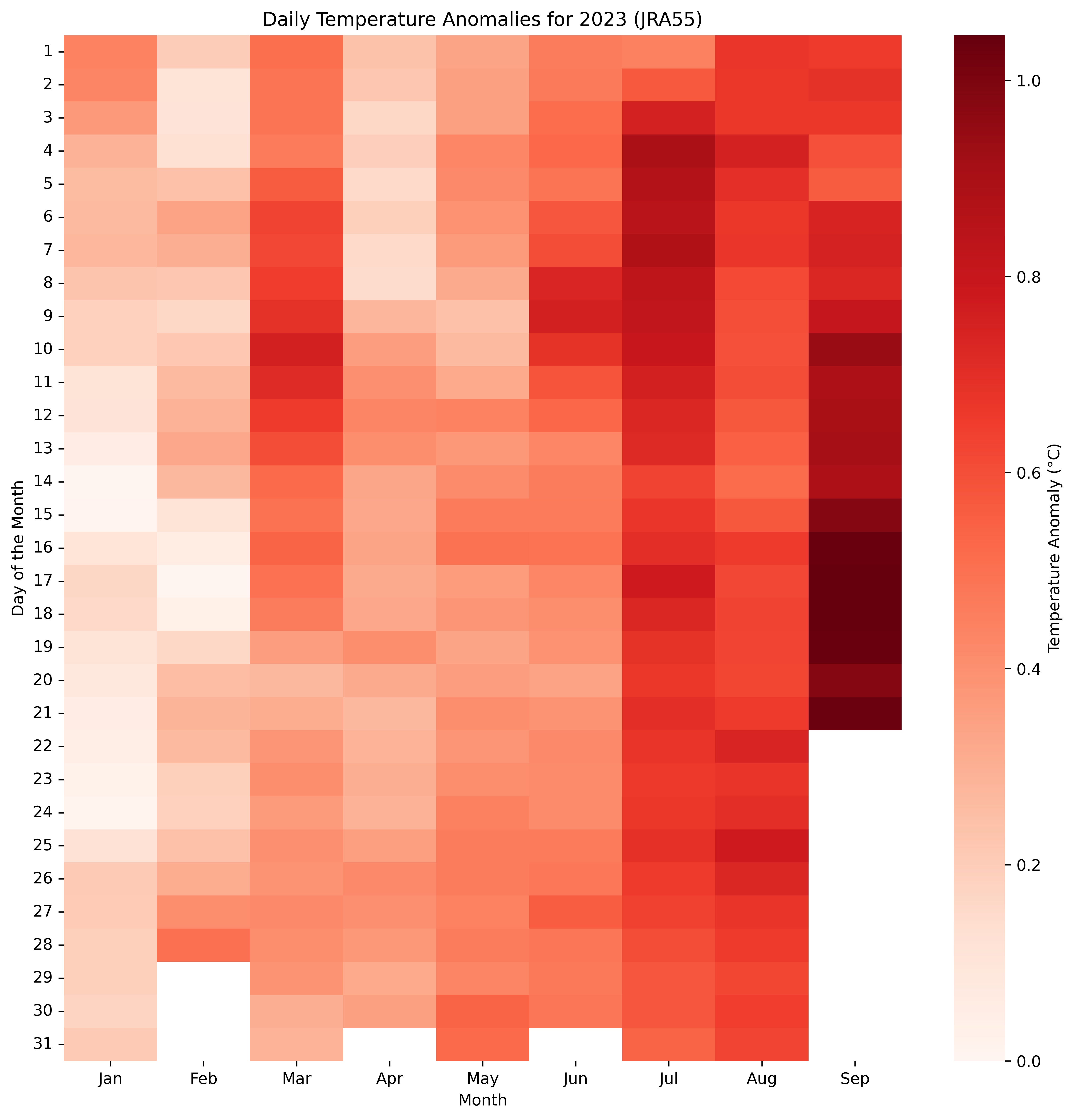
The second figure zooms in on 2023, and shows daily temperatures for each day of the year (broken down by month) as a heatmap. Here we can see that much of the past week was around 1C over the 1991-2020 baseline period. Given warming of approximately 0.9C between preindustrial (1850-1900) and the 1991-2020 period in the HadCRUT5 dataset, this amounts to around 1.9C above preindustrial levels (or ~2C if using Berkeley Earth to extend the record that far back).
We extend this anomaly heatmap back in time in our third figure, showing daily global mean surface temperature anomalies all the way back to when the dataset begins in January 1958. Here the day of the year is shown on the y-axis, with year on the x-axis. The current year stands out as highly anomalous compared to any prior years in the record.

One of the benefits of using reanalysis is that it is designed to accurately capture the spatial pattern of absolute temperatures rather than just anomalies (due to being driven by state-of-the-art weather models to turn observational data into temperature fields). The fourth figure shows daily absolute global mean surface temperatures over the full record, and shows a clear seasonal cycle where the maximum global temperature occurs during the northern hemisphere summer (driven by the preponderance of global land being located in the northern hemisphere).

Somewhat surprisingly, the increase in global temperatures to do human-driven warming is clearly apparent even in the absolute temperatures, with the type of global warmth typically associated with northern hemisphere summers expanding by nearly two months over the past 70 years.
Estimating monthly temperatures for September
With the first 21 days of September available in the JRA-55 dataset at the time this was published, we can predict where the entire month of September will end up with reasonable confidence. We do this by constructing a simple linear regression, using all of the Septembers between 1958 and 2022 to predict what the expected monthly value would be based on the first 21 days of the month.
The fifth figure, below, shows the best estimate of September monthly temperatures alongside the 95th percentile confidence intervals (2-sigma). It shows that September is almost certain to smash prior monthly records by a large margin, with the month likely to end up around 0.85C over the 1991-2020 baseline period, or between 0.4C and 0.5C warmer than the next-warmest September (2020).
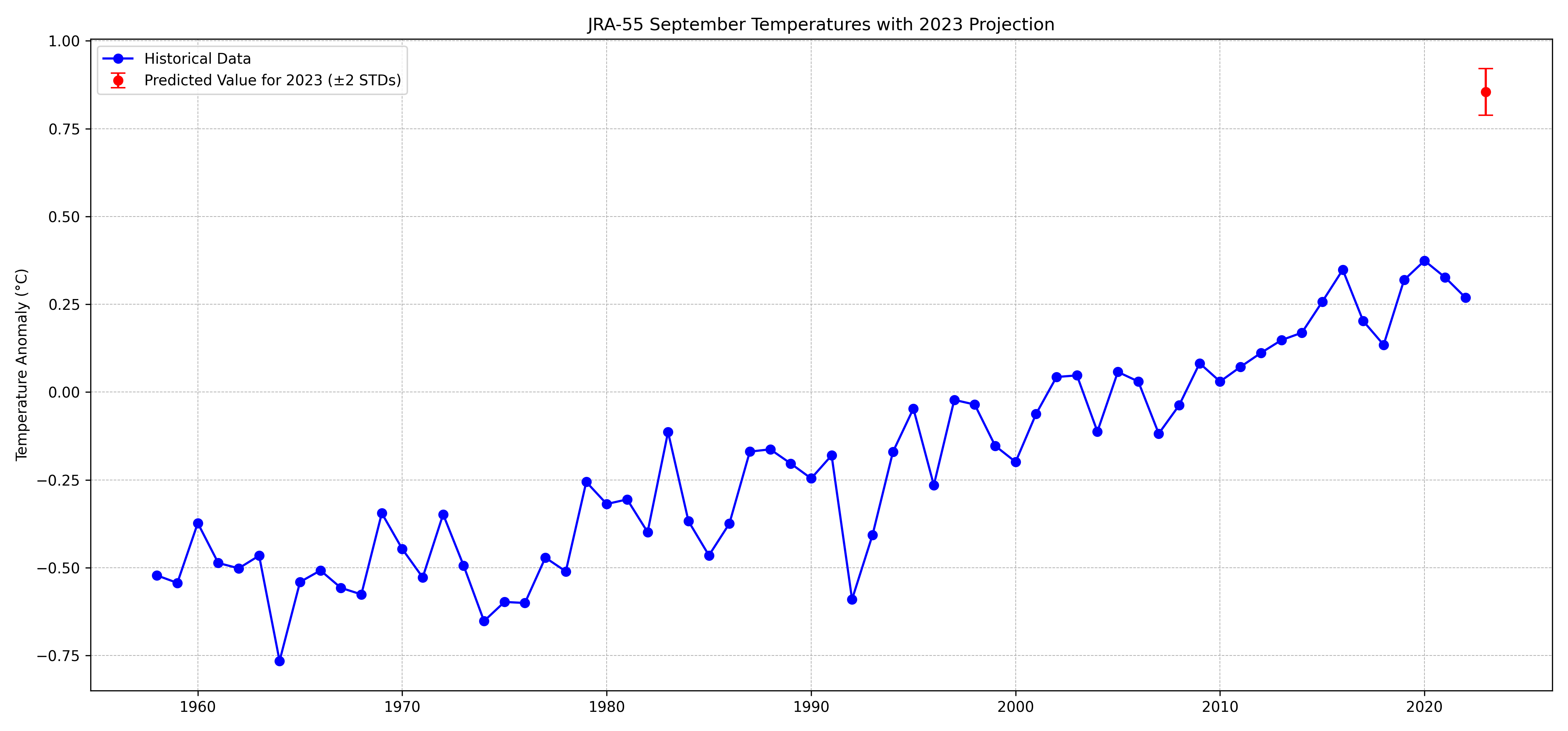
Based on the warming since preindustrial in surface temperature datasets, we can estimate September 2023 as somewhere between 1.7C (HadCRUT5) and 1.8C (Berkeley Earth) above the 1850-1900 average.
In the sixth figure, we show how the monthly temperature anomalies in 2023 to-date (including our prediction for September) compare with those from prior years. Here years are color coded from blue to red depending on what decade they occurred in, with 2023 highlighted in black.
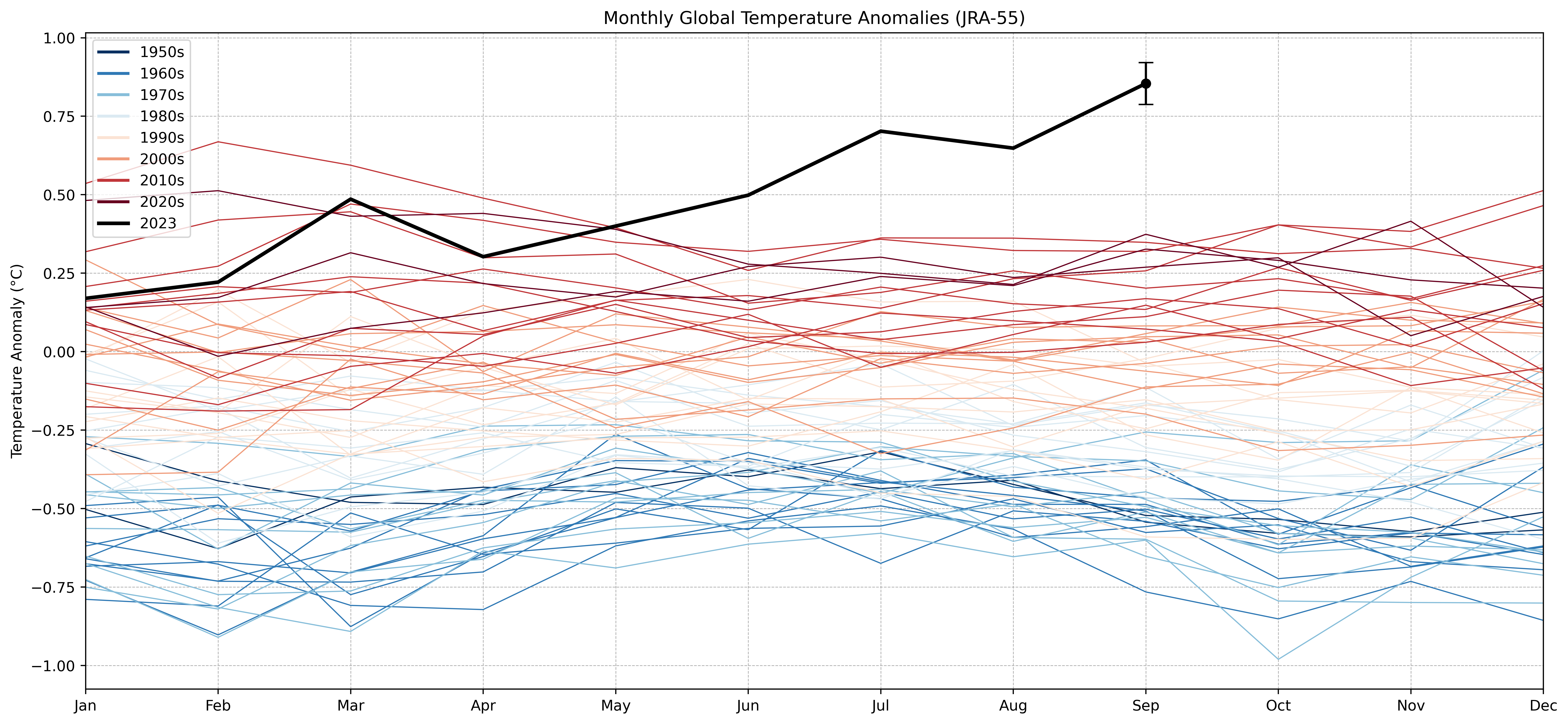
This figure, perhaps more than any so far, emphasizes just how extreme global temperatures have been since June, with September being the most anomalous month so far out of an already extremely anomalous summer.
Finally, the seventh figure shows the same plot but for absolute temperatures rather than anomalies. While September was cooler than the prior months in absolute terms (after all, winter is coming), it was still far above any prior September and on-par with a typical July over the past decade globally.

For more on the latest global surface temperatures and their potential causes, I’d recommend reading the detailed analysis in the latest Berkeley Earth monthly temperature report.
Also thanks to Ryan Maue for making processed global temperature and anomaly fields from JRA-55 readily available for the community to use.
Nice job. I appreciate the reference and links to the different datasets. Maybe sometime you can give us an overview of their origin. I hope this is somewhat of an anomalous spike.
A couple graphs are labeled Heamap vs Heatmap, just FYI.
Hi. Thanks for these visualizations. To clarify up front I am a climate activist and natural resource scientist. My question is about the 3rd image 'Heatmap of daily global mean surface temperature anomalies back to 1958 relative to the 1991-2020 baseline period.' I'm wondering how you chose the baseline period in general and why you chose 1991-2020 for this visualization. This choice of baseline is the basis for everything in the image, so as feedback, I think it would be good to explain this to your readers as well:-) Thanks in advance for your reply! Appreciate your work!