The most accurate record of US temperatures shows rapid warming
It turns out that eyeballing graphs is not an effective way to analyze data
Climate skeptics have a new favorite graph. But it turns out that it shows exactly the opposite of what climate skeptics claim it does.
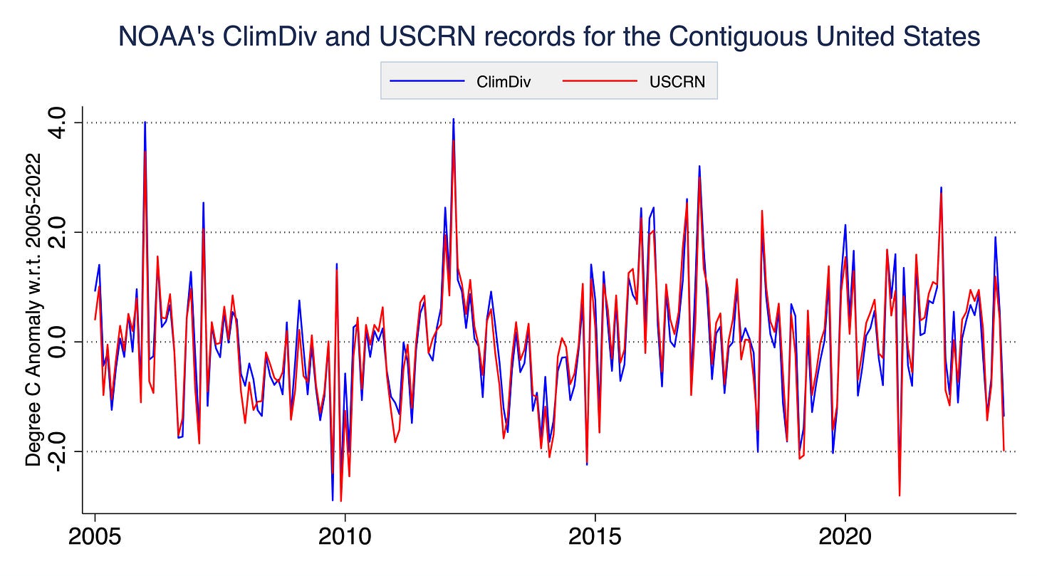
“Zero US warming in 18 years, per US Climate Reference Network temp stations” trumpets Steve Milloy in a viral tweet. “U.S. Government Has an Accurate Measure of U.S. Temperature That Shows No Recent Warming But It’s Hidden” says the DailySkeptic website. They are both referring to this graph showing monthly temperature records between 2005 and 2023. This shows data from the new U.S. Climate Reference Network, a pristine long-term climate measurement system.
At first glance it does looks pretty flat; its hard to say that the record shows much warming. But this is a case where actually analyzing the data, rather than simply eyeballing it, gives a very different answer.

The US Climate Reference Network
Measuring US and global temperatures is not an easy task. While we have mostly volunteer-run weather station data from across the country going back to the late 1800s, these weather stations were never set up to consistently monitor long-term changes to the climate. Stations have moved to different locations over the past 150 years, most more than once. They have changed instruments from mercury thermometers to electronic sensors, and have changed the time they take temperature measurements from afternoon to morning. Cities have grown up around stations, and some weather stations are not ideally located.
While scientists can effectively correct biases introduced by changing measurement techniques over time, we have long argued for setting up dedicated measurement networks to track longer-term climate changes both in the US and globally.
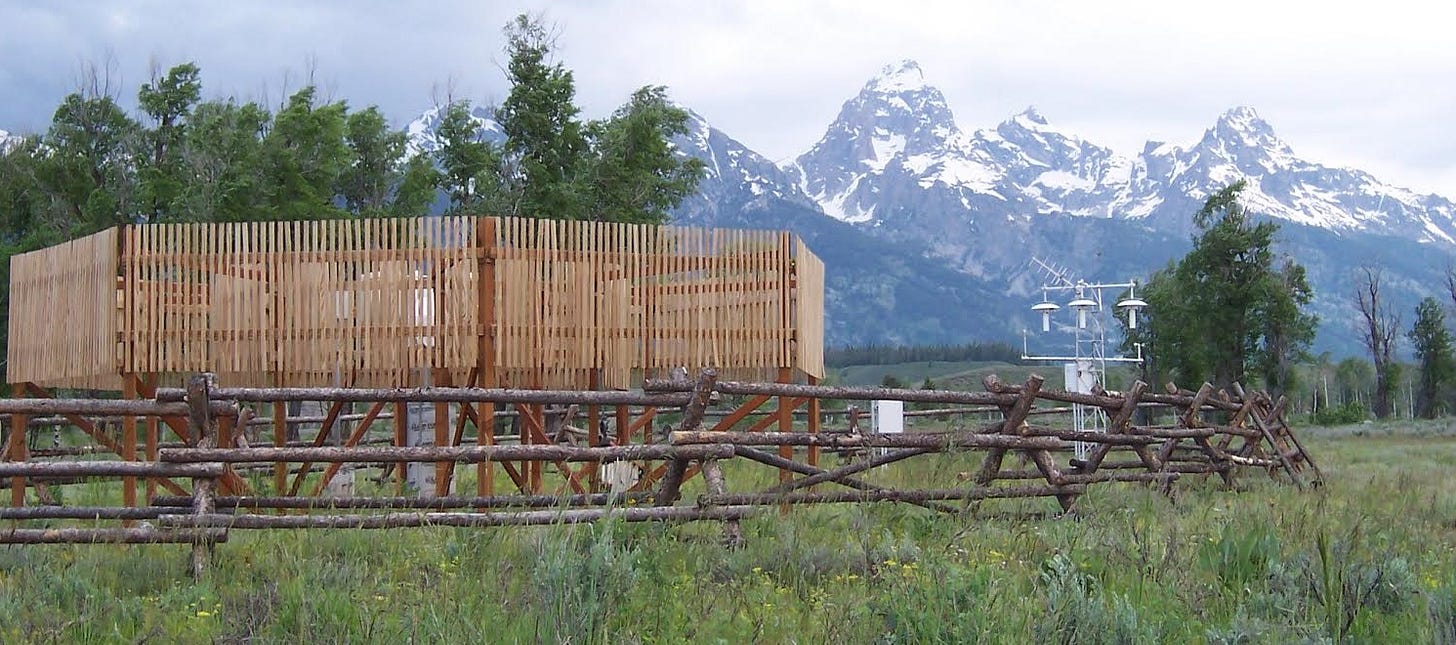
To ensure a more stable set of measurements going forward, NOAA began developing a U.S. Climate Reference Network (USCRN) starting in 2001. The USCRN includes 114 stations spaced throughout the U.S. that are well sited and away from cities. They have three temperature sensors that measure every two seconds and automatically send in data via satellite uplink. The reference network is intended to give us a good sense of changes in temperatures going forward, largely free from the issues that plagued the historical network.
The USCRN is understandably a topic of interest for those skeptical of the quality of the historical weather station network (which is used in NOAA’s current ClimDiv US temperature record). If the warming we have experienced in the US is in part due to factors like urbanization or other localized biases, the pristine rural USCRN data would show the real, unbiased results.
Comparing the USCRN to NOAA’s US record
So how does the USCRN compare to NOAA’s ClimDiv record? The figure below shows both series side by side. Because we are looking at monthly values, its both hard to eyeball the difference between the two and how they are changing over time (though keen eyed observers may notice the red USCRN line tends to be a bit below the blue ClimDiv line early on in the series, and above it later on).

This data is relatively noisy because it is showing a small (~2%) part of the Earth’s surface that is the contiguous U.S., and is showing monthly values which have a lot more variability than annual value (indeed, showing daily or hourly temperatures would be even harder to accurately eyeball!).
The picture becomes much clearer when we look at annual values and zoom out a bit to the full U.S. temperature record from 1895 onwards, as shown in the figure below. Here we see that the new pristine USCRN network matches the old ClimDiv network quite well during the period of overlap.

Hiding the incline?
If we zoom into the 2005-2022 period when the USCRN is available, we see something surprising: the USCRN actually shows faster warming over the period of overlap than the old weather network. So rather than “hiding” the weather network that shows no recent warming, NOAA’s new USCRN actually shows faster warming than the official US ClimDiv temperature record.

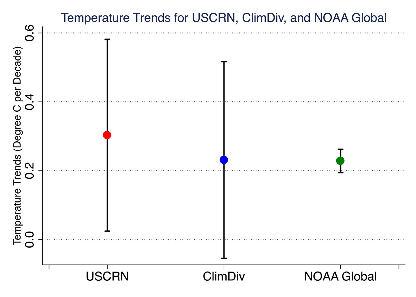
We can see this clearly if we compare trends over the 2005-2022 period. The figure below shows the trends (in degrees C per decade) between USCRN (red dot), ClimDiv (blue dot), and NOAA’s surface temperature record for the global as a whole over the same period (green dot). While the trend uncertainties are larger (due to representing only 2% of the planet!), we still see statistically significant warming in the USCRN record over the 2005-2022 period, with a central estimate of 0.30C per decade, compared to 0.23C per decade for both the ClimDiv network and the world as a whole.
So rather than hiding the fact that there is no recent warming, NOAA’s pristine US Climate Reference Network actually shows 31% faster warming than NOAA’s standard ClimDiv weather station network, and 33% faster warming than NOAA’s global temperature record over the same period. If anything, USCRN provides evidence that the official NOAA temperature data for the US (ClimDiv) is underestimating the rate of warming over the past 18 years, similar to what we found in our 2016 paper in the journal Geophysical Research Letters, in which we wrote:
During the period of overlap between the USHCN [ClimDiv’s predecessor] and USCRN networks, we can confidently conclude that the adjustments to the USHCN station records made them more similar to proximate homogenous USCRN station records, both in terms of trends and anomalies. There are no systematic trend biases introduced by adjustments during this period; if anything adjusted USHCN stations still underestimate maximum (and mean) temperature trends relative to USCRN stations.


Great analysis, thanks. Now I don't have to do it.
This is similar to setting 1880 as our "baseline" and saying there wasn't any noticeable warming until the late 70's. It works if the person you are talking to doesn't know that 1880 was the hottest year of the 19th century. By about 0.6C!
This was also the tactic with the "great slowdown" of warming between 2000 and 2010 that Deniers trumpeted as "proof" Global Warming was a hoax. It worked only if you set 97/98 as your starting point. Once again, El Nino years and the hottest years of the 20th century.
People never seem to learn that these kinds of arguments are structured to appeal to what they "want to believe". Not reality.
I´m no Climatologist, so could someone please help me understand something. Your final graph shows an average climb in temperature by 0.2°C per Decade, to my ears that sounds miniscule. 1 degree in 50 years doesn´t strike me as an enormous problem.