
Introducing the Climate Brink Dashboard
A new place to find daily updated climate data

With the advent of modern reanalysis products (weather models run backwards in time, ingesting data from satellites, weather balloons, airplanes, and surface observations) we now have an unprecedented look at the real-time evolution of the Earth’s climate.
I often use ECMWF’s ERA5 reanalysis (which is arguably the most state-of-the-art of the bunch) to look at current daily global temperature anomalies, to forecast where the current month might end up, or to use as inputs to a model (along with El Nino / La Nina predictions) to estimate what temperatures for the year will be.
But rather than manually making these charts every week or so, I (admittedly with the help of Claude Code) have put together an interactive climate dashboard that will live here at The Climate Brink: https://dashboard.theclimatebrink.com/
It currently includes interactive graphics for daily surface temperatures (you can mouse over each day to see the anomaly, and drag your curser to zoom in on any particular period of interest).
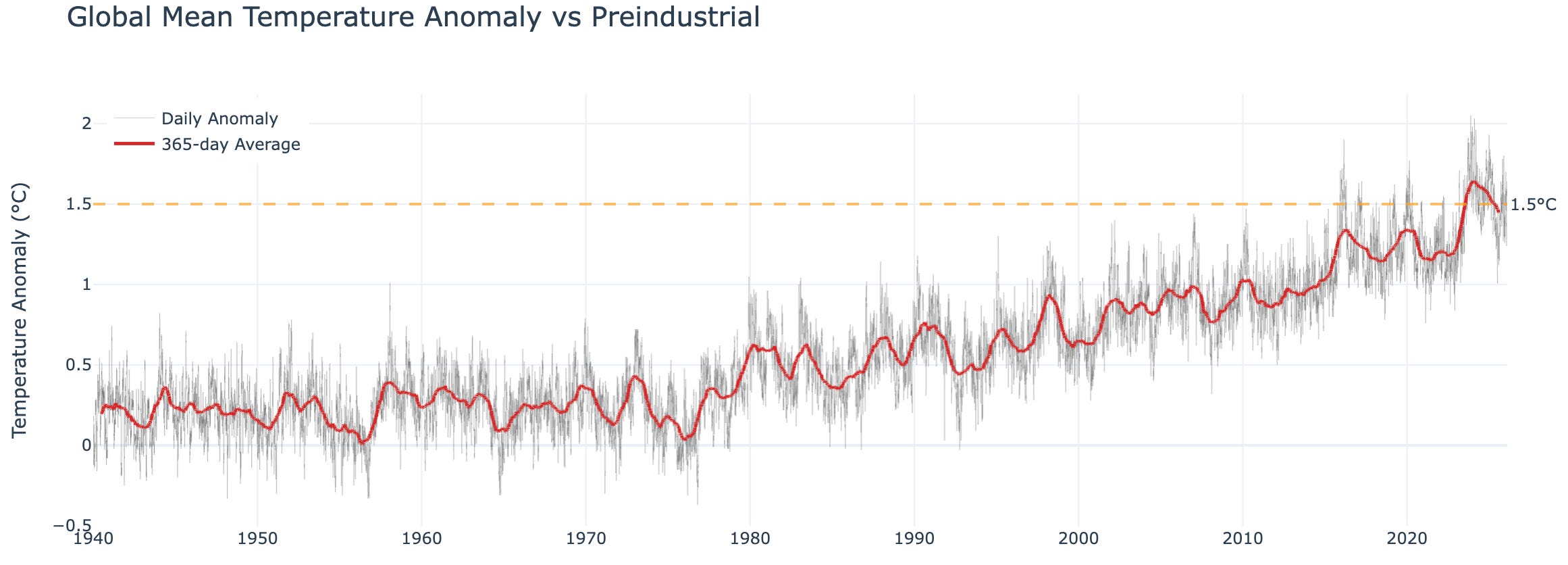
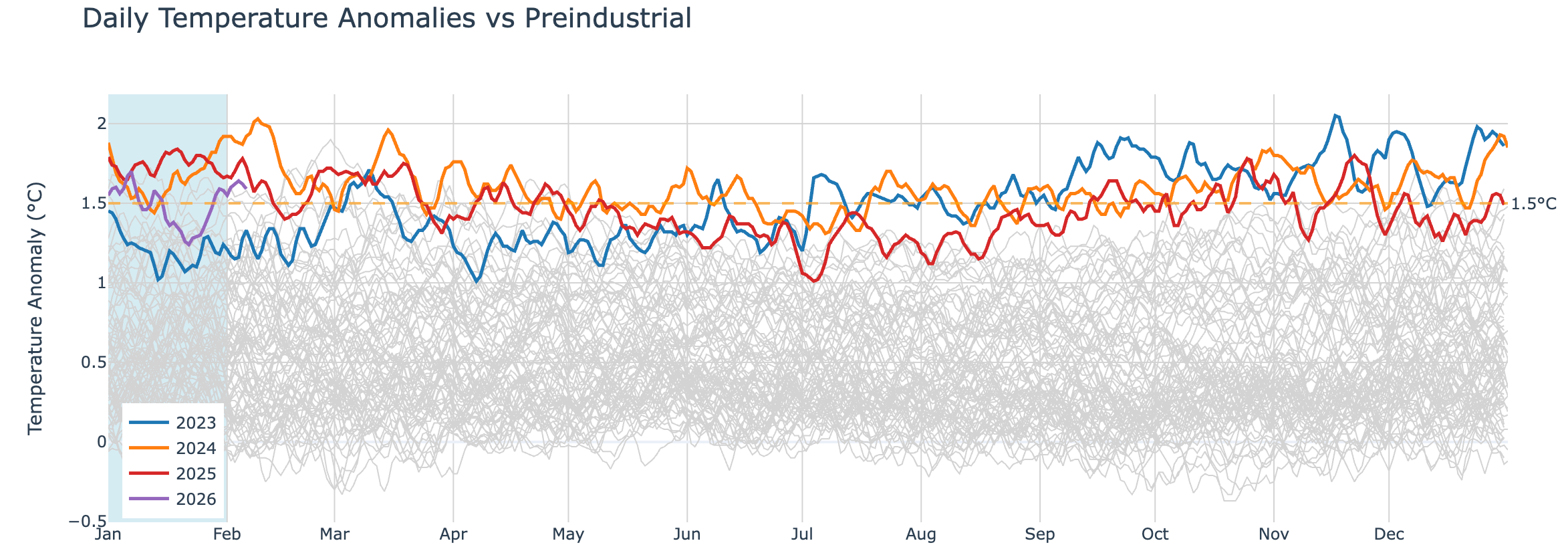
As well as a view showing the current year compared to the past three years (colored lines) and all prior years since 1940 (when ERA5 currently begins).
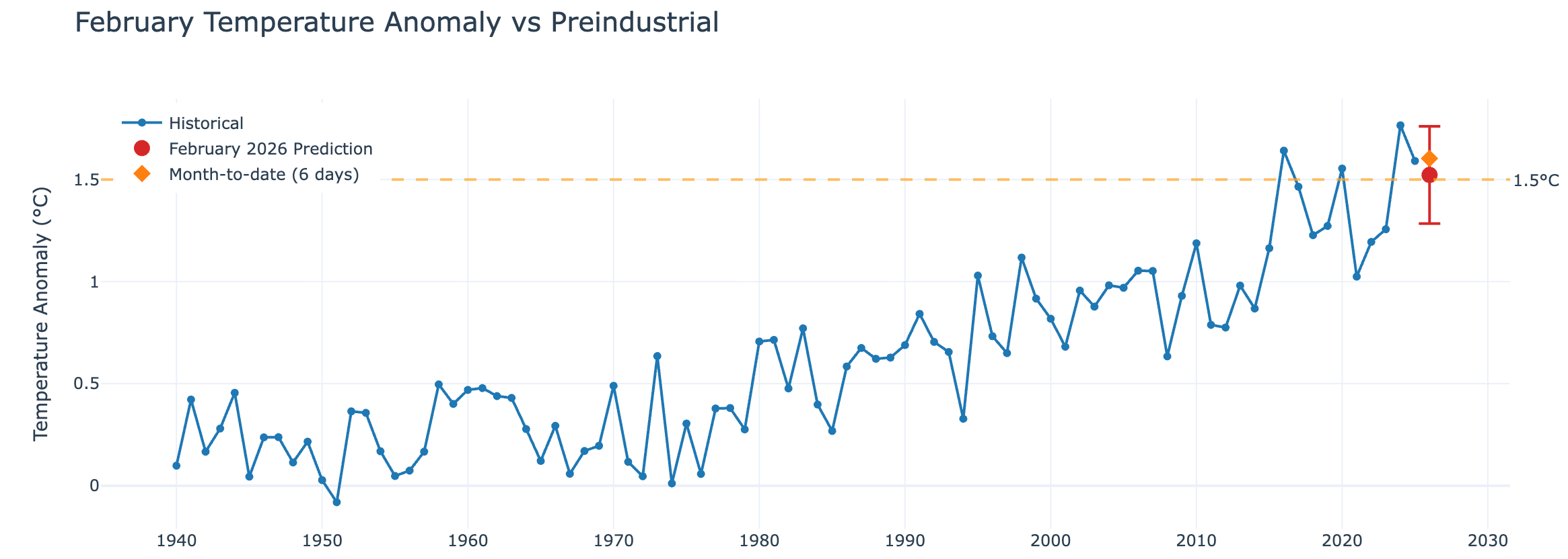
There are also predictions for the current monthly temperature based on the month-to-date; this will update with each day of new data, and the error bars will shrink accordingly.
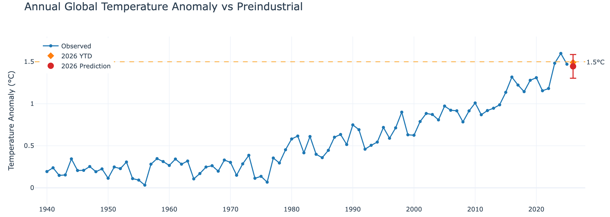
Similarly, I’ve adapted the model I use to predict annual temperatures for the current year, pulling in the latest El Nino and La Nina plume of model predictions from IRI (using the average of the dynamic models) to inform the estimate.
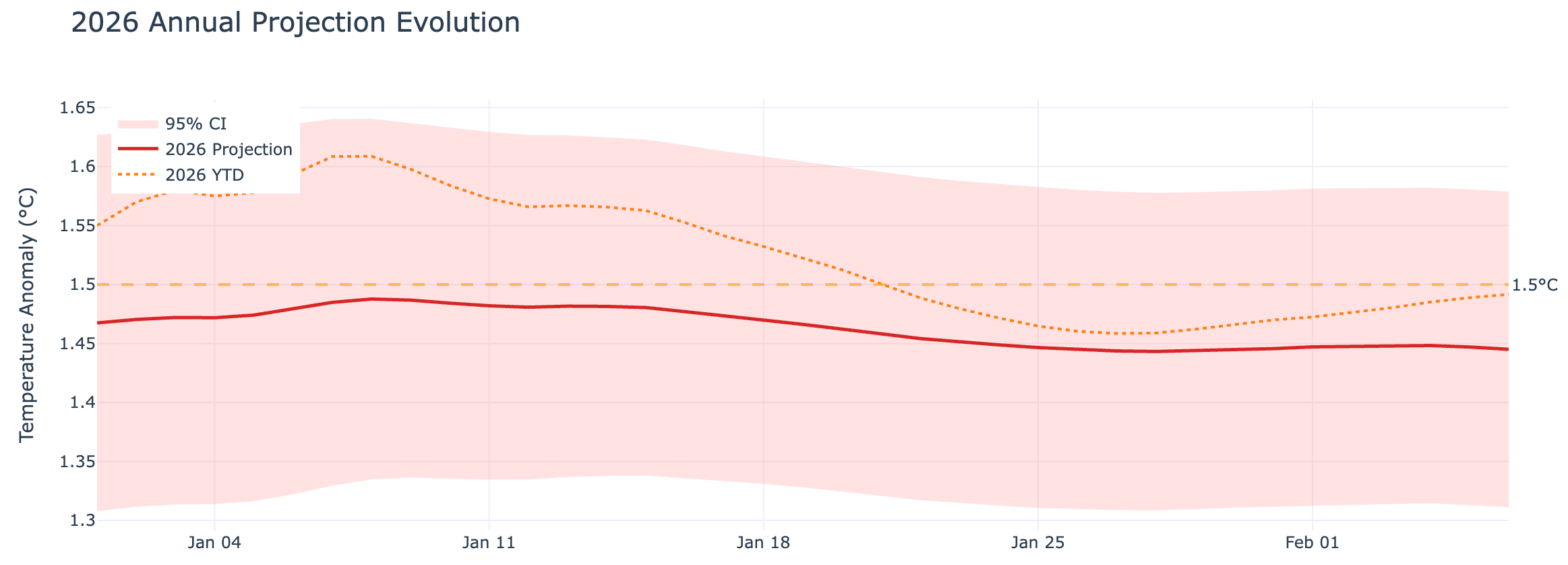
This next one is a bit in the technical weeds, but I find it fascinating to track how the annual prediction changes as each new day of data (and updated El Nino/La Nina forecasts) become available. It shows a history of each day’s 2026 projection (along with uncertainties) as well as the year-to-date temperature.
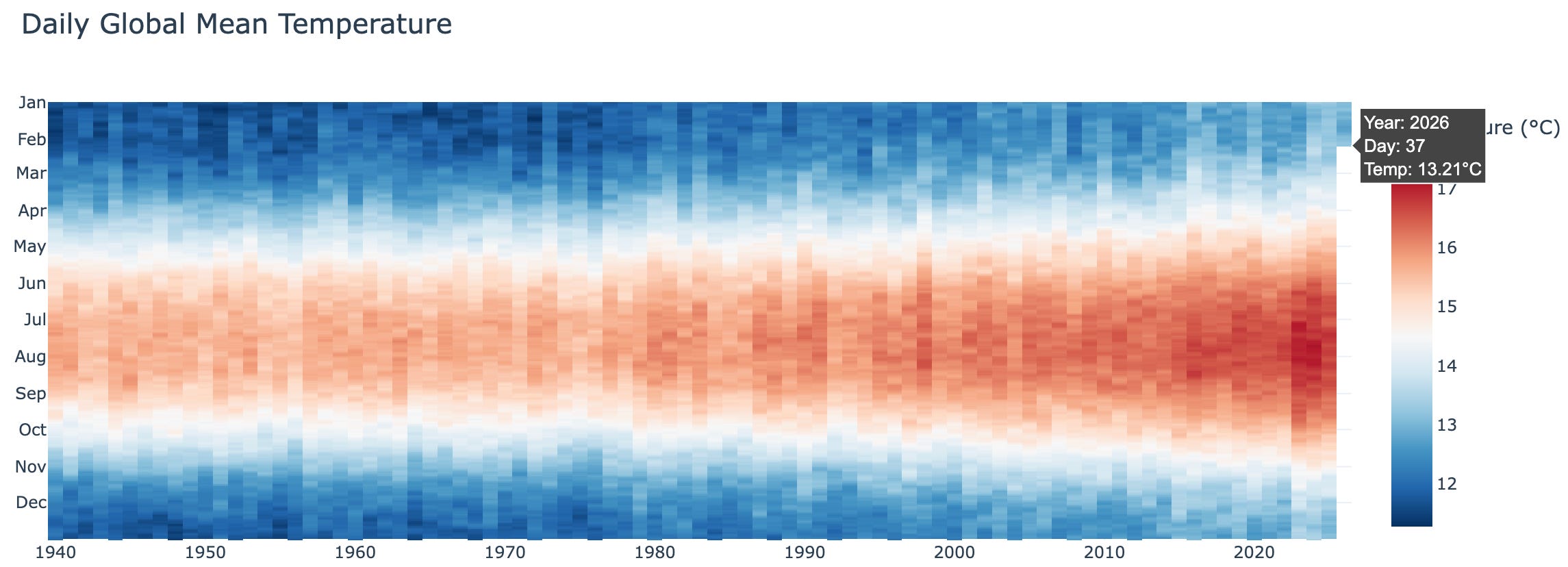
Finally, some pretty (and interactive) Hawkins-style climate stripe plots showing global mean surface temperatures (and anomalies) over time.
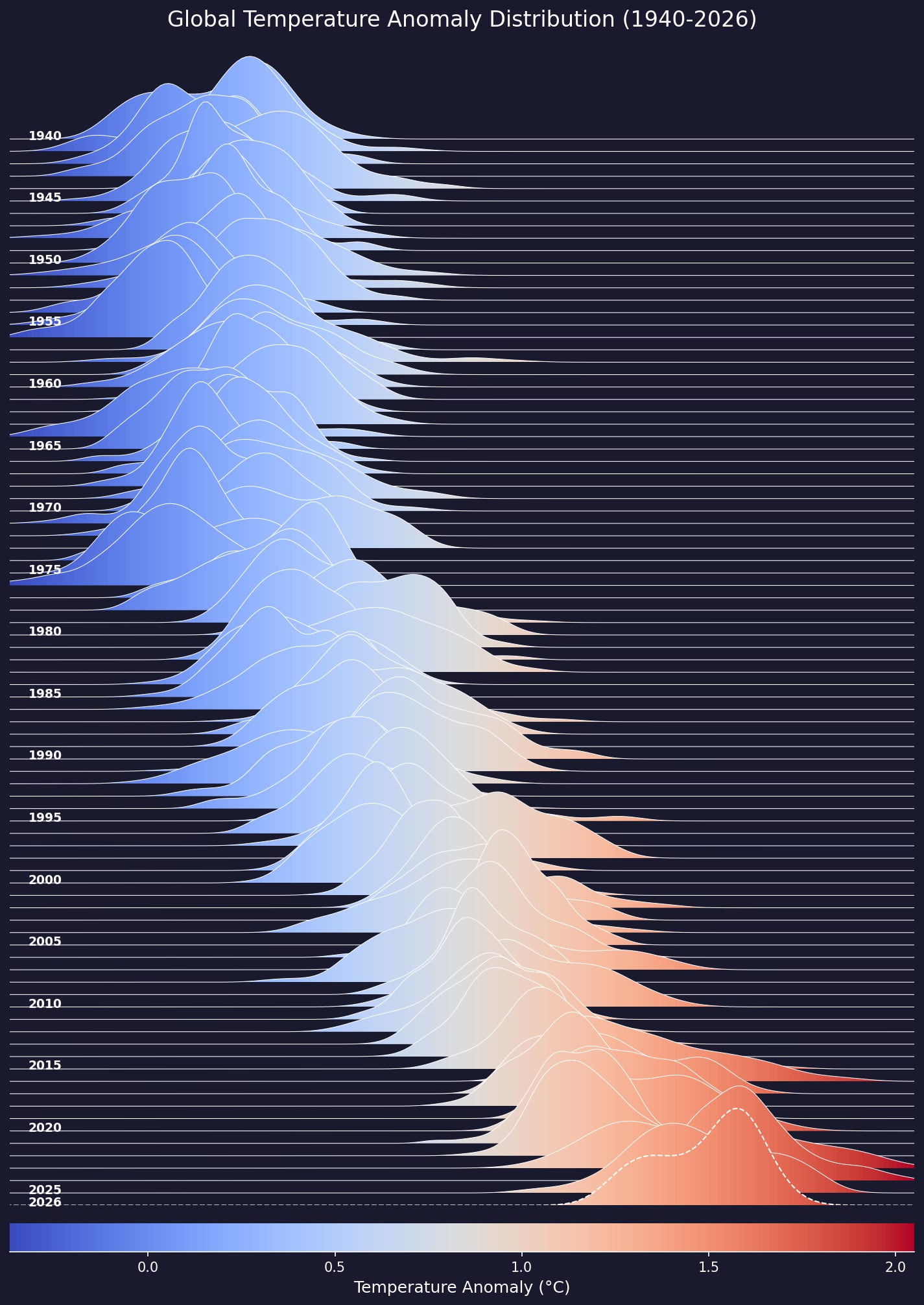
As well as a plot of the distribution of temperature anomalies for each year (inspired by the cover of Joy Division’s 1979 album Unknown Pleasures), with 2026 to-date shown with a dashed line.
There are some additional options including a dark (default) and light mode, as well as the option to turn off interactive graphs for faster page loads (as its a lot of data for folks with slow internet).
If you have other suggestions for datasets that we could include in the dashboard (ideally regularly updated ones) let me know! I’m also planning on having a tab for the full set of monthly surface temperature products as well as up-to-date climate model observation comparisons in the near future. Go check it out here!
I apparently also ran out of memory for the site as too many people tried to view it at the same time. Updating it to a more robust hosting plan for the moment!
Zeke, this is awesome! Great work putting that together. It's very clear even at a quick glance.